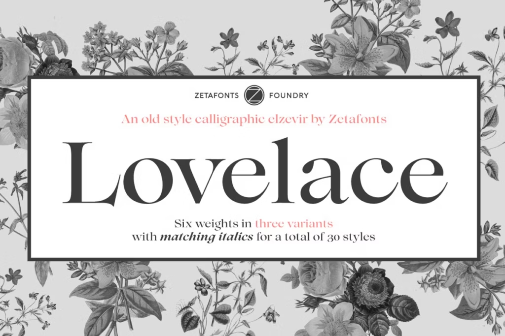
Lovelace: Victorian-Inspired Typeface with 30 Elegant Fonts
Lovelace is a beautifully designed typeface created by Cosimo Lorenzo Pancini, Andrea Tartarelli, and Maria Chiara Fantini. It’s a tribute to the traditional “Old Style” typography of the 19th century. Lovelace brings back the classic hand-lettered shapes of the Renaissance, offering a more casual and approachable alternative to the popular Bodonian serifs. What makes Lovelace special is its elegant look and versatility, which sets it apart in the world of modern typography.
This typeface is perfect for those who want to add a touch of sophistication and warmth to their designs. With its unique blend of traditional and modern elements, Lovelace is sure to make a statement. Whether you’re working on a project that requires a classic feel or a modern twist, Lovelace is an excellent choice. Its designers have done an amazing job of crafting a typeface that is both beautiful and functional.
Overall, Lovelace is a fantastic addition to any designer’s toolkit, and its beauty and versatility are sure to inspire creativity.
Design Style of Lovelace
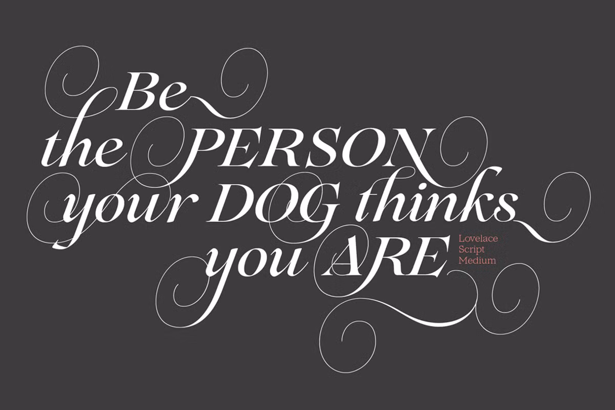
The Lovelace typeface gets its look from old-style calligraphy and strong, angled serifs, similar to what typographers like Pheimester and Alexander Kay used to do. You can see these influences in the tiny details and elegant look of Lovelace. To make it even more interesting, the design also takes some ideas from the Elzevir style, which was popular in the 19th century. This adds a nice contrast to the typeface, making it look more sophisticated.
Lovelace is a typeface that comes in two different sizes, which is pretty useful. It has six different weights, from really thin to really bold. The version for regular text is designed to be easy to read, with letters that are big enough to see clearly on a screen. This makes it great for using in big blocks of text, like in a book or on a website.
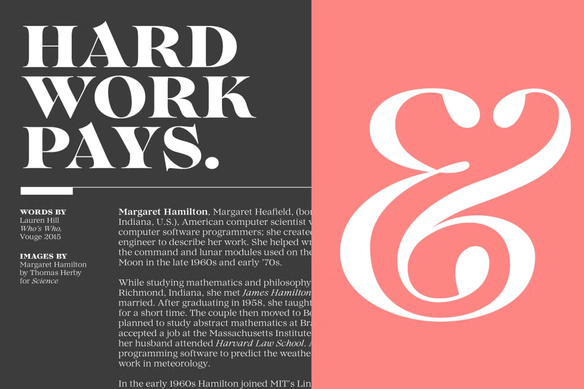
The other version, for headings and titles, is more fancy and has stronger contrasts, which makes it perfect for making a big impact in things like magazines and posters. The people who made Lovelace thought really carefully about how it would look in different situations, so it always looks nice and elegant.
Character Sets and Advanced Features
One of the standout features of Lovelace is its expansive character set, which covers over 200 languages that utilize Latin, Cyrillic, and Greek alphabets. This extensive coverage makes Lovelace a versatile choice for designers and typographers working in diverse linguistic contexts.
Lovelace also has some extra features that make it really useful and versatile. These features include things like advanced OpenType stuff that helps with usability and flexibility.
- Stylistic Alternates: Offers alternative characters for added design variety.
- Standard and Discretionary Ligatures: These ligatures improve the aesthetic flow of text and help create a more polished look.
- Positional Numerals: This feature ensures that numbers are displayed in a style consistent with the surrounding text.
- Small Caps: Perfect for creating emphasis in headings or design elements.
- Case Sensitive Forms: Provides different forms for uppercase and lowercase letters, enhancing typographic harmony.
Use Cases for Lovelace
Lovelace is a highly versatile typeface that can be utilized in a wide range of applications. Here are some of the most effective use cases for this elegant font:
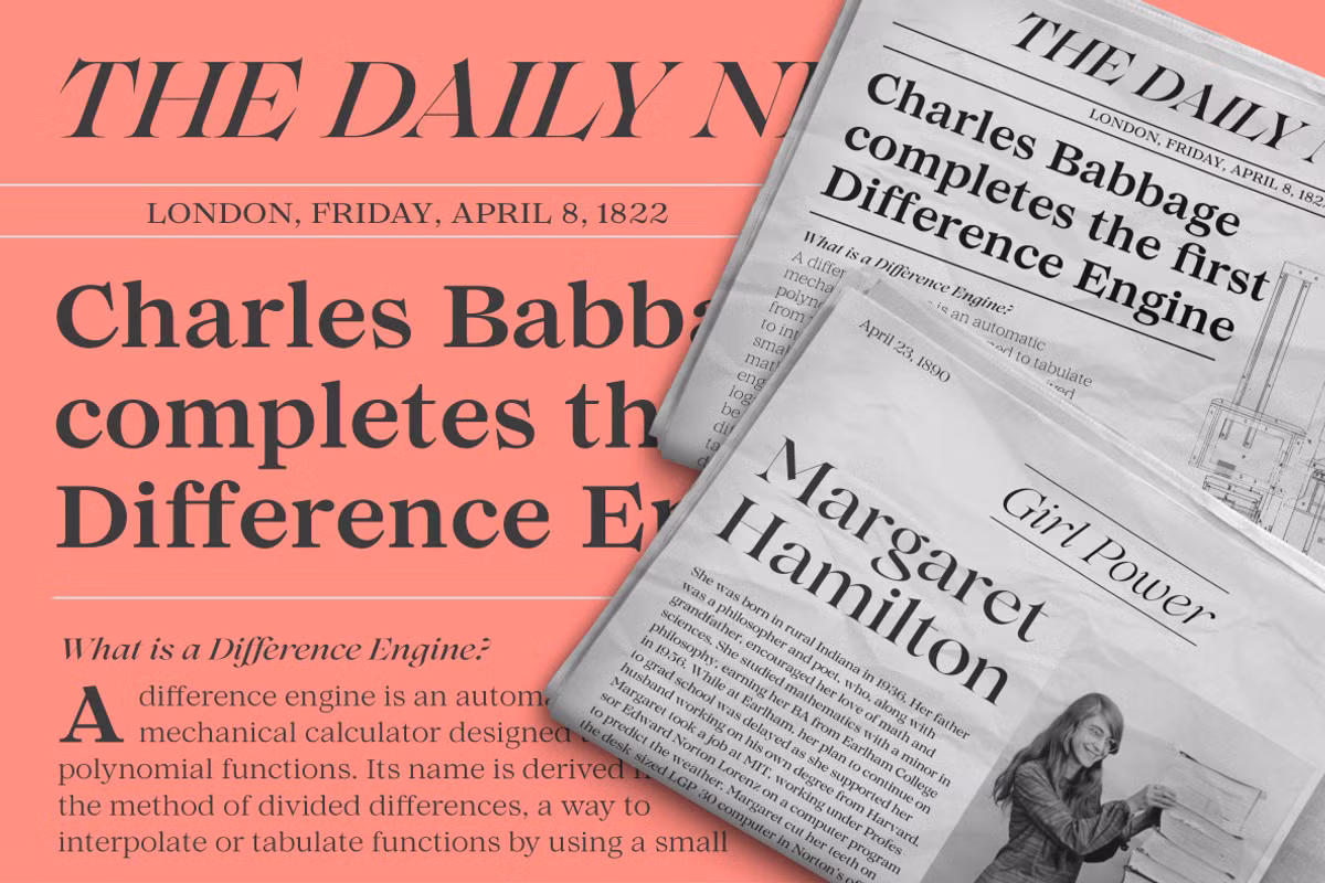
- Editorial Design: The sharp contrast and refined details of the display variant make Lovelace an excellent choice for magazines, newspapers, and journals.
- Branding: Its friendly yet sophisticated appearance lends itself well to logo design, packaging, and other branding materials.
- Web Design: The text variant’s screen-friendly design ensures that Lovelace performs beautifully on websites and digital platforms.
- Invitations and Stationery: The elegant curves and calligraphic influences make this typeface suitable for wedding invitations, event announcements, and other formal stationery.
Pairing Suggestions
When it comes to pairing Lovelace with other typefaces, the key is to choose complementary fonts that enhance its beauty without overshadowing it. Here are some pairing suggestions:
- Body Text Pairing: Consider combining Lovelace with a clean sans-serif font like Montserrat or Lato for body text. This creates a modern contrast while keeping the overall design elegant.
- Headings and Subheadings: Pair Lovelace with a bold serif typeface like Playfair Display for headings. This combination can create a striking hierarchy in editorial layouts.
- Minimalist Designs: For less busy designs, pairing Lovelace with a simple geometric sans-serif like Futura can produce a sleek and sophisticated look.
Licensing and Availability
You can get Lovelace from Zetafonts, and they have different licensing options. This means that whether you are a graphic designer, someone who makes websites, or a business owner who wants to make your brand look better, you can use Lovelace for personal or commercial projects.
When you buy Lovelace, you get to use all thirty different weights, so you can pick the one that works best for your project. And if you have any questions or problems with the typeface, don’t worry, Zetafonts is there to help you out and make sure you’re getting the most out of what you’ve bought.
Conclusion
Lovelace is not just a typeface, it’s a way to bring back the elegance of Victorian typography. It has 30 beautiful fonts and lots of characters to choose from, making it perfect for many design projects. You can use it to create editorial content, branding materials, or digital designs – it’s really versatile.
Lovelace is all about combining beauty and functionality, so you can make your typography stand out. By using Lovelace, you can add a touch of charm to your designs and take them to the next level. With its advanced features and stunning fonts, Lovelace is a great choice for anyone looking to elevate their design work.
Whether you’re working on a big project or just want to add some flair to your designs, Lovelace is a great option. It’s a way to make your typography more beautiful and effective, and to bring a sense of sophistication to your designs.