Slight: Elegant Calligraphy Font with Extensive OpenType Features
Introducing Slight: The Elegant Calligraphy Font
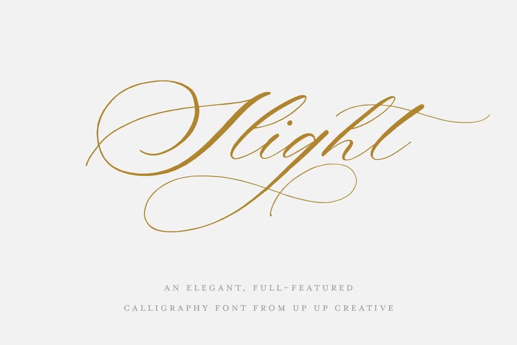
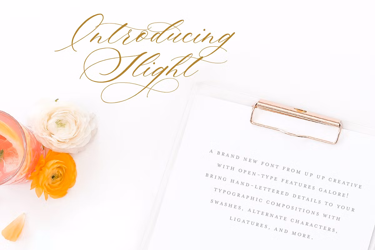
Slight is more than just a font – it’s a beautifully written script that looks great and has lots of features. It’s perfect for lots of different design projects, like invitations, branding, and editorial work. The way it slants to the right makes it look fancy and charming, which is why designers love using it to make their work stand out.
Whether you’re working on a special project or just want to add some elegance to your design, Slight is a great choice. Its unique style and features make it a great option for anyone looking to create something beautiful and eye-catching. With its sophisticated look and feel, Slight is sure to elevate any design project and make it look professional and polished.
Design Style of Slight
The way Slight is designed is really beautiful, with smooth curves and flowing lines that remind you of old-fashioned calligraphy. The people who made the font were very careful to make sure it has a strong lean to the right, which makes it look energetic and fun. This special touch doesn’t just make it look nice, it also gives the text a unique personality.
When you use Slight, it adds a bit of flair to whatever you’re writing, making it stand out in a good way. The curves and lines all work together to create a sense of movement and style, which is perfect for adding some visual interest to your words. Overall, the design of Slight is a great example of how a font can be both beautiful and functional at the same time.
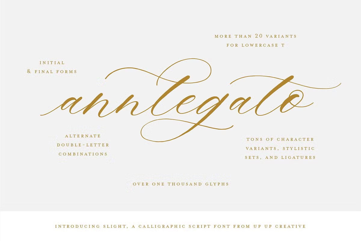
With more than 1000 glyphs, Slight captures the essence of hand-lettered artistry while providing the versatility required for modern design. The font includes a range of stylistic alternates and ligatures, allowing designers to create unique compositions that stand out.
Character Sets and OpenType Features
Slight is packed with an impressive array of features that make it a powerful tool for design professionals. The OpenType capabilities of this font ensure that you have access to a wide range of alternate characters and ligatures, all included within a single font file.
Some of the key OpenType features of Slight include:
- Contextual Alternates: Automatically adjusts characters based on their placement in a word, enhancing the natural flow of text.
- Stylistic Alternates: Provides multiple options for many letters, allowing for personalized design choices.
- Initial and Final Forms: Unique designs for the beginning and end of words to create visually appealing text.
- Ligatures: Combines certain letter pairs into a single glyph for a smoother and more cohesive look.
- Multilingual Support: Includes a variety of currency symbols and supports multiple languages.
- Multiple Ampersand Styles: Six distinct designs for the ampersand symbol, offering versatility in typography.
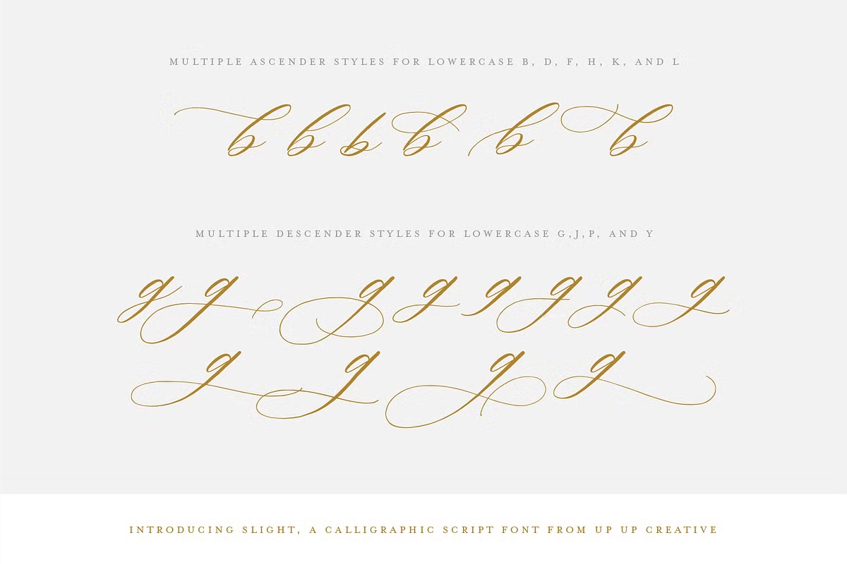
- Ascending and Descending Letter Variants: Fun options for letters that extend above or below the baseline, perfect for creative layout adjustments.
These features make your text look better and also give you a lot of ways to be creative. You can use them easily in programs like Adobe Illustrator, Adobe InDesign, or even Microsoft Word. This means you can focus on making your design great, instead of getting stuck on technical problems.
Use Cases for Slight
Slight is really versatile, which makes it perfect for lots of different uses. Let’s take a look at some of the most popular ways people are using it.
- Invitations: Slight’s elegant style is perfect for wedding, event, and party invitations, adding a touch of sophistication that sets the tone.
- Branding: Use Slight for logos, business cards, and other branding materials to create a memorable and stylish identity.
- Editorial Design: Whether you’re designing magazine covers, articles, or book covers, Slight can add a refined touch to your layouts.
- Social Media Graphics: Create eye-catching graphics and posts that stand out in a crowded feed with Slight’s unique letterforms.
- Print Materials: From brochures to flyers, Slight can enhance any print material with its distinctive, hand-crafted look.
Pairing Suggestions for Slight
To maximize the effectiveness of Slight in your designs, pairing it with complementary fonts is essential. Here are some pairing suggestions:
- Sans Serif Fonts: Pair Slight with a clean sans serif font like Montserrat or Helvetica for a modern and balanced look.
- Serif Fonts: Combining Slight with a serif font such as Playfair Display or Merriweather can evoke a classic feel, making it ideal for formal invitations and high-end branding.
- Minimalist Fonts: For a modern look, try pairing Slight with simple fonts like Lato or Raleway for a sleek and sophisticated design.
When pairing fonts, ensure that they complement each other in weight and style, maintaining harmony throughout your design. Experimenting with different combinations can lead to stunning results.
Licensing and Support
With Slight, you get a pretty sweet deal – all its special features are packed into one font file, which is a great way to save some cash. The license is also really flexible, so you can use it for your own projects or for work with clients.
And if you need to get your hands on all the extra glyphs, you can just ask for a special file after you’ve made your purchase. This makes it a great option for designers who want to try out new things without breaking the bank.
Plus, having everything in one file makes it easy to stay organized and focused on your design work. If you have any questions or need help, just send an email to [email protected]. You can also keep up with what Slight is working on and see what’s coming next by following on Instagram, Facebook, and Pinterest.
Conclusion
Slight is more than just a fancy font – it’s a powerful tool that helps you create amazing designs easily. With all its special features, unique characters, and beautiful style, Slight is perfect for lots of things, like invitations, branding, and more.
When you learn what it can do and try pairing it with other fonts in creative ways, you can really unlock its potential and make your designs stand out. So, try out Slight and see how it can bring your designs to life!
It’s a great way to add some elegance and style to your work, and with a little practice, you can create some really stunning things. Whether you’re working on a big project or just want to add some flair to a small design, Slight is a great choice.
Its unique look and feel make it perfect for adding a touch of sophistication to any design, and its versatility means you can use it in lots of different ways. So why not give Slight a try and see what you can create?