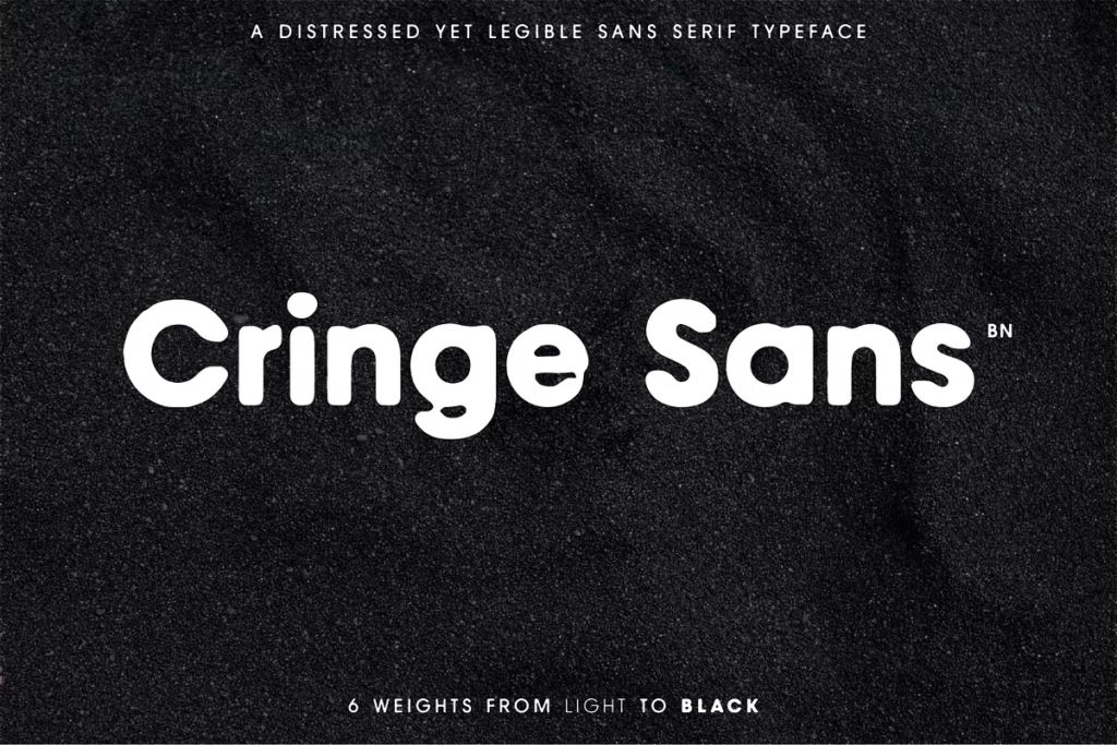
Cringe Sans: Distressed Typeface for Unique Brand Design
Cringe Sans is a really cool font that can add some personality to your designs. It’s not just about looking good, but also about being easy to read, so your message gets across clearly. This font is special because it’s been carefully made to be different, with lots of variations to choose from. If you’re a designer who wants to make an impact, Cringe Sans is a great choice. It’s got everything you need to create something that stands out from the crowd. Whether you’re working on a branding project or just want to add some flair to your designs, this font is a great tool to have. With its unique style and versatility, Cringe Sans can help you create something truly memorable.
Design Style
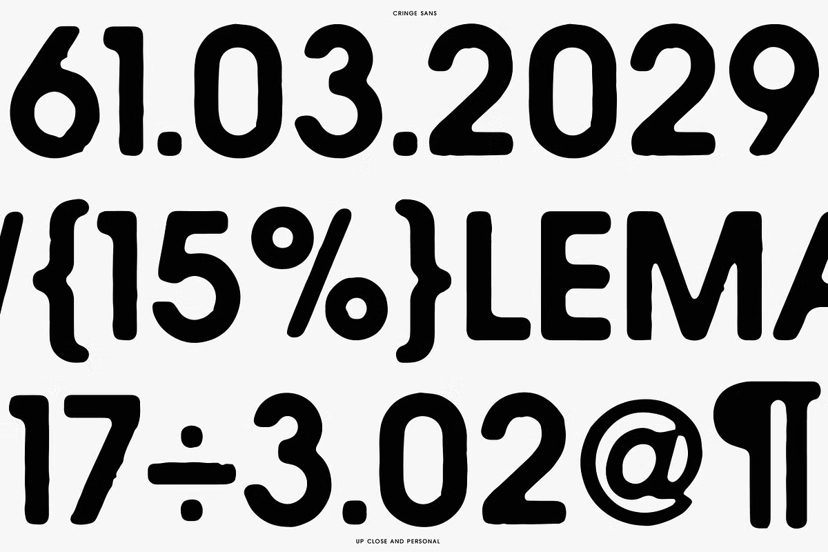
Cringe Sans has a really unique, worn-out look that gives your designs a lot of personality and makes them feel more genuine. What’s cool about this font is that each letter has its own special traits, which means it’s not just something you use to convey a message, but it actually becomes a big part of your brand’s visual style. This font can add a lot of character to your designs, making them stand out and feel more authentic. By using Cringe Sans, you can create a visual identity for your brand that’s really distinctive and memorable.
The distressed style of Cringe Sans is perfect for projects that aim to convey a sense of nostalgia or edginess. Its rugged appearance allows it to fit seamlessly into a variety of contexts, from modern web design to vintage-inspired print media. The careful crafting of each character ensures that this typeface remains readable, even at smaller sizes, making it versatile across different applications.
Character Sets and Features
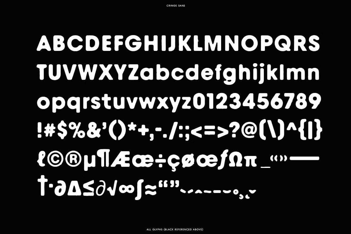
One of the things that really sets Cringe Sans apart is its huge collection of characters. This font has a wide range of characters, including:
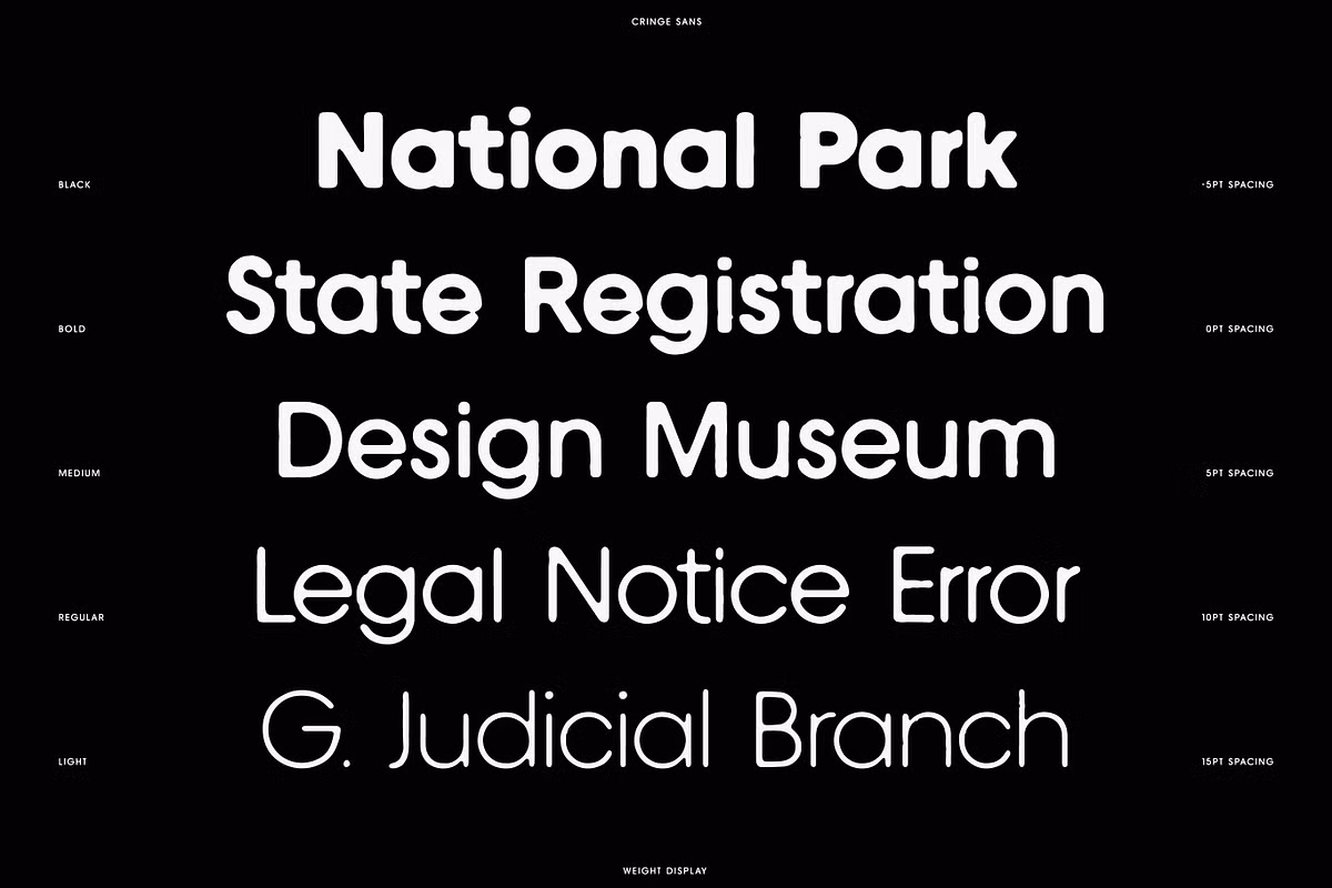
- 5 Weights: Ranging from Thin to Black, offering versatility for various design needs.
- Upper & Lowercase: Complete character sets that allow for flexibility in text styling.
- All Necessary Punctuation & Numerals: Ensuring that all your textual needs are met.
- Accent Marks: Perfect for multilingual projects, accommodating characters from multiple languages.
The careful adjustments to the spacing between letters, which took over 15 hours to complete, make sure that each character looks good next to the others. This improves how easy it is to read the text and makes it look more appealing overall. By paying close attention to how each letter interacts with the ones around it, the design becomes more visually pleasing and effective.
Use Cases for Cringe Sans
Cringe Sans has a special look that makes it easy to read, so it’s great for lots of different uses.
- Branding: Ideal for logos and brand identities that need to stand out with character.
- Posters and Flyers: Perfect for promotional materials that require a bold, eye-catching font.
- Web Design: A great choice for website headers or call-to-action buttons needing a unique flair.
- Merchandise: Works well on t-shirts, hats, and other merchandise where a distressed look can enhance the product’s appeal.
Whether you are designing for a music event, a retro-themed café, or a modern art gallery, Cringe Sans will provide that distinctive touch that makes your project memorable.