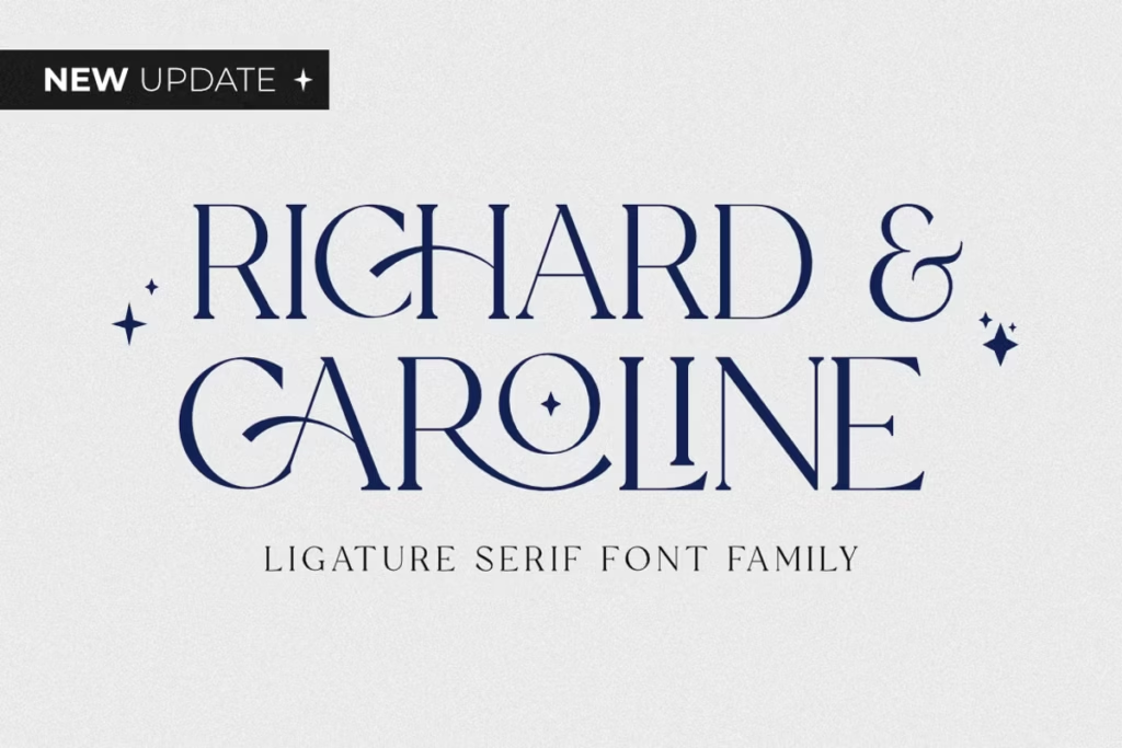
Richard & Caroline Family: Luxurious Serif Font with New Updates
The Richard & Caroline font is a really fancy serif font that mixes old and new styles together. It’s not just a font, it feels luxurious and can make any design project look high-end. What makes it special is that it has lots of extra features like ligatures and alternate characters, which lets designers create visuals that are truly eye-catching. In this article, we’re going to take a closer look at the Richard & Caroline font, talking about its design, the characters it includes, how it can be used, and more. This font is perfect for designers who want to add a touch of elegance to their work.
With its classic feel and modern twist, it’s great for projects that need to look sophisticated. Whether you’re working on a website, a magazine, or a book, the Richard & Caroline font can help you create something that looks really professional. Its unique features, like the ligatures and alternate characters, give designers a lot of flexibility to try out different looks and feels. Overall, the Richard & Caroline font is a great choice for anyone who wants to add a bit of luxury to their design projects.
Design Style of Richard & Caroline
The Richard & Caroline Family has a classic look with serifs, mixing old and new styles. This makes the font look fancy and perfect for things like branding and printing. It’s great for making things look elegant and sophisticated.
This font is really special because it can be used in so many different ways. The serifs, which are the little lines at the ends of the letters, are carefully designed to give it a classy look. That makes it perfect for big projects that need to look fancy, like invitations to weddings, logos for companies, or layouts for expensive magazines. The Richard & Caroline Family of fonts gives you a way to make your designs look elegant and sophisticated, which is just what you need for things like that. It’s a great choice when you want to make a good impression.
Character Sets and Features
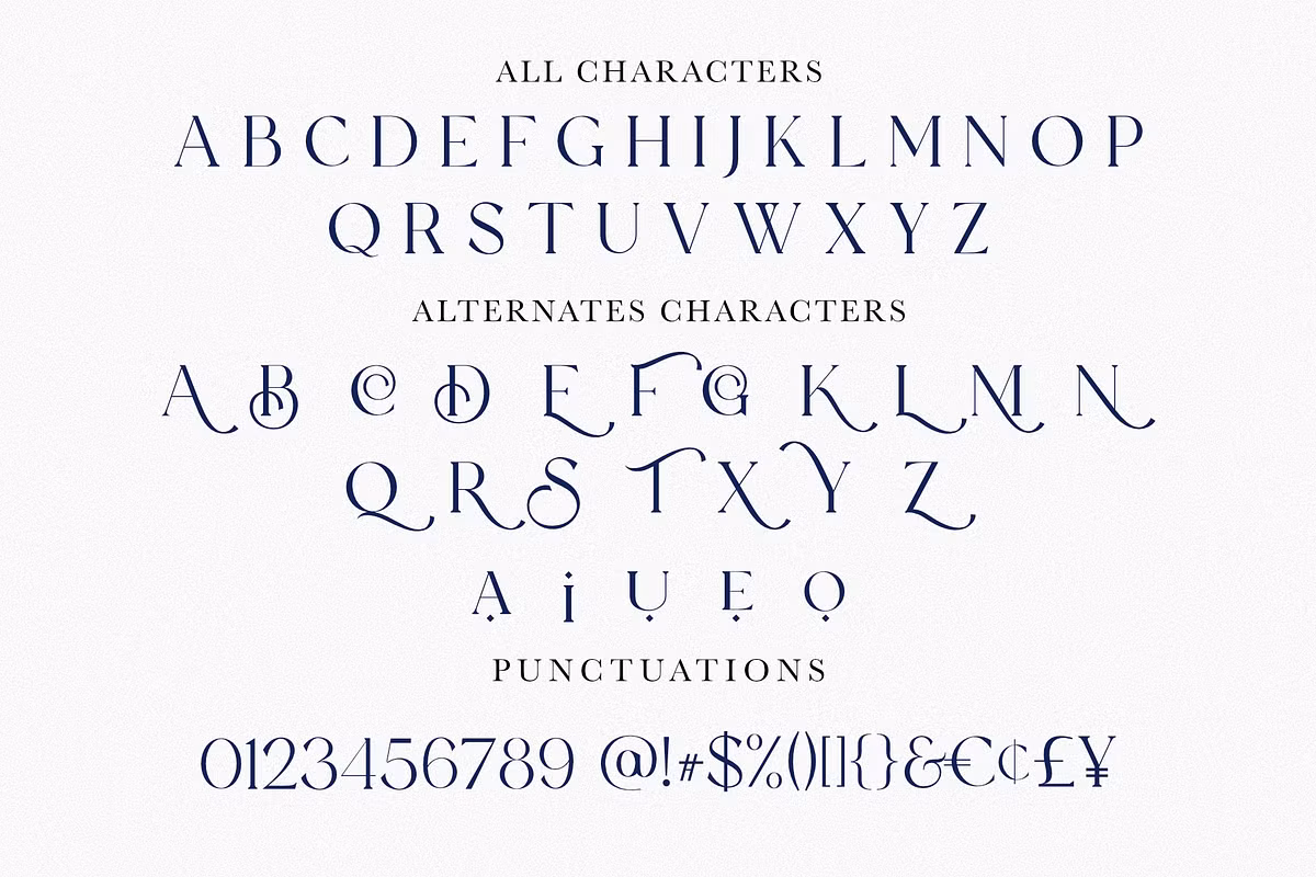
One of the most compelling aspects of the Richard & Caroline Family is its extensive character set. This font includes a variety of ligatures and alternates, which are essential for creating unique and personalized typography. By enabling ‘stylistic alternates’ in software that supports OpenType, designers can access a range of lowercase and uppercase alternate characters, including A, E, U, I, and O.

In addition to ligatures and alternates, Richard & Caroline also supports a total of 75 languages, making it a versatile choice for global projects. This inclusivity ensures that your designs can reach a wider audience without compromising on style or readability.
For those looking to explore all the special characters that Richard & Caroline has to offer, access is provided through the Glyphs panel in programs like Adobe and Affinity Designer. This feature allows for seamless integration of unique typographic elements into your designs.
New Updates in the Richard & Caroline Family
The Richard & Caroline Family just got a whole lot better with some exciting new updates. Now, designers have a lot more choices when it comes to fonts, which is really great. Some of the new updates include a bunch of different weights and styles, like:
- Richard & Caroline Thin (otf, ttf, woff, woff2)
- Richard & Caroline Light (otf, ttf, woff, woff2)
- Richard & Caroline Normal (otf, ttf, woff, woff2)
- Richard & Caroline Extra Light Italic (otf, ttf, woff, woff2)
- Richard & Caroline Light Italic (otf, ttf, woff, woff2)
- Richard & Caroline Normal Italic (otf, ttf, woff, woff2)
Having so many options lets designers pick the perfect style for their work, which makes the whole thing look better and easier to read. With lots of extra connections between letters and different versions of uppercase letters, designers can make their work really stand out and create something truly unique. This gives them the freedom to try out new ideas and make their project look just the way they want it to.
Use Cases for Richard & Caroline Family
The Richard and Caroline family is really good at adapting to different design needs, making it a great choice for many projects. Let’s take a look at some of the most popular ways to use it.
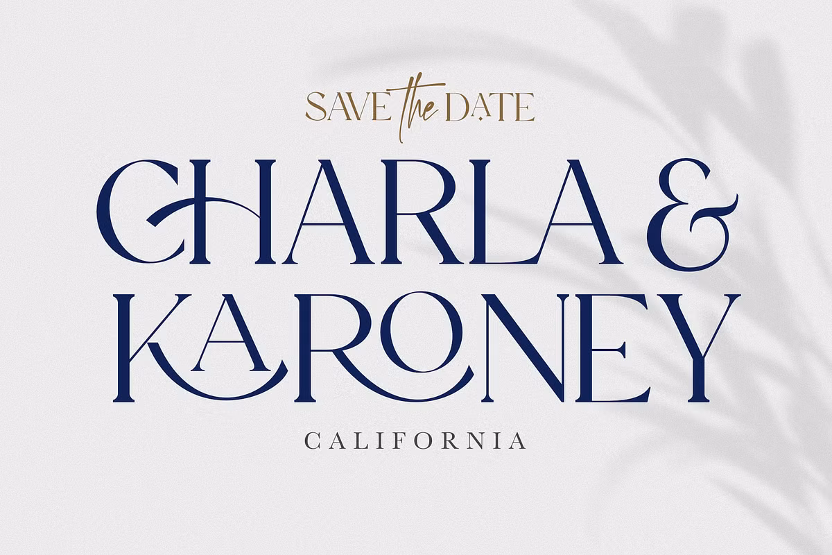
The fancy font of Richard & Caroline is perfect for fancy brands that want to look really classy and elegant. It’s great for brands that want to show they’re high-end and sophisticated.
When it comes to creating stuff like brochures, flyers, or packaging, you want it to look nice and be easy to read. This font is great for that – it adds a touch of class and makes sure people can understand what you’re trying to say.
Web Design: With its variety of weights, Richard & Caroline can be used for headers, body text, and call-to-action buttons, creating a cohesive look across your website.
Invitations and Stationery: The font’s elegant design is perfect for wedding invitations, event programs, and personalized stationery.
Pairing Suggestions
When designing something that looks good, choosing the right fonts is really important. The Richard & Caroline Family is a great font that works well with lots of other fonts, so you can get the balance and contrast you want in your designs. Here are some ideas for fonts that go well with it.
Richard & Caroline with Sans-Serif Fonts: Pairing Richard & Caroline with a clean sans-serif font like Montserrat or Open Sans can create a stunning contrast, emphasizing the elegance of the serif while maintaining readability.
When you want to create a design that’s a bit more romantic or playful, think about pairing Richard & Caroline with a fancy script font, like Great Vibes or Pacifico. This can make your wedding invitations or branding materials feel more personal and special. It’s a great way to add some extra charm and make your design stand out.
When you pair a simple font like Roboto or Lato with Richard & Caroline, it creates a nice balance. The modern look of these fonts complements the classic feel of the serif, making the overall design look great without one overpowering the other. This mix of old and new styles can really make your design stand out.
Licensing and Availability
The Richard & Caroline Family is available in multiple formats, including OTF, TTF, WOFF, and WOFF2, ensuring compatibility with various design software. It is supported in most Adobe and Affinity Designer applications, making it accessible for designers across different platforms.
When you’re getting a license for a font, you need to read the fine print to make sure you can use it for what you need. The Richard & Caroline Family usually has licenses that are pretty flexible, so you can use the font for personal stuff or for your business, and you don’t have to worry about getting in trouble. This way, you can just focus on making your designs look great with the font.
Conclusion
The Richard & Caroline font is really something special – it’s a fancy serif font that brings together old and new styles. It has a huge collection of characters, lots of ligatures, and many different weights, making it perfect for all sorts of design projects. Whether you’re creating a brand, printing materials, or making digital content, Richard & Caroline gives your designs a touch of class and sophistication that helps them stand out.
And with the latest updates, this font family keeps giving designers the tools they need to create amazing typography that people love, no matter where they see it. It’s great for making a lasting impression, and its versatility means it can be used in many different ways. Overall, Richard & Caroline is a fantastic choice for anyone looking to add some elegance to their designs.