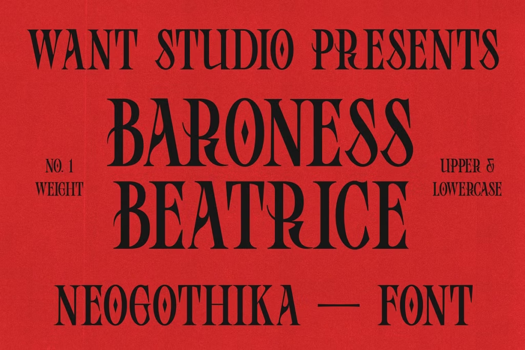
Baroness Beatrice Font: Contemporary Blackletter Design with Elegance
Meet Baroness Beatrice, a beautiful font that combines modern style with the classic look of blackletter design. It’s perfect for designers who want to add a bit of elegance to their work without losing that timeless feel. And the best part? You’ll get free updates, making Baroness Beatrice a great choice for all sorts of projects. Whether you’re working on something new or just want to refresh an old design, this font is sure to bring a touch of sophistication to the table. With its unique blend of old and new, Baroness Beatrice is a versatile option that’s sure to impress.
Design Style
Baroness Beatrice has a classic look that’s similar to old-fashioned blackletter styles, but it’s been updated to work well in modern design. This font has a nice mix of sharp lines and smooth curves, which makes it really stand out and look polished. The combination of these different elements creates a beautiful balance that’s perfect for grabbing people’s attention without being too overwhelming.
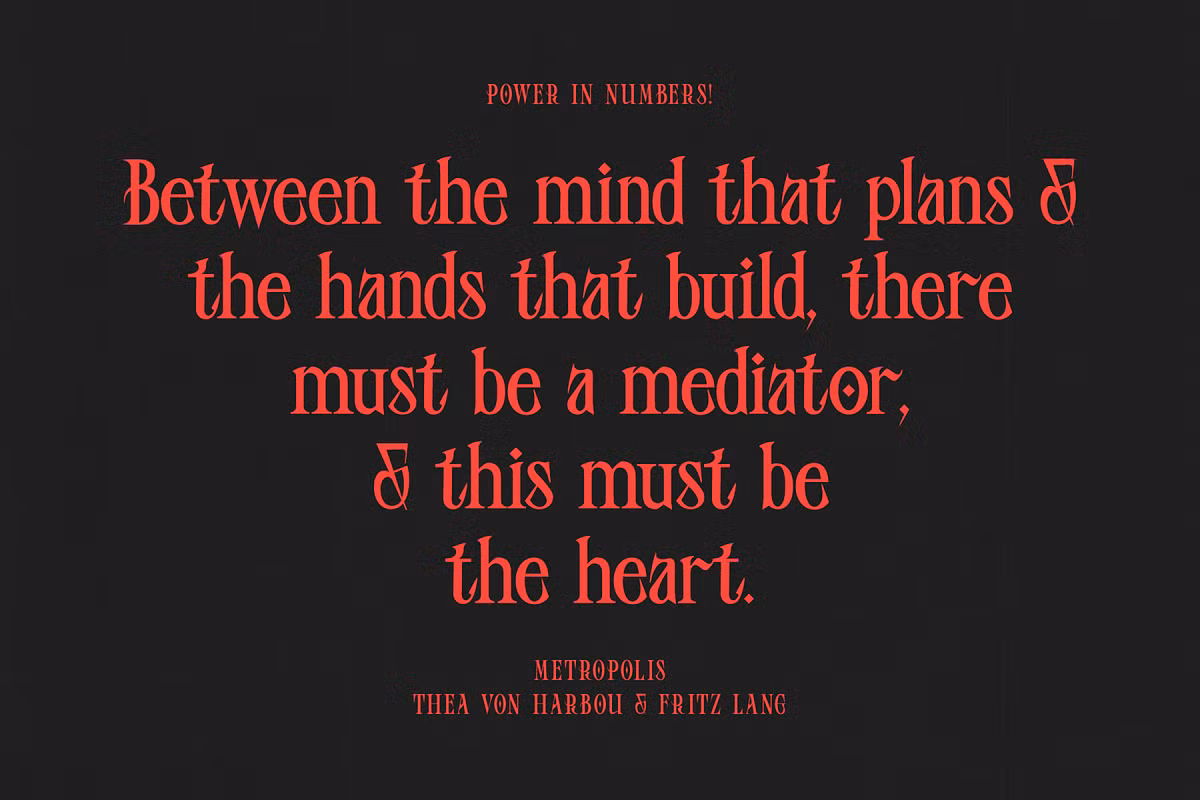
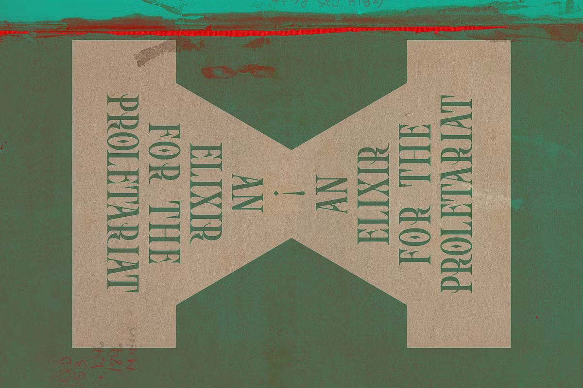
The Baroness Beatrice font is really special and perfect for important projects like luxury brands, magazine designs, and fancy event invites. What makes it stand out is its one-of-a-kind letters and symbols that are still easy to read, even though they look super fancy. It’s like a mix of old and new – it takes inspiration from classic typography, but it’s also versatile enough to work well with modern design styles. This makes it a great choice for anyone who wants to add a touch of elegance to their work.
Character Sets
Baroness Beatrice really stands out with its huge collection of characters. It’s got a massive range of letters, numbers, and symbols, which makes it perfect for lots of different languages and design projects. Whether you’re working on a multilingual website or just need to add some special characters to your text, this font has got you covered. You can easily switch between languages and type away without worrying about missing any characters, which is really convenient. This versatility is one of the things that makes Baroness Beatrice such a great choice for designers and writers who need to work with different languages and styles.
Baroness Beatrice is a great font because it also has special characters and ligatures, which makes it look really nice. This means designers can make their work look amazing and one-of-a-kind, which is perfect for projects like logos or brochures. With Baroness Beatrice, you have a lot of options to choose from, so you can make your ideas look exactly how you want them to.
Use Cases
Baroness Beatrice is a really versatile font that can be used in many different ways. Here are a few examples of where it works really well:
- Branding: Use Baroness Beatrice for logos and branding materials to convey luxury and elegance.
- Editorial Design: This font is perfect for magazines, book covers, and articles that require a sophisticated touch.
- Invitations: Whether for weddings, galas, or other formal events, Baroness Beatrice adds a refined look to invitations and stationery.
- Posters and Flyers: Create eye-catching promotional materials that stand out with the unique characteristics of this font.
- Web Design: Integrate Baroness Beatrice into your website headers or banners to elevate your online presence.
Pairing Suggestions
When you’re looking to pair fonts, Baroness Beatrice gives you a lot of options. To get a design that looks good, here are some suggestions for pairing fonts that work well together.
Baroness Beatrice & Sans-serif Fonts: Pairing it with a clean sans-serif font like Helvetica or Open Sans can create a beautiful contrast, allowing the ornate details of Baroness Beatrice to stand out without overwhelming the viewer.
Using Baroness Beatrice with a traditional serif font, like Times New Roman or Georgia, can really make it stand out. It adds a classic touch and makes the text easy to read. This combination works well because the serif font helps balance out the unique feel of Baroness Beatrice, creating a nice mix of old and new.
Baroness Beatrice & Script Fonts: For a more whimsical touch, try pairing it with a delicate script font. This combination works particularly well for wedding invitations or romantic branding.
Licensing
When you’re thinking about using a font like Baroness Beatrice, you need to know what you can and can’t do with it. Luckily, Baroness Beatrice has pretty flexible rules, so you can use it for personal stuff or to make money, which is really helpful. This way, you don’t have to stress about getting in trouble for using the font in your projects. You can just focus on making your designs look great.
You’ll always get the latest features and improvements with free updates. This means Baroness Beatrice is not just a font, it’s something you can rely on for a long time – a good investment for designers who want to stay up-to-date.
Conclusion
Baroness Beatrice is a really special font that brings together modern style and the classic look of blackletter design. It has a one-of-a-kind set of characters, can be used in many different ways, and comes with thoughtful suggestions for pairing it with other fonts. This makes it a great choice for designers in all kinds of fields. Whether you’re working on a brand, laying out a magazine or newspaper, or designing wedding invitations, Baroness Beatrice adds a level of sophistication and flair that will take your projects to the next level. And with free updates always available, you can be sure that your design tools will always be current and relevant. So why not try out Baroness Beatrice and see how it can elevate your typography today? It’s a great way to add some elegance and style to your work.