Introduction to Causten Font Family
The Causten font family is a beautifully designed set of fonts that combines simplicity and style. It’s a geometric sans serif typeface, which means it’s based on simple shapes like circles and lines. This family of fonts is special because it was created with careful attention to detail, making sure that every part of each letter is perfectly balanced. The result is a font that looks clean, neat, and professional, making it perfect for all sorts of creative projects. Whether you’re designing a website, a book, or a poster, the Causten font family is a great choice because it’s easy to read and looks great. Its simple, yet elegant design makes it versatile and useful for many different types of projects.
Design Style of Causten
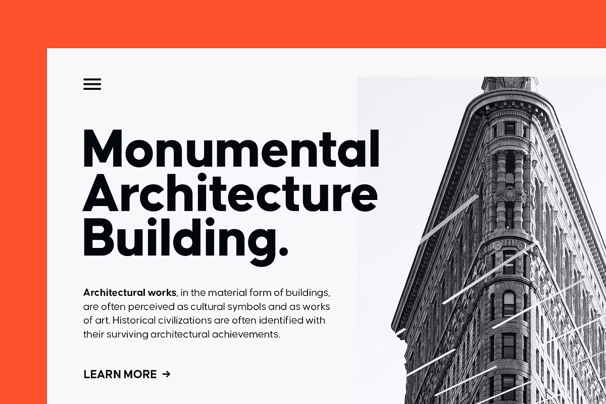
The Causten font family has a simple and modern look. It takes the easy-to-read style of sans serif fonts and adds some geometric shapes to make it special. Each letter is designed to be balanced, so it’s easy on the eyes and gives any design a fresh feel. This balance also makes the font look contemporary, which is great for making things look up-to-date. The combination of simplicity and geometric elements makes Causten a unique font family that’s perfect for adding some personality to your designs.
The Causten font family is really versatile, it comes in nine different weights and has matching oblique styles. This means designers can use it to create all sorts of visual effects, from big headlines to smaller body text, and it’s easy to make things stand out. With so many options, it’s perfect for any design project, whether you’re working on a big campaign or just a simple website. The different weights and styles make it simple to create a hierarchy of information, so your message gets across clearly.
Characteristics of the Typeface
The main things that make the Causten font family special are:
- Shapes are used to create each letter, making sure they all work well together and look good. This way, everything is consistent and balanced.
- The font has a really modern look because of its sharp edges and straight lines. It’s simple, but it looks great. The sharp angles give it a clean feel.
- Logical structure: Every character is crafted with a logical approach, promoting readability and visual appeal.
Character Sets and Glyphs
The Causten font family comes equipped with an extensive character set, making it a versatile choice for multilingual projects. It includes both uppercase and lowercase letters, punctuation, and a variety of symbols that enhance its usability in different contexts.
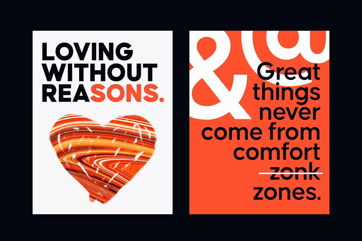
The Causten typeface has a special feature that makes it really interesting – its stylistic sets and ligatures. These are like extra tools that designers can use to make their typography more unique and creative. With these alternative glyphs, you can make your text look super formal or really playful, depending on what you’re going for. It’s all about having the freedom to try out different looks and find the one that works best for your project. This flexibility is what makes the Causten typeface so versatile and fun to work with. Whether you’re designing a fancy invitation or a fun poster, the alternative glyphs can help you achieve the perfect style.
International Characters
When you’re working on a project that needs to reach people all around the world, it’s really helpful to have a font that can handle lots of different languages. The Causten font family is great for this because it has characters from many languages. This is especially good for big brands that want to look the same everywhere, no matter what language they’re using. With Causten, you can be sure that your words will look good and be easy to read, no matter where in the world you are or what language you’re speaking. It’s a simple thing, but it makes a big difference in how professional and put-together your project looks.
Use Cases for Causten
The Causten font family is really versatile, which means it can be used in lots of different ways. Here are some examples of where it works really well:
- Branding: With its modern and clean design, Causten can be used effectively in logo designs and branding materials.
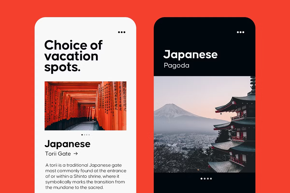
- Web Design: When it comes to websites, Causten is a great pick because it looks good and is easy to read. This means that people can easily read what’s on your site, no matter what device they’re using.
- Print Materials: When it comes to things like brochures and posters, the typeface has many different styles, which makes it really useful for creating interesting and dynamic layouts in printed materials. This means you can use it to make your prints really stand out.
- Editorial Design: Causten works well in magazines and books, providing a contemporary look while maintaining readability.
With its appealing design and versatility, the Causten font family is an excellent choice for any designer looking to enhance their typography.