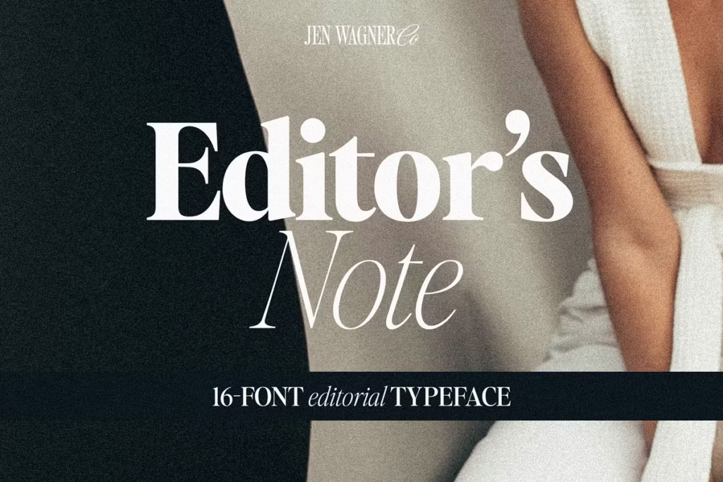
Editor’s Note
Font Editorial Serif: Versatile Typeface for Modern Design
Introduction to Editor’s Note Typeface
The Editor’s Note font is really something special – it’s modern, but also has a classic feel to it. What makes it so great is the way it’s designed, with clean lines and curves that are just right. This font is perfect for all kinds of projects, from big headings to quotes that grab your attention.
And with 16 different fonts to choose from, including regular and italic styles, you’ve got a lot of options. Whether you’re making something for print or for digital, Editor’s Note looks sharp and sophisticated. It’s a great tool for any designer to have, and it can really make your work stand out.
You can use it to create headers that pop, quotes that inspire, or calls to action that get results. Overall, Editor’s Note is a fantastic font that can add a lot of style and flair to your designs.
Design Style of Editor’s Note
The style of Editor’s Note is simple and clean, like the typography you see in magazines and newspapers. It’s a popular look in modern design right now. This font is great because it’s not too fancy, so you can use it for lots of different things.
It has a good mix of big and small letters, which makes your text easy to read and nice to look at. What makes Editor’s Note stand out is the way it spaces out the letters on purpose, which makes the text easy to read and look nice.
This makes it perfect for big signs or titles. The font looks great when used for things like big headings, quotes that grab your attention, and calls to action that really stand out, helping your message get through to the people you’re trying to reach.
Weight Variations
The Editor’s Note family has a lot of different styles to choose from, like Hairline and Bold. This means you can pick the one that works best for what you’re doing. Even though they look a little different, they all have a clean and simple feel to them.
- Hairline: Perfect for subtle, understated designs.
- Regular: A versatile option for most applications.
- Bold: Ideal for making a strong statement in headlines.
Character Sets and Language Support
One of the standout features of Editor’s Note is that it has a really wide range of characters – we’re talking uppercase and lowercase letters, numbers, and all the punctuation you need. This means that no matter what language you’re working with, or what kind of project you’re on, your designs will always look polished and consistent.
So, whether you’re creating a brand identity, designing packaging, or making invitations, Editor’s Note has got all the tools you need to make it look great.
Furthermore, Editor’s Note offers foreign language support, making it a global solution for your typography needs. This inclusivity allows designers to reach a wider audience without sacrificing the beauty and integrity of their designs.
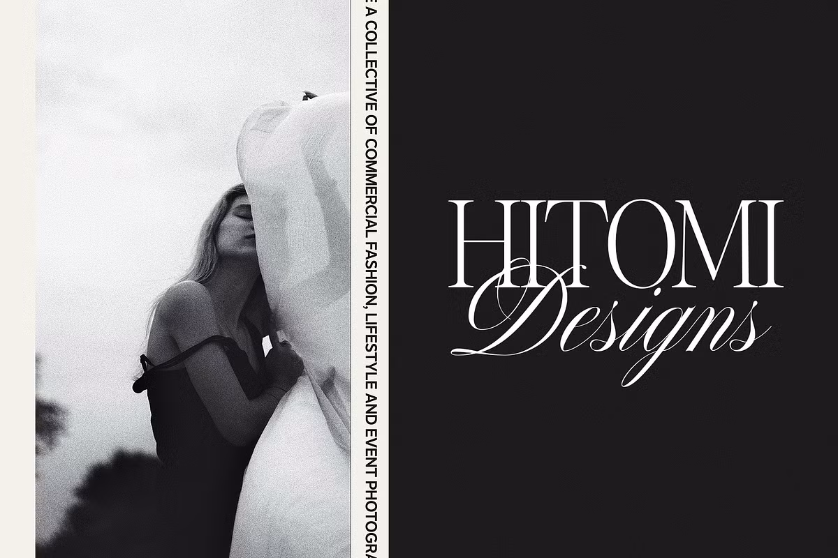
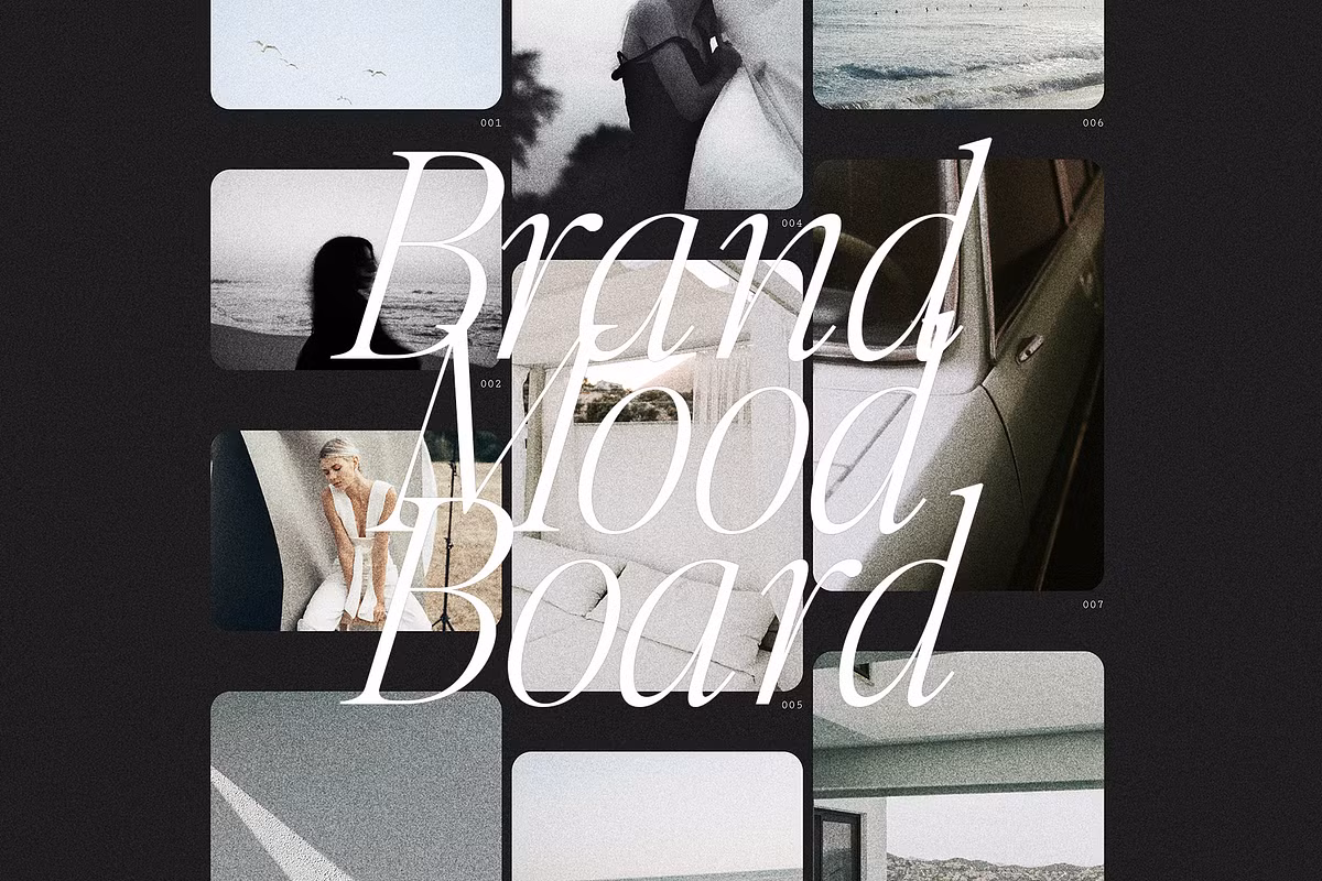
Use Cases for Editor’s Note
When we think about using Editor’s Note in real-life situations, it’s really flexible. Here are some great examples of how you can use this typeface:
- Branding: Use Editor’s Note for logos to create a strong visual identity that resonates with your brand message.
- Editorial Design: Perfect for magazines, newsletters, and other publications that require a clean, modern touch.
- Invitations: Look really great when they’re written in Editor’s Note – it’s a fancy font that adds a bit of class.
- Packaging: This typeface enhances product packaging, giving it a polished and professional appearance.
By utilizing Editor’s Note in these various contexts, you can ensure that your designs stand out and communicate effectively with your audience.
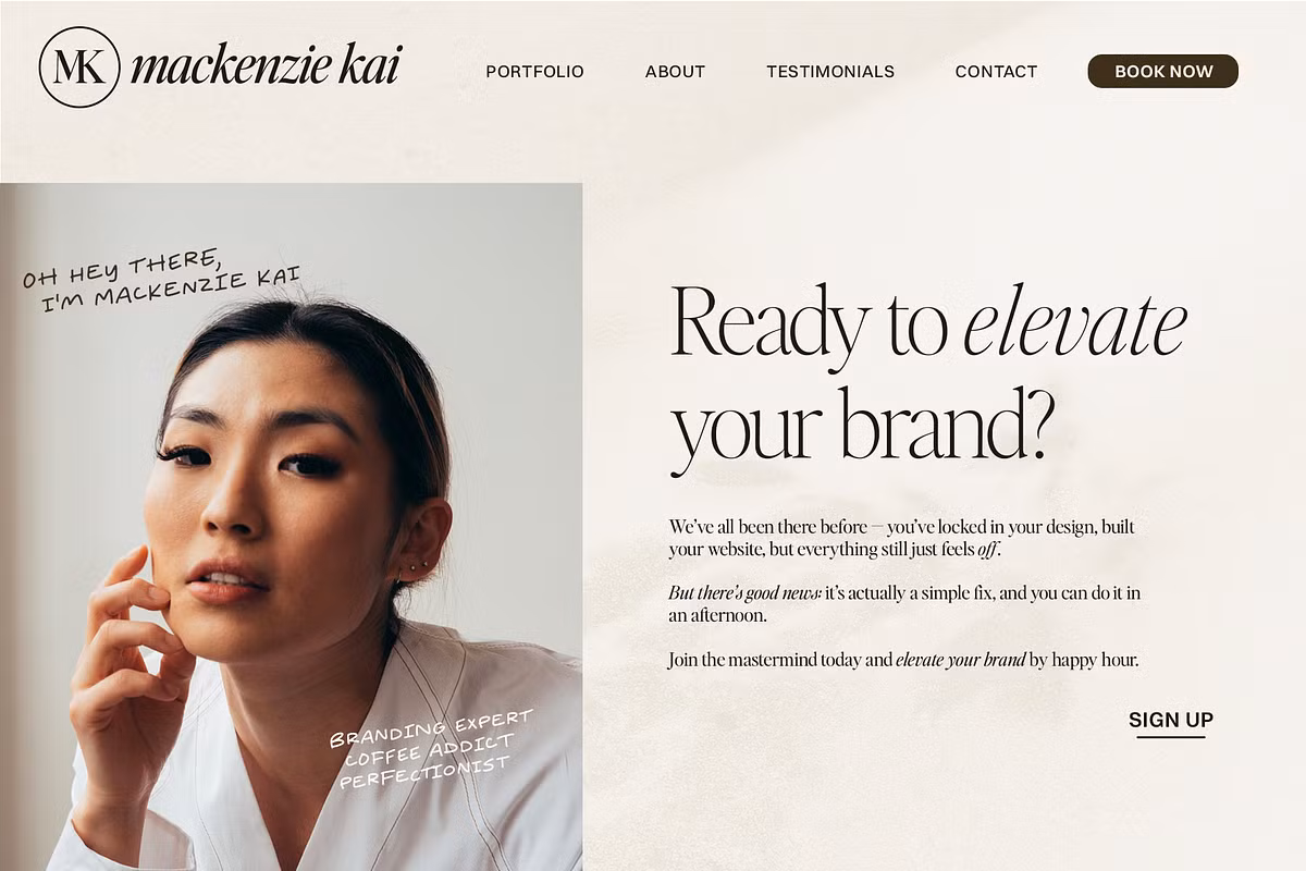
Pairing Suggestions
To take your designs to the next level, think about combining Editor’s Note with other fonts that work well together. We’ve got a few suggestions for font pairings that you might like:
- This font, called Essential Sans, is really nice and simple. It goes well with another font called Editor’s Note, and it makes things easier to read.
- If you want to give your work a more personal feel, try using the Editor’s Hand font. It’s a handwritten font that’s great for things like quotes and notes.
- Nautica has a really nice flow to it, making it a great match for the more formal look of Editor’s Note.
Mixing and matching these typefaces with Editor’s Note can create dynamic visual hierarchies, ensuring your designs are both engaging and effective.
Licensing and Usage Guidelines
When you buy Editor’s Note, you need to know about the different licensing options. The Desktop License lets you use the font for a lot of things, like:
- Logos
- Branding
- Non-editable invitations
- Packaging and products
So, the license has some limits. It doesn’t work for things like apps or websites where people can customize stuff, or when you upload things to a server. If you’ve got a team of designers, you’ll need to get a separate license for each one – the one license won’t cover everyone.
To get the most out of Editor’s Note while keeping your design projects compliant, just follow the licensing rules. This way, you can use it to its full potential without any issues. By doing so, you’ll be able to create amazing things with Editor’s Note, and you won’t have to worry about breaking any rules.
Conclusion
So, what makes the Editor’s Note typeface family so great for designers? Well, for starters, it’s really versatile and comes in a wide range of weights, which means you can use it for all sorts of projects, from branding and packaging to editorial designs.
The design style is also really elegant and clean, making it perfect for creating designs that are both captivating and easy to read.
When you’re working on a project, you want your message to come across clearly and with sophistication, and that’s exactly what Editor’s Note helps you do. By using its character sets and pairing suggestions, you can take your design work to the next level and create visual communication that really resonates with your audience.
Whether you’re looking to make a statement or just want to create something beautiful, Editor’s Note is definitely a powerful tool to have in your toolkit. With its extensive range of features and capabilities, it’s no wonder that designers love using it to create stunning designs that stand out from the crowd.