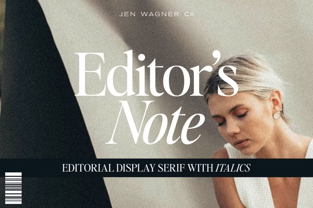
Editor’s Note: Clean Editorial Serif Typeface for Modern Design
Introducing Editor’s Note
Welcome to the world of modern typography, where Editor’s Note is making a mark. This editorial serif typeface is all about simplicity and freshness, giving minimalism a whole new twist. It’s not just a font, but a way to bring a clean and sleek look to your designs. Editor’s Note has a great balance of clean lines and smooth curves, making it really easy to read. This makes it perfect for anyone who wants to take their design projects to the next level. With its modern feel and focus on readability, Editor’s Note is a great choice for designers who want to create something fresh and exciting. Whether you’re working on a big project or just want to try out a new look, Editor’s Note is definitely worth considering. Its unique style and versatility make it a great addition to any design toolkit.
You can use Editor’s Note for lots of different things because it comes with 16 different fonts. It has regular and italic options, which makes it good for things like big headings or fancy quotes. If you’re into design or making brands look cool, you’ll like Editor’s Note. It’s a simple but nice font that works well for modern designs.
Design Style of Editor’s Note
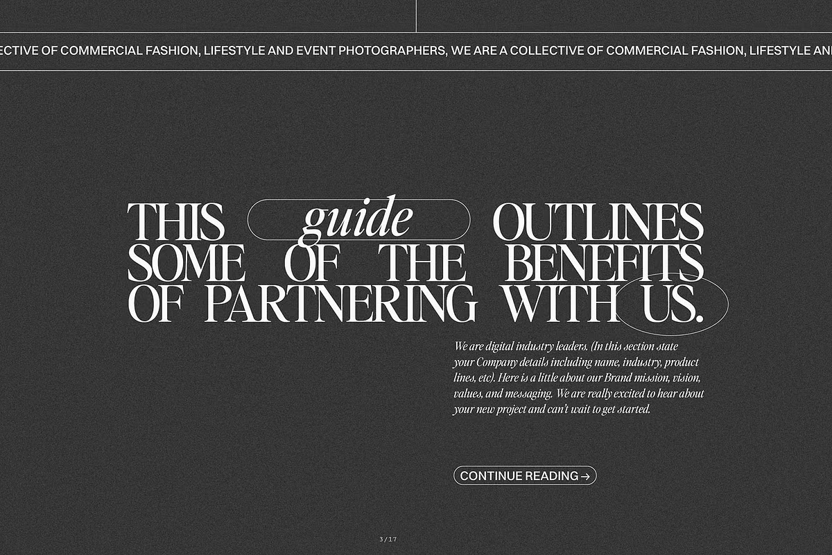
The Editor’s Note design is really something special – it’s all about modern editorial design. The way the uppercase and lowercase letters are made is super clean and neat, which makes it perfect for big headings and quotes that need to stand out. What’s cool about this font is that it’s based on the idea of keeping things simple, so it looks fancy without being too much. This means it’s great for grabbing people’s attention without overwhelming them.

The way the letters are spaced in Editor’s Note is done on purpose, which makes it easier to read and creates a nice flow for the reader. If you’re a designer who likes the modern look of all capital letters, you can try adjusting the space between the letters to get the look you want. Usually, setting it between -20 to -35 does the trick. This gives you the freedom to make the font work perfectly with your design, and you can easily adapt it to fit your needs.
Character Sets and Features
The Editor’s Note font has a wide range of characters, including big and small letters, numbers, and punctuation marks. This means it can be used for many different languages, so your design can be seen by more people without losing its style. It’s great for creating things that need to be read by people who speak different languages.
The font has a simple yet stylish look that works well in both printed and digital materials. You can use it to create magazine pages, invitations, or branding stuff, and it will always look modern and classic at the same time. This makes it a great choice for many different projects, as it can fit in with lots of different styles. The clean lines and nice curves of the font are what make it so versatile and easy to use.
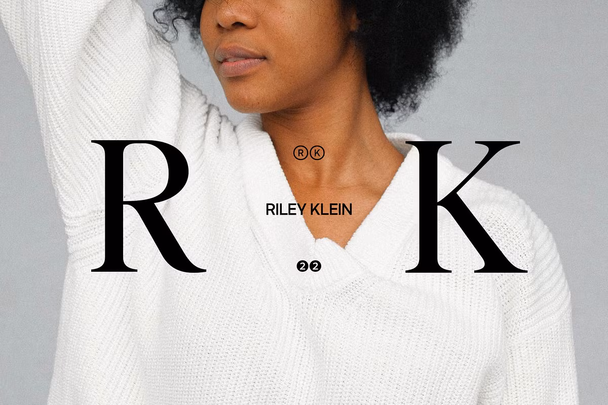
Use Cases for Editor’s Note
- Branding: Use Editor’s Note to create memorable logos or brand identities that stand out in a crowded market.
- Editorial Design: Perfect for magazine layouts, book covers, and other editorial content where readability and style are paramount.
- Invitations: A great place to use this style, it’s simple but still looks really nice, which makes it perfect for when you want to add a bit of sophistication to your invitations.
- Quotes and Calls to Action: When you use this font for quotes or calls to action, it really stands out. The boldness of the font makes these parts of your text eye-catching and memorable, which is great for getting your message across.
Pairing Suggestions
Consider pairing Editor’s Note with other modern sans-serif fonts for a balanced layout. Its unique style allows for various combinations that enhance readability and aesthetic appeal.