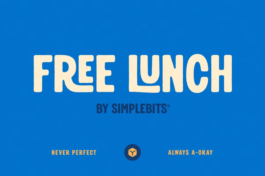
Free Lunch: Playful Vintage Display Font for Headlines and Logos
Free Lunch is a really cool font that looks like it was made for old-school diners and lunch spots. It’s got a fun, playful vibe that’s perfect for adding some personality to your designs. You can use it for headlines, logos, or anything else that needs a bit of nostalgia and charm. The font has a special set of characters and style options that make it stand out, and it’s great for creating a vintage look that feels like it belongs in a classic butcher shop or neighborhood deli.
Whether you’re designing a sign for a lunch counter or just want to add some whimsy to your project, Free Lunch is a great choice. It’s a display font that’s all about capturing the spirit of mid-20th-century dining culture, and it’s sure to bring a smile to people’s faces. So if you’re looking for a font that’s a little bit quirky and a lot of fun, Free Lunch is definitely worth checking out.
Design Style
The Free Lunch design really stands out with its big, bold letters that grab your attention right away. It’s like a blast from the past, inspired by the signs from the 1950s, and it gives you a sense of nostalgia every time you look at it. The letters have soft, rounded edges and aren’t perfectly uniform, which makes them look like they were painted by hand, just like the old signs used to be. This gives the font a unique, homemade feel that’s really appealing.
When you see it, you can’t help but think of a different time, one that was simpler and more charming. The overall effect is a font that’s not only eye-catching but also full of character and personality.
Playful Aesthetics
The Free Lunch font has a really fun feel to it. It’s great for making menus or signs that are playful and catch your eye. Because it’s all in capital letters, each word really stands out, which makes it perfect for headlines that you want people to notice. This font is all about being lively and carefree, so it’s a good choice if you want to add some personality to your design.
Whether you’re making a sign for a store or a menu for a restaurant, Free Lunch can help you create something that’s both fun and inviting. It’s a great way to add some whimsy to your design and make it more engaging.
Two Distinct Styles
When you get Free Lunch, you also get two different styles to choose from: Regular and Rough. The Regular style is great for designs that need to look polished and clean, with smooth edges that give it a sleek feel. On the other hand, the Rough style has a textured look that gives your design a vintage feel.
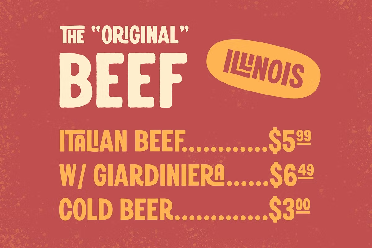
This means designers can pick the style that fits their project best, whether they want it to look refined and fancy or more rustic and gritty. You can use the Regular style for something that needs to look modern and clean, or the Rough style for something that needs a bit of an edge. Either way, you’ve got options, and that’s what makes Free Lunch so versatile.
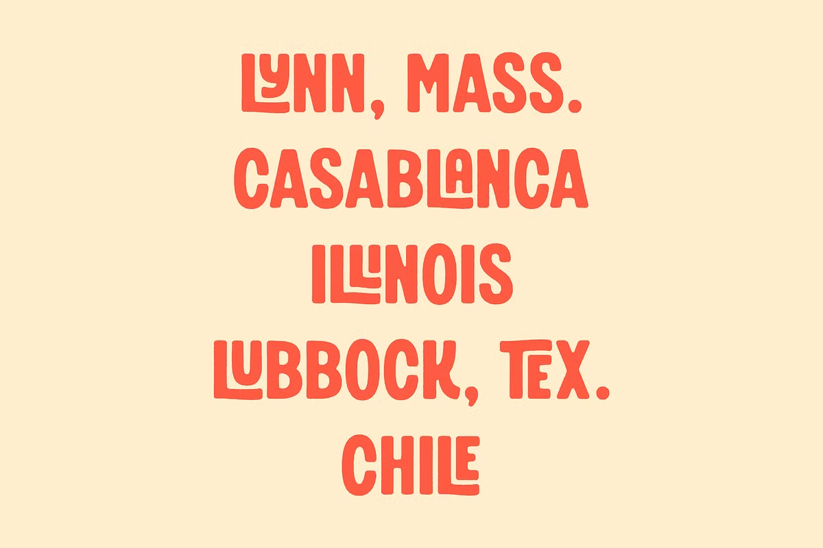
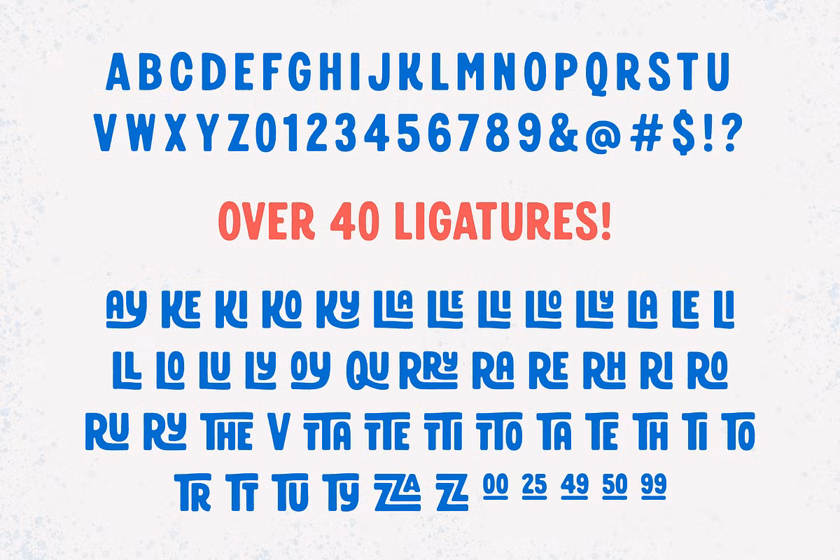
Character Sets
The Free Lunch font is really special because it has a lot of characters to choose from, like big letters, numbers, and basic punctuation marks. But what makes it even more exciting is that it also includes some extra goodies like alternate glyphs and a bunch of ligatures – over 40 of them!
These ligatures are super helpful because they make the text look smooth and connected, kind of like those cute hand-painted signs you see around town. They really add to the overall look and feel of the font, making it more visually appealing and fun to use.
Use Cases
When you think about it, the idea of a free lunch is really useful in a lot of different situations. Here are some examples of when it can be really helpful:
- Restaurant Menus: The playful yet bold style of Free Lunch makes it perfect for restaurant menus, especially those that focus on comfort food or vintage dining experiences.
- Event Flyers: If you’re trying to get the word out about a food festival, a local market, or just a fun community event, you want your flyers to really grab people’s attention.
- Branding for Food Products: If you’re designing labels or logos for artisanal food products, Free Lunch adds a touch of authenticity and charm.
- Packaging Design: The font is also suitable for packaging, especially for products that aim to evoke nostalgia or a handmade quality.
The possibilities are endless, and with a little imagination, you can use Free Lunch to take your designs to the next level.
Pairing Suggestions
To maximize the impact of Free Lunch, consider pairing it with complementary fonts that enhance its vintage charm while providing balance. Here are some pairing suggestions:
- Serif Fonts: Pairing Free Lunch with a classic serif font like Merriweather or Playfair Display can create a beautiful contrast.
- Modern Fonts: For a modern look, pairing Free Lunch with a simple font like Roboto or Open Sans can keep the design feeling new.
- Script Fonts: For a more whimsical look, consider pairing Free Lunch with a casual script font like Pacifico or Great Vibes.
Licensing and Availability
One of the great things about Free Lunch is that you can use it without paying a dime, which makes it perfect for personal projects or commercial work. But, like with any font, you should take a closer look at the licensing agreement to make sure you’re using it correctly.
A lot of free fonts come with some rules, like not being able to share them with others or needing to give credit to the creator, so it’s always a good idea to check the fine print before adding it to your designs. This way, you can avoid any potential issues and use Free Lunch with confidence.
Conclusion
So, Free Lunch is more than just a font – it’s a way to add some excitement to your designs. Its fun and quirky style, with a touch of vintage flair, makes it perfect for all sorts of creative projects, like menus for restaurants or branding for special products.
What really sets it apart is all the extra features it comes with, like different styles, special glyphs, and ligatures, which give you lots of room to get creative. Why not give Free Lunch a try and see how it can inspire your next big design project? It’s a great way to add some personality to your work and make it stand out.