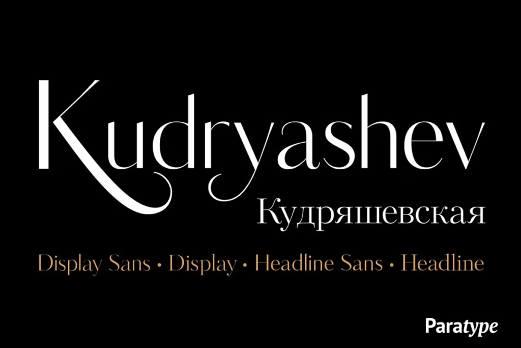
Kudryashev Display: High-Contrast Typeface for Elegant Design
Introduction to Kudryashev Display
The Kudryashev Display typeface is really something special – it’s super light and has a lot of contrast, which makes it stand out. It was actually inspired by another typeface called Kudryashev text. What’s cool about the Kudryashev family is that it includes not just the display version, but also a headline version, and they’ve even thrown in two sans-serif fonts that match the weight and contrast of the others. When you put all these elements together, you get a typeface that’s really versatile and looks great, making it perfect for all sorts of design projects.
Whether you’re working on a big headline or just need some clean, elegant text, Kudryashev’s got you covered. The way the different fonts work together is really nice, and it’s clear that a lot of thought went into creating a typeface that’s both beautiful and practical.
Design Style of Kudryashev Display
The Kudryashev Display has a really elegant feel to it, with lots of carefully thought-out details. It’s especially good when you use it in big sizes, which makes it perfect for grabbing people’s attention. The serif versions, which Olga Umpeleva designed back in 2011, have a classic, sophisticated look. On the other hand, the sans-serif versions, which Isabella Chaeva and Alexandra Korolkova worked on together in 2015, give the whole type family a more modern feel.
This mix of old and new styles makes the Kudryashev Display really versatile and useful for all sorts of design projects. Whether you’re going for a traditional or a contemporary look, this typeface has got you covered. Its high contrast and beautiful lines make it a great choice for anyone who wants to make a statement with their design.
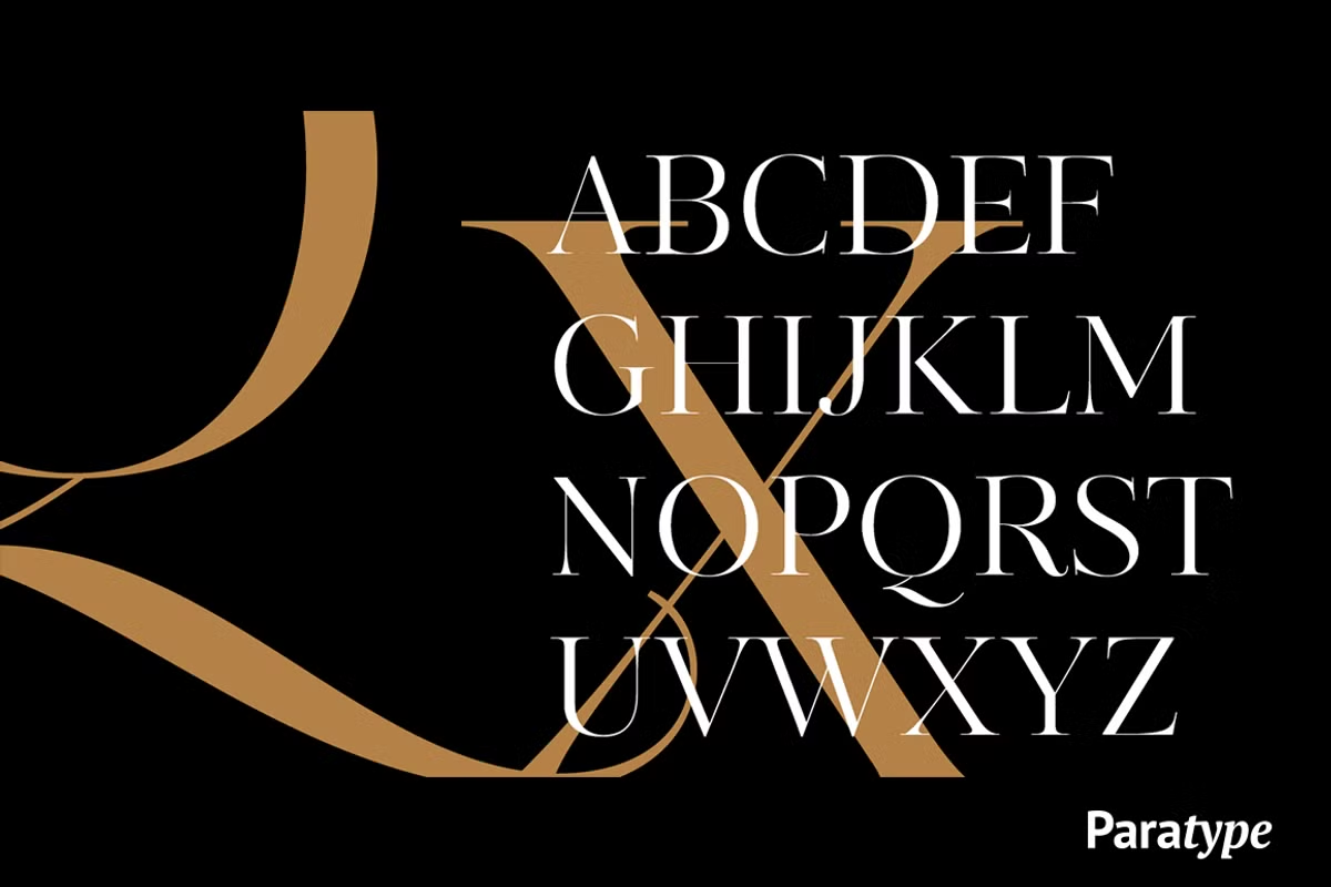
Visual Characteristics
The Kudryashev Display font has a really nice look to it, with sharp lines and letters that are easy to tell apart. The serifs, which are the little lines at the end of the letters, are tapered in a way that looks elegant and refined. This catches your eye and makes the font look polished. What’s also interesting is that the lines that make up the letters are different thicknesses, which creates a sense of energy and visual interest.
This mix of thick and thin lines makes the font look both strong and sophisticated at the same time. Plus, because of this contrast between thick and thin, the text is still easy to read even when it’s really big.
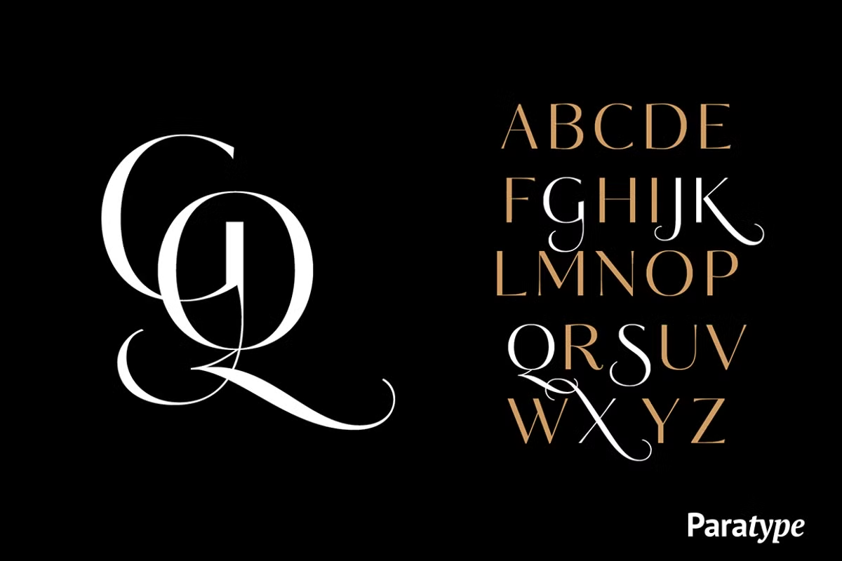
Character Sets and Features
The Kudryashev Display font is really versatile and has a wide range of characters to choose from. You get all the standard Latin letters, numbers, and punctuation marks, which is great for any design project. Plus, it comes with some extra alternate characters that let you customize your typography to fit your needs.
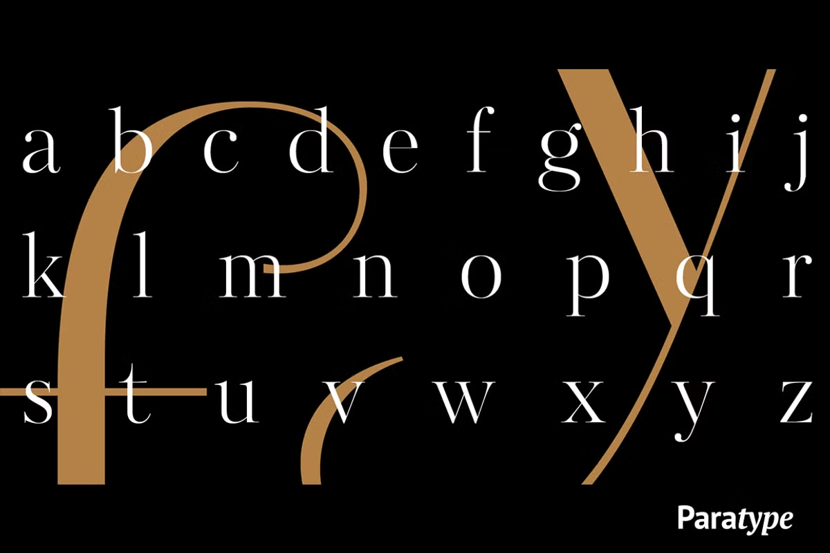
This means you can play around with different looks and feels to find the one that works best for you. With Kudryashev Display, you’ve got the tools to create something unique and eye-catching. Whether you’re working on a big project or just need a font for a small task, this one’s got you covered. It’s all about having the freedom to express yourself and bring your ideas to life.
Use Cases for Kudryashev Display
The Kudryashev Display is really versatile, which means it can be used in lots of different design areas. Let’s take a look at some of the most interesting ways it can be applied:
- Magazine Layouts: Use Kudryashev Display for headlines and subheadings to create a striking visual impact that draws readers in.
- Packaging Design: The typeface’s elegant details make it perfect for product packaging, helping to convey quality and sophistication.
- Branding: Establish a strong visual identity with Kudryashev Display, utilizing its high-contrast features to make your brand stand out.
- Advertising: Capture attention in advertisements with bold statements made possible by the high-contrast nature of this typeface.
When it comes to designing for digital or print, you want a font that’s versatile and easy to read. That’s where Kudryashev Display comes in – it’s a great choice for designers who want to add a touch of elegance to their work.
Pairing Suggestions
When it comes to pairing Kudryashev Display with other typefaces, the key is to balance its high-contrast nature with complementary styles. Here are some effective pairings:
- Kudryashev Sans: Pairing Kudryashev Display with its sans-serif counterpart creates a cohesive look that balances elegance with modernity.
- Open Sans: This font is really easy to read and its simple style looks great with the fancy details of Kudryashev Display.
- Merriweather: For a more traditional approach, this serif font complements the classic elements of Kudryashev Display while ensuring a harmonious design.
Experimenting with these pairings can help you achieve a unique visual hierarchy and enhance the overall aesthetic of your designs.
Conclusion
Kudryashev Display is a sophisticated typeface that marries elegance with functionality. Its high-contrast design, combined with a versatile character set and thoughtful pairing options, makes it an excellent choice for a variety of design applications. Whether you’re working on a magazine layout, packaging design, or branding project, Kudryashev Display offers the aesthetic appeal and clarity needed to make a lasting impression. By leveraging its unique characteristics and thoughtfully considering its use cases, you can elevate your design projects and create visually stunning results.