Lastica: Futuristic Geometric Font with Slim Character Sets
Introduction to Lastica
Lastica is a really cool font that looks like it’s from the future. It’s got super skinny letters that make it stand out. The people who made Lastica wanted it to be modern and work well with lots of different design projects. They focused on making it easy to read and look good, so it’s a great choice for designers who like modern styles. Lastica has a special look that designers and typographers really like, it’s simple but still really stylish.
Design Style of Lastica
Lastica has a really modern look to it, with letters that are sleek and slim. The shapes used to make the letters are geometric, which gives off a feeling of being ahead of the curve and innovative. This makes Lastica a great fit for brands that are all about tech or for digital projects. The letters are made to be precise, so they’re easy to read, but they also have a bit of an artistic touch to them. This balance between being legible and looking good makes Lastica stand out. The futuristic feel of the design is perfect for companies that want to seem cutting-edge and forward-thinking. Overall, Lastica is a great choice for anyone who wants a font that is both modern and stylish.
The way the lines are all the same thickness also helps make the characters look like they belong together, which makes the whole thing look nicer. This means Lastica can be used for big titles or small text and it will still look good, making it easy on the eyes for the person reading it.
When you’re creating something like a poster, a website, or a brand’s image, using Lastica’s modern design can really make your work pop and stand out from the rest. It’s a great way to make a lasting impression in a market that’s already pretty crowded.
Character Sets of Lastica
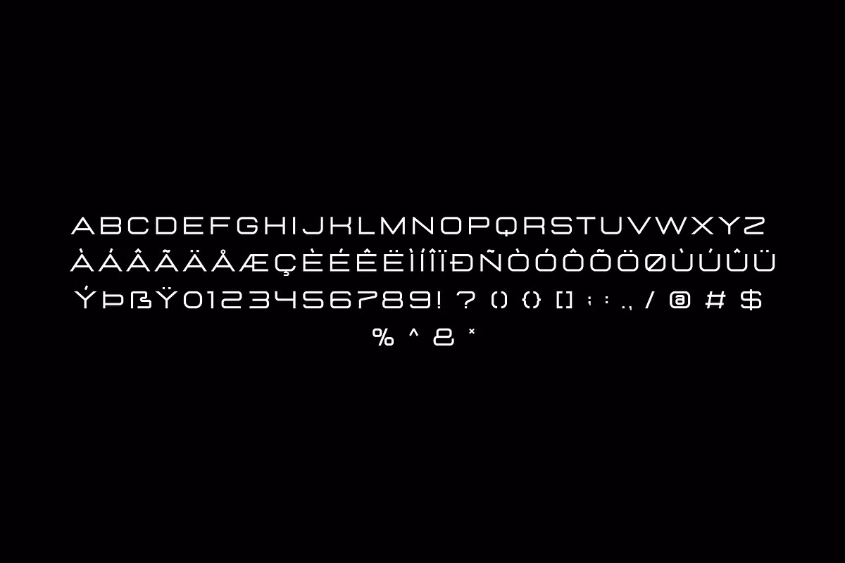
Lastica has a lot of characters to choose from, which makes it really useful for many different projects. It’s got all the basic letters, numbers, and symbols that you need, plus some extra ones like Latin-1 Supplement and Latin Extended-A. This means you can use Lastica for a wide range of things, from simple texts to more complex designs that need special characters. The fact that it supports these extra character sets gives you a lot more flexibility when it comes to typography, which is a big plus. Whether you’re working on a document, a website, or something else entirely, Lastica’s got the characters you need to get the job done.
Lastica makes sure your writing looks good and is easy to read by using basic letters and numbers. This way, your text will always look professional.
- Latin-1 Supplement: This expands the range of characters, allowing for multilingual support and enhanced expression.
- Latin Extended-A: Adding additional letters and diacritics, this feature is particularly useful for designers working with diverse languages.
Lastica is a great pick for brands that need to reach people all around the world, or for any project that needs to show a lot of different texts. This is because it has a really wide range of characters that can be used in many different ways.
Use Cases for Lastica
Lastica is really versatile, so it can work well in lots of different design situations. Let’s take a look at some examples of how Lastica can be useful:
- Branding: Lastica’s modern aesthetic makes it a great choice for tech startups, fashion brands, or any business aiming to project a contemporary image.
- Web Design: Its clean lines and legibility make Lastica suitable for web applications, ensuring that users have a pleasant reading experience.
- Advertising: The bold yet sleek nature of Lastica can capture attention in posters, flyers, and digital ads, making your message stand out.
- Print Media: Whether it’s magazines, brochures, or books, Lastica’s character sets allow for dynamic layouts that engage readers.
Lastica is a great tool because it works well and looks good too, which makes it perfect for lots of different creative projects.
Pairing Suggestions for Lastica
Consider using Lastica in combination with complementary fonts to enhance your design. Pairing it with a serif font can create a beautiful contrast, while using a sans-serif font can maintain a cohesive modern look.