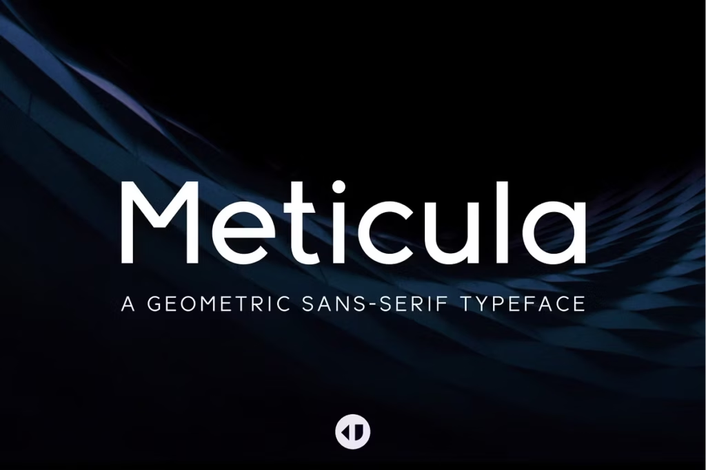
Meticula: Versatile Sans-Serif Typeface for Modern Design
Meticula is a carefully made sans-serif font family with 18 different fonts. It takes ideas from modern design and sans-serif typefaces, making it perfect for many graphic design and typography projects. The simple design and many font styles make it a great choice for designers who want to improve the way they communicate visually. This font family is really versatile, so designers can use it in lots of different ways to make their work look great.
With its clean lines and modern feel, Meticula is a great option for anyone looking to add some style to their designs. Whether you’re working on a big project or just need a font for a small task, Meticula has lots of options to choose from, making it easy to find the perfect fit.
Design Style
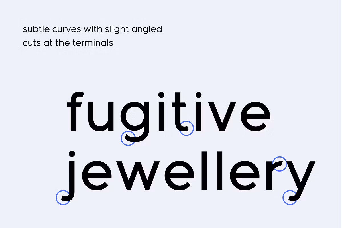
Meticula is a font that really catches your eye with its simple, geometric shapes and clean lines – it’s the perfect example of modern design. What makes this font family so great is its minimalist look, which means it works just as well for big, bold headlines as it does for smaller, more subtle body text. One of the key things that makes Meticula so easy to read is its consistent stroke weight, and this is true whether you’re using it in print or digital formats.
This consistency is what makes it so versatile and legible, no matter where it’s used. Overall, Meticula’s unique blend of style and functionality makes it a great choice for anyone looking for a modern, easy-to-read font. The Meticula font family is made up of carefully crafted fonts that work well together, giving designers the freedom to create a wide range of typographic styles.
Character Sets
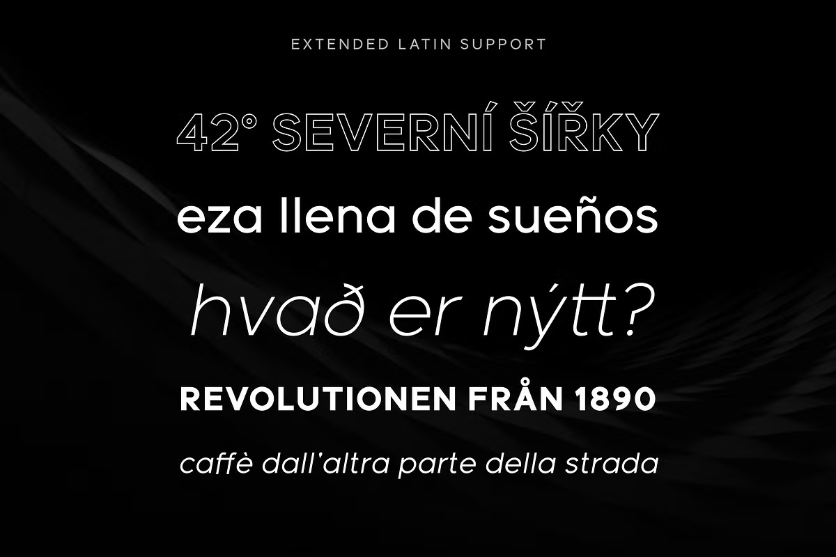
Meticula offers an extensive character set that supports multiple languages, making it suitable for international projects. The font family includes uppercase and lowercase letters, numerals, and a variety of punctuation marks, ensuring that your text can be both comprehensive and visually appealing.
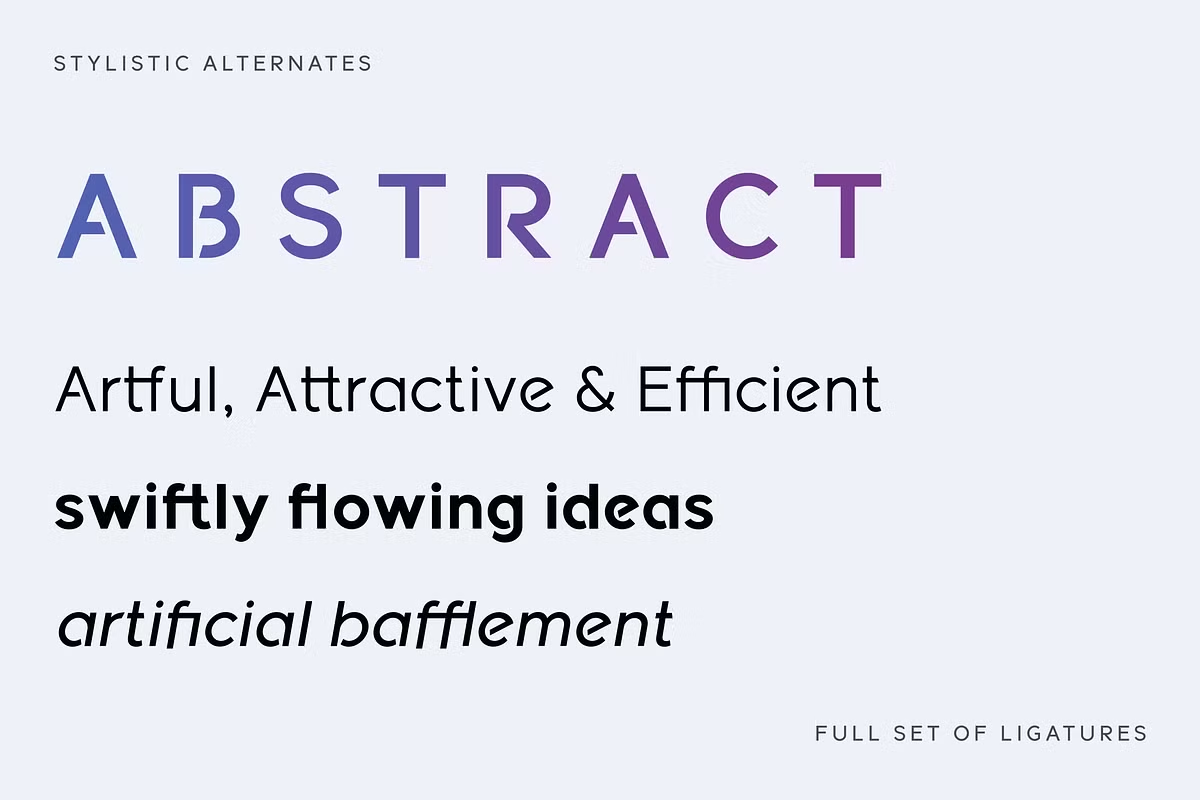
The Meticula family offers a range of weights and styles, which is really useful for designers. They can pick from light, regular, medium, bold, and extra-bold options, giving them the freedom to create a visual hierarchy of information that’s really engaging. This flexibility allows designers to get creative with their typography, making their work more interesting and effective.
Use Cases
Meticula is a versatile typeface that can be effectively used in a multitude of design contexts. Here are some of the prominent use cases:
- Branding and Identity: Meticula’s clean and modern aesthetic makes it ideal for branding projects, helping to establish a professional image for companies across various industries.
- Web Design: The font’s legibility in smaller sizes makes it suitable for web applications, ensuring that your website remains user-friendly while maintaining a modern look.
- Print Media: Whether for brochures, business cards, or posters, Meticula provides the versatility needed to create striking layouts that draw attention.
- Editorial Design: With its range of weights, Meticula is perfect for magazines and books, where it can be used for both headlines and body text alike.
These examples show how Meticula stands out for its ability to keep things clear and simple, while also looking modern and stylish, which makes it a great tool for designers to have. It’s really good at balancing clarity with a contemporary design look, making it a top choice for designers who want to create something that’s both easy to understand and visually appealing.
Pairing Suggestions
When it comes to typography, pairing fonts effectively can elevate your design to new heights. For Meticula, consider the following pairing suggestions:
- Meticula + Serif Font: Pairing Meticula with a serif font like Merriweather can create a beautiful contrast between modern and traditional styles, making it great for editorial layouts.
- Meticula + Handwritten Script: To give your design a personal feel, try pairing Meticula with a handwritten script font, such as Pacifico.
- Meticula + Monospace Font: For a tech-inspired look, you can pair Meticula with a monospace font, such as Courier New, to create a sense of innovation and modernity.
These pairing suggestions demonstrate how Meticula can complement other typefaces, thereby enhancing your overall design. Experimenting with different combinations can lead to exciting and unique typographic solutions.
Licensing
Understanding the licensing of Meticula is crucial for designers who wish to incorporate it into their projects. The font family typically offers a range of licensing options, catering to different needs—from personal projects to commercial use.
Before utilizing Meticula in your designs, it’s essential to review the licensing agreement to ensure compliance with the terms. Many font foundries provide licenses that allow for usage in various formats, including web, print, and mobile applications.
By securing the appropriate license, you not only respect the rights of the font creators but also ensure that your use of Meticula remains legal and ethical, allowing you to focus on your creative process without worry.