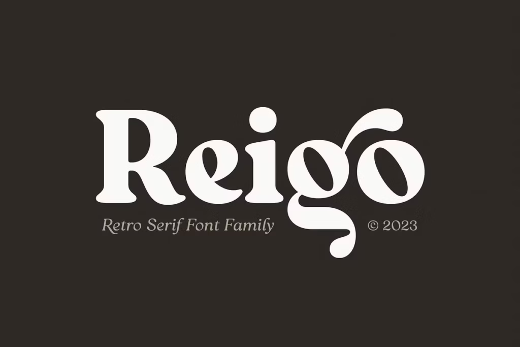
Reigo Complete Family: Versatile Serif Font for Creative Typography
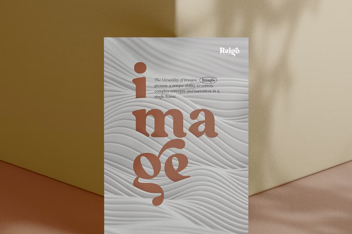
The Reigo complete family is a really nice serif font that catches your eye. It has smooth curves and fancy lines that give off a cozy, warm, and classy feel, making it perfect for lots of different projects. This font is super versatile and has lots of different styles and features, which lets designers and typographers create messages that really grab people’s attention. Whether you’re working on a big project or just something small, Reigo is a great choice because it’s easy to read and looks really good. It’s like a warm hug for your words, making them feel welcoming and friendly.
With all its different styles, you can use Reigo to create everything from fancy titles to simple text, and it will always look great. So, if you want a font that’s both stylish and easy to use, Reigo is a great option.
Design Style
The Reigo font has a special look that combines old and new styles. Its letters have soft curves, which makes the font feel friendly and easy to read. This mix of soft and fancy elements makes Reigo a great choice for many different design projects. It can fit in nicely with lots of different styles, making it a versatile font.
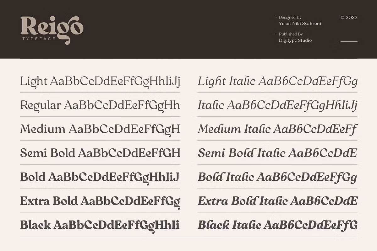
The way the letters flow together is smooth and natural, like a curve. This makes Reigo feel approachable and nice to look at. Overall, Reigo is a great font for designers who want something that is both classic and modern. Reigo is a pretty cool font with 7 upright styles and 7 italics to match, which makes it really versatile for designing stuff.

Character Sets and OpenType Features
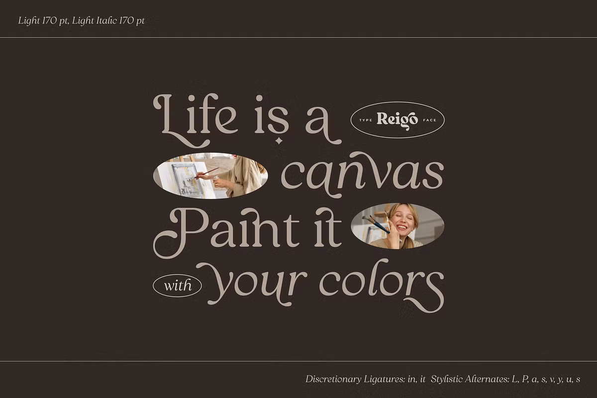
The Reigo font family has a lot to offer, especially when it comes to its characters. It’s not just about the usual letters, but also about all the extra symbols and marks that make writing more interesting. With Reigo, you get a whole range of glyphs that go beyond the standard alphabet, including special characters, numbers, and punctuation marks.
This makes it a great choice for people who want to add some flair to their writing, whether it’s for a formal document or a creative project. The designers of Reigo clearly thought about how people would use the font, and they included everything you might need to make your text look great.
Use Cases for Reigo
The versatility of the Reigo font makes it suitable for a wide range of applications. Here are a few examples of how you can use Reigo in your projects:
- Branding and Logo Design: The elegant and warm characteristics of Reigo make it an excellent choice for brand identities that aim to convey trust and sophistication.
- Reigo can make magazines, books, and newsletters look better and easier to read, which helps keep people interested in what they’re reading.
- Reigo’s letters are easy to read and look good on websites. They make it simple for people to understand what they’re reading and have a good time doing it.
- Invitations and Stationery: The soft curves of Reigo are perfect for personal projects like wedding invitations, business cards, and other stationery designs, adding a touch of elegance.
Pairing Suggestions
To maximize the impact of your designs using the Reigo font family, consider pairing it with complementary typefaces. Here are some suggestions:
- When you’re looking to create a modern contrast, try pairing Reigo with simple fonts like Helvetica or Open Sans.
- Script Fonts: For projects that require a touch of whimsy or romance, pairing Reigo with a script font like Great Vibes can create a beautiful and harmonious design.
- Display Fonts: Combine Reigo with bold display fonts for headings to create a striking visual hierarchy that draws attention while maintaining readability.
Licensing and Availability
The Reigo font family is really easy to use, thanks to a simple licensing agreement. This means designers and businesses can use it in their projects without a lot of hassle. The license usually lets you use the font for both personal and commercial things, so you can use it in lots of different ways without having to worry about extra costs or rules.
When you buy Reigo, you get all 14 styles – 7 that are upright and 7 that are italic. You also get lots of extra features that come with OpenType. This means you have everything you need to make your writing look amazing, without having to sacrifice quality or flexibility.
If you need help with the font or how to use it, don’t worry, our support team is here to help you get the best out of Reigo. They’ll answer any questions you have, so you can enjoy using it without any problems.
Conclusion
The Reigo family of fonts is really something special. It’s a serif font that’s both elegant and versatile, making it a must-have for anyone who creates things. The curves are smooth, it’s got a lot of characters, and it’s got some advanced features that make it really powerful.
Reigo is great for people who work on brands, design magazines or newspapers, or just want to make something personal. It’s flexible and creative, so you can use it to make your ideas look amazing. With Reigo, you can try out lots of different things and take your typography to the next level. It’s a great tool to have in your toolbox, and it can help you make some really beautiful things.