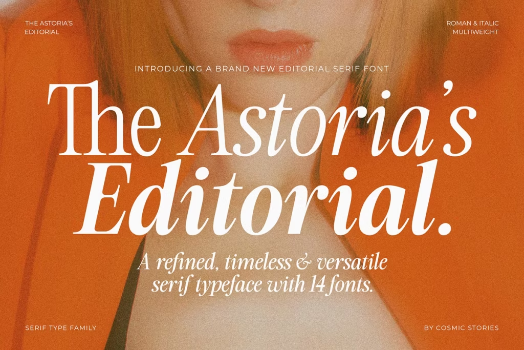
The Astoria’s Editorial Serif: Versatile Typeface Blending Retro and Modern Styles
Meet The Astoria’s Editorial Serif, a truly versatile editorial typeface that effortlessly blends retro charm with a modern touch. This typeface carries the elegance of advertisement typography with a bold retro soul, making it a standout choice for designers and creatives alike.
Design Style
The Astoria’s Editorial Serif is a one-of-a-kind mix of old and new styles. It takes ideas from classic publishing and vintage signs, and combines them with a modern twist. The letters are carefully designed to create a warm and elegant look that works well in many different design projects. What makes this typeface special is how it blends old-fashioned charm with a fresh, contemporary feel – it really makes a statement on the page, whether you’re reading it in a book or on a screen.
This font has classic details that give it a traditional feel, but it’s still easy to read. It works well for both big headings and small text, making it a great choice for any project that wants to look classy and timeless.
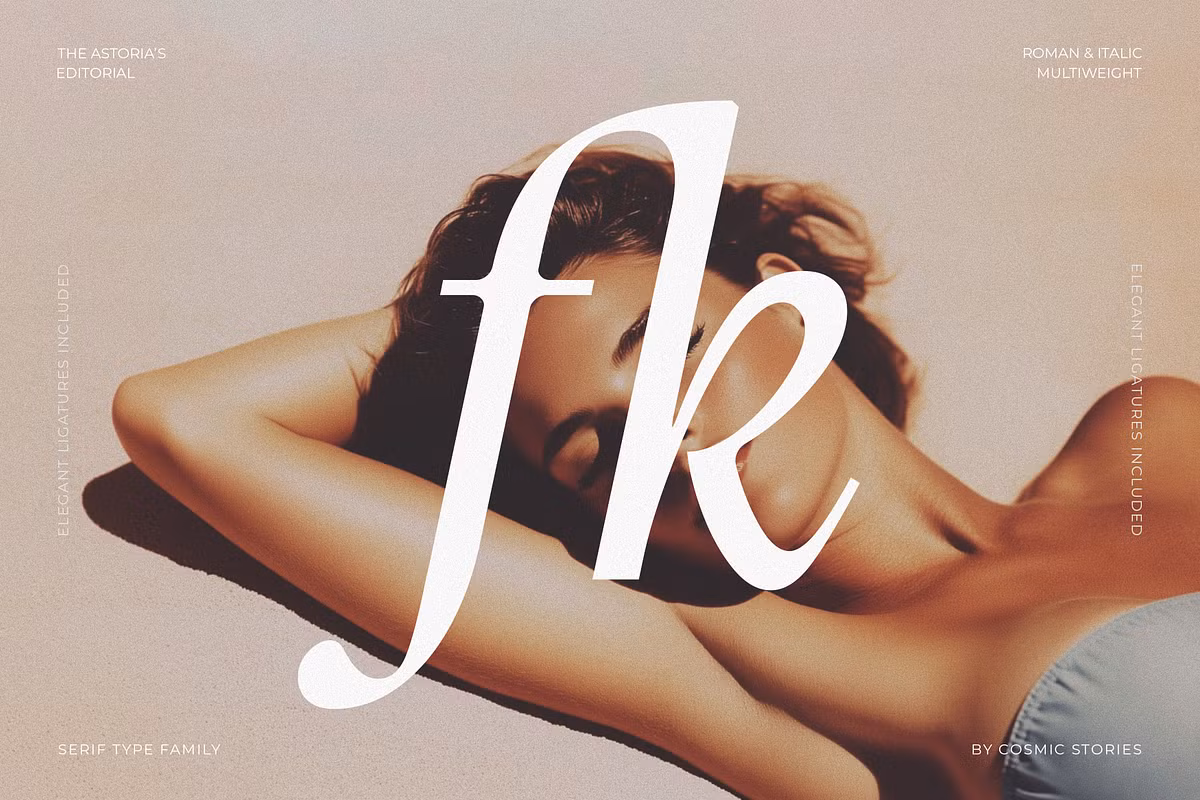
Character Sets and Features
The Astoria’s Editorial Serif has a lot to offer with its 14 different styles. It includes 7 carefully made weights, each with its own italic version. This gives designers a wide range of options to pick the perfect weight for their project, making it easy to create a design that looks great and flows well.
The Astoria’s Editorial also has some special features that make text look really nice. It has something called refined ligatures, which help the words flow together smoothly. This makes the text look polished and professional. The font comes in lots of different formats, like OTF, TTF, WOFF, and WOFF2, so it works with most design programs and websites. Plus, it supports many languages, which is great for people who speak different languages and want to use the font. This means that people all around the world can use The Astoria’s Editorial, and it will still look good and be easy to read.
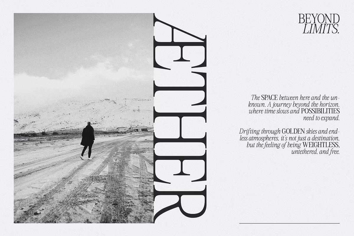
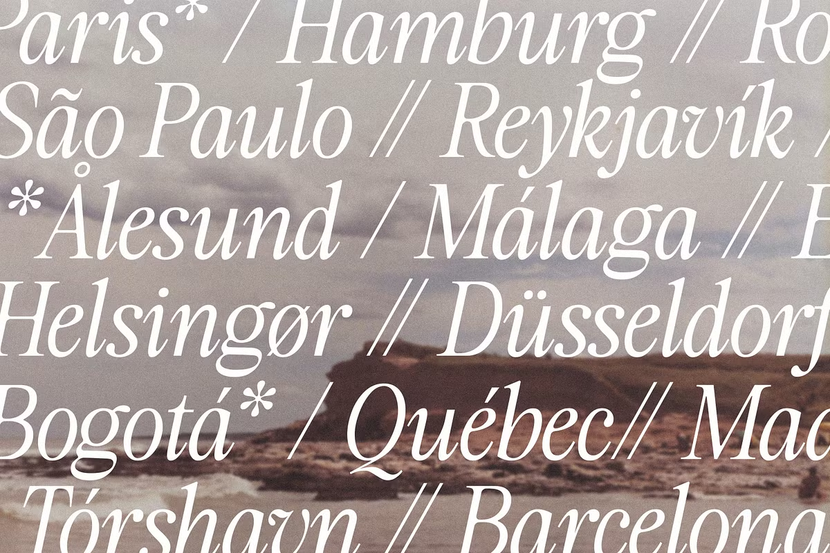
Use Cases
The Astoria’s Editorial is really versatile, which makes it super useful for lots of different design projects. Let’s take a look at some of the most interesting ways it can be used.
- Editorial Layouts: The typeface is ideal for magazine spreads, newspapers, and other editorial designs where clarity and style are paramount.
- Branding: The Astoria’s Editorial can help bring out a brand’s personality, whether it’s a classic look or a modern feel. They can create a logo that feels timeless or one that’s fresh and new. Either way, their goal is to make sure the brand’s identity shines through.
- Luxury Packaging: For high-end products, a fancy look is a must. This type of font has nice curves and a strong presence, making it perfect for luxury packaging. It gives the product a fancy feel that catches the eye. The elegant design of the font makes the packaging look expensive and special, which is just what you want for a luxury product.
- Expressive Headlines: Its impactful design makes The Astoria’s Editorial perfect for headlines that need to grab attention and leave a lasting impression.
Pairing Suggestions
Consider pairing The Astoria’s Editorial Serif with a sans-serif typeface for a balanced contrast in your design. The combination of its elegant curves with a clean, modern font can create stunning visual interest.