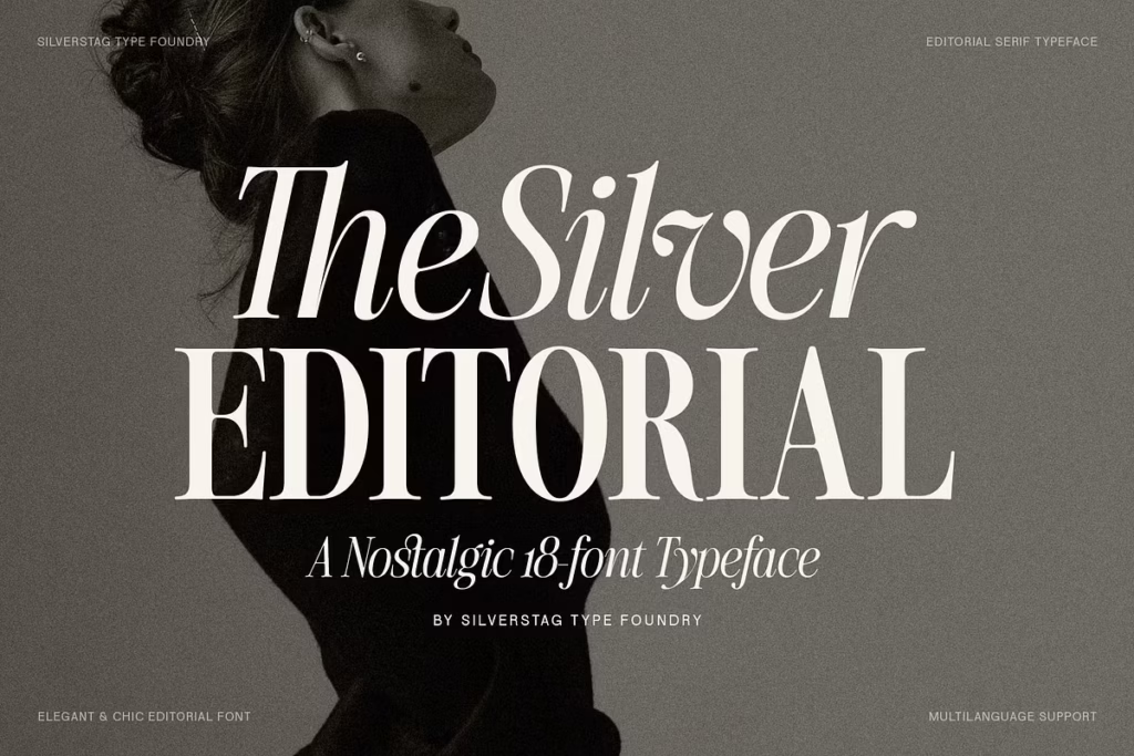
The Silver Editorial: A Nostalgic Typeface Reimagined
The Silver Editorial is a classic font set that gives a vintage feel to modern text. It’s a serif font that’s been updated and expanded from a popular original, now with 18 different fonts to choose from. This includes 9 different weights, each with its own italic version. The Silver Editorial is perfect for designers who want their work to look beautiful and professional. It’s a great choice for anyone who needs a font that’s both stylish and versatile. With its wide range of weights and styles, The Silver Editorial can be used for everything from fancy titles to everyday text. It’s a refined and elegant font that’s sure to add a touch of sophistication to any project. Whether you’re working on a magazine, a book, or a website, The Silver Editorial is a great option for anyone who wants their text to look its best.
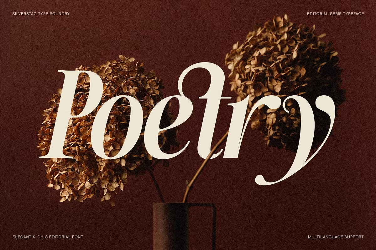
Design Style of The Silver Editorial
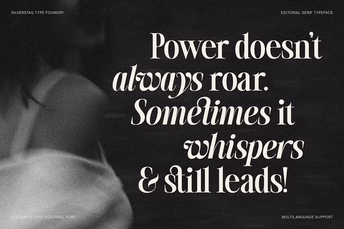
The Silver Editorial has a unique design style that’s really charming. It’s inspired by classic typefaces from the 80s, which gives it a nostalgic feel, but it still looks modern. The serifs are bold and expressive, like you’d see in old high-fashion magazines, but they’ve been updated to look sharper and cleaner, making them perfect for digital use. This mix of old and new styles is what makes The Silver Editorial so special. It’s a great example of how a vintage look can be reimagined for the present day. The result is a typeface that’s both elegant and contemporary, making it ideal for a wide range of uses. Overall, The Silver Editorial’s design style is a big part of its appeal, and it’s what sets it apart from other typefaces.
The Silver Editorial has been carefully designed to keep the cool and confident feel of its earlier versions, while getting rid of anything extra that might make it look outdated. Its clean lines and beautifully shaped forms are meant to make you trust it and want to look at it, which makes it great for lots of different uses.
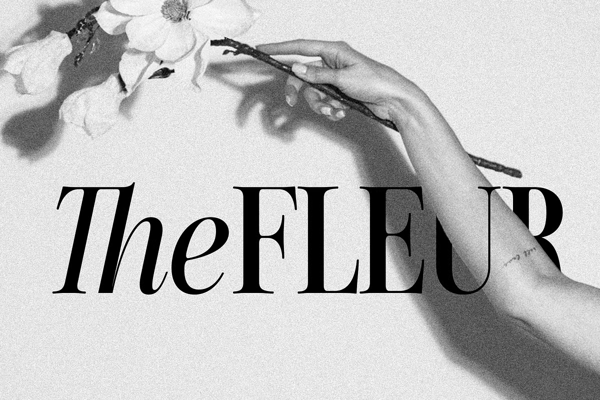
The Art of Serifs
The letters in The Silver Editorial have extra bits at the ends, called serifs, which aren’t just for show – they’re a key part of what makes this font special. Every single one of these serifs has been carefully thought out to make sure they’re not too fancy, but still interesting, so the font is easy to read, even in big headings. This mix of style and readability means The Silver Editorial can grab your attention in titles, but still be clear and easy to understand in the main body of text. The slanted letters, or italics, are especially nice, adding a touch of excitement and elegance to any design they’re used in, making the whole thing feel more dynamic.
Character Sets and Language Support
The Silver Editorial really stands out with its huge range of characters. It supports more than 100 languages, which means designers can create messages that people all around the world can understand. If you’re making books or magazines that need to be in multiple languages, or if you want to reach people everywhere, The Silver Editorial helps you get your message across clearly. This font is great for designers who want to communicate with a global audience, and it’s easy to use, no matter where your audience is from. With The Silver Editorial, you can make sure your message is heard, no matter what language your audience speaks.
The versatility of the character set allows for creative expression across different languages and scripts. This consideration makes The Silver Editorial an essential tool for designers who value inclusivity and accessibility in their work.
Use Cases for The Silver Editorial
The Silver Editorial shines in various design scenarios. Here are some of the primary use cases where this typeface truly excels:
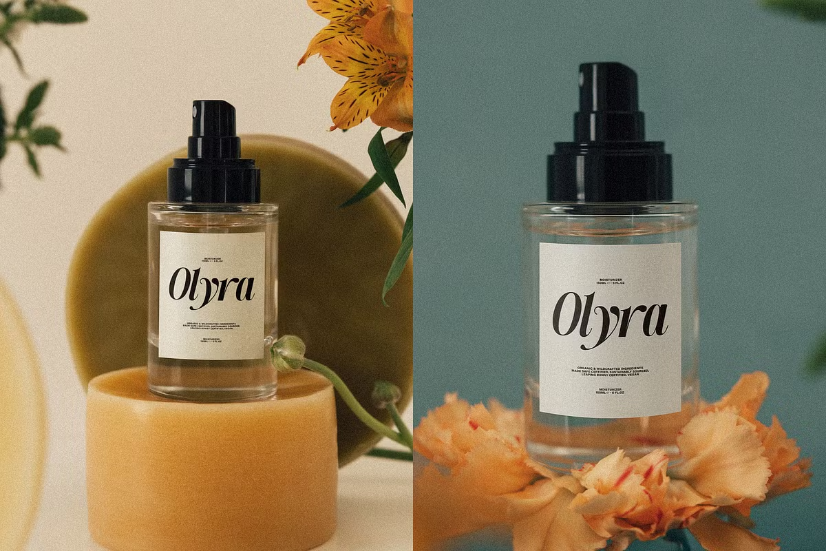
- Luxury Branding: The Silver Editorial gives a classic and sophisticated look to high-end skincare lines and artisanal products, making them seem trustworthy and appealing right away.
- Print Media: This font style is great for things like magazines, books, and online publications. It’s really good at grabbing your attention, but it’s also easy to read.
- Web Typography: With its clean structure and strong rhythm, The Silver Editorial is a reliable choice for websites needing personality without compromising user experience.
- Visual Storytelling: Make impactful statements with eye-catching titles or pair the font with expressive photography to create engaging visual storytelling.
Pairing Suggestions for The Silver Editorial
Pairing fonts can really make your design projects stand out, and The Silver Editorial is super versatile in this area too. So, here are some font pairing ideas you might want to think about:
- Sans-Serif Pairing: When you put The Silver Editorial with a simple sans-serif font like Montserrat or Lato, it looks really nice.
- Script Fonts: For a more creative look, you can pair The Silver Editorial with beautiful script fonts like Great Vibes or Pacifico.
- Modern Minimalism: Using simple fonts like Avenir or Futura with The Silver Editorial can create a sleek and modern look.
Licensing and Availability
You can buy The Silver Editorial with different licensing options, so it’s easy to use for personal or commercial projects. If you already bought the original version, you can upgrade to version 2.0 and get a special deal. Just send a message or email with your order details and you’ll get a $35 discount code.
When thinking about using The Silver Editorial, you need to consider how you plan to use it. Are you going to use it in print or digital media? The licensing options are set up to be flexible, so you can use it in the way that works best for your projects.
Conclusion
The Silver Editorial is a typeface that combines old and new styles, making it a great choice for designers who want to add some personality to their work. It’s perfect for high-end brands, magazines, and websites because it’s both elegant and modern. The Silver Editorial has a lot of characters and was designed with care, making it a valuable asset for any designer.
It’s not just a tool, but a key part of what makes your designs special. With its many uses and beautiful design, The Silver Editorial can help take your projects to the next level. Whether you’re working on a luxury brand, a magazine, or a website, this typeface has the versatility and sophistication to make your work stand out. Its unique blend of retro and contemporary elements makes it a great way to add some flair to your designs. By using The Silver Editorial, you can create something truly special and inspiring.