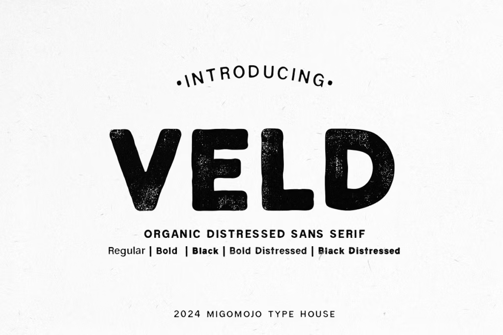
Veld Font Family: Organic Sans-Serif Typeface with Vintage Flair
Introducing the Veld Font Family
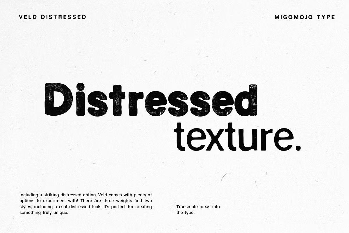
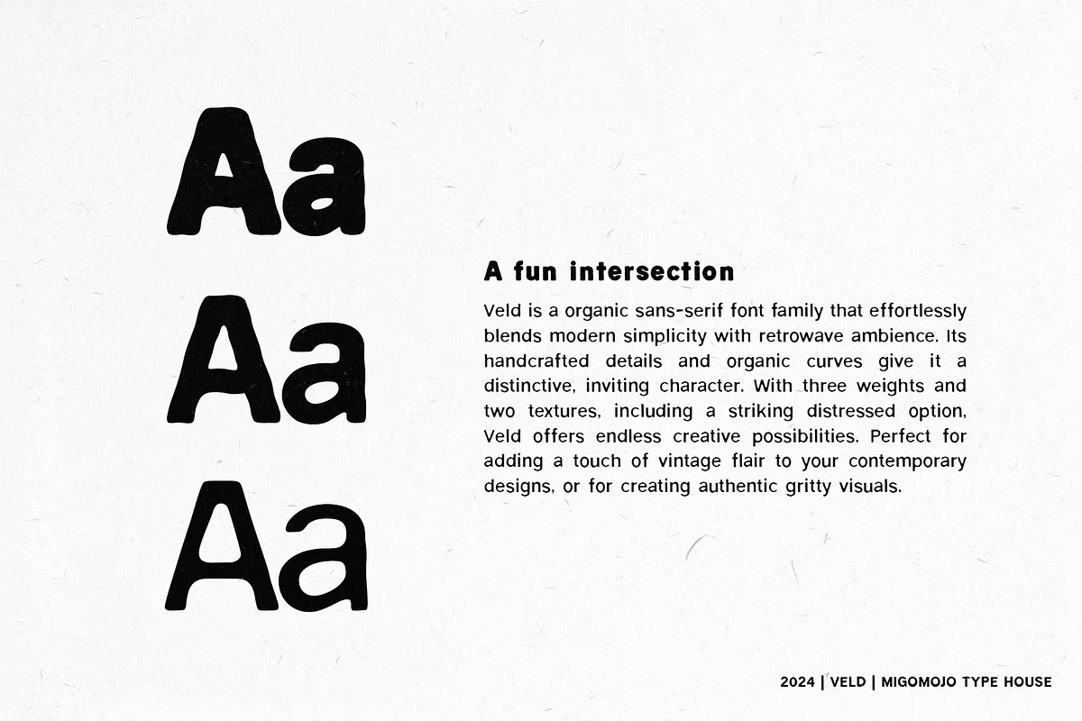
The Veld Font Family has a special look that mixes simple and old styles. It’s a sans-serif font with handmade details and curvy lines that make it stand out. This font is not just nice to look at, but it also has a unique personality that can make your design projects better. The Veld Font Family comes in three different thicknesses and two textures, including a rough, worn-out look that can add a real, gritty feel to your work. If you want to give your modern designs a vintage touch or make something that feels real and down-to-earth, the Veld Font Family is a great choice for designers and artists.
Design Style of Veld
The way the Veld Font Family looks is based on ideas from nature. It’s different from regular sans-serif fonts that can seem boring and unfeeling. Veld has curves that feel like they were drawn by hand, which makes it feel warm and welcoming. The way the lines get thicker or thinner in different versions of the font also makes it special and gives it its own personality. This makes Veld stand out and feel more human, like it was made by someone who cares about how it looks.
The details in the font are like little touches that make it feel more real and less like a machine made it. Overall, the Veld Font Family has a unique style that comes from its natural and handmade feel. Veld is a pretty cool font that can be used in lots of different design projects. It comes in a few different styles, like Regular, Bold, and Black, which gives you some flexibility when you’re designing something.
Character Sets
The way Veld’s characters are made lets it work for lots of different things. It has big and small letters, numbers, and punctuation, so you can make text look nice and flow well. The font also has a natural feel to it, which makes it good for both headings and regular text, giving designers a lot of options.
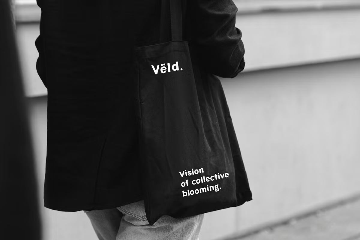
Use Cases for the Veld Font Family
The Veld Font Family is great for lots of different design situations. Here are some examples of when it works really well:
- Branding: Veld’s one-of-a-kind style can make your brand look really different.
- Editorial Design: Suitable for magazines and books that seek to convey a sense of authenticity.
- Packaging: Gives a handcrafted feel that appeals to consumers looking for artisanal quality.
- Event Posters: Distressed options are perfect for creating eye-catching posters.
Pairing Suggestions
When it comes to typography, pairing fonts effectively can enhance your designs significantly. The Veld Font Family pairs beautifully with various typefaces to create striking contrasts and harmonies. Here are some recommendations:
- With Serif Fonts: Pair Veld with a classic serif font like Playfair Display.
- With Script Fonts: Combining Veld with a script font adds a personal touch.
- With Geometric Fonts: Pairing with Montserrat creates a fresh appearance.
Licensing Information
The Veld Font Family comes in several formats like .otf, .ttf, and .woff2, so it works with many design programs. It has five different styles: Veld Regular, Veld Bold, Veld Black, Veld Bold Distressed, and Veld Black Distressed. This gives designers a lot of options to pick the right style for their project. They can choose the perfect weight and texture to fit their needs.
When you use Veld for your projects, make sure to check the rules about using it. This is important whether you’re using it for personal stuff or for your business. Knowing what you can and can’t do with Veld will help you get the most out of it.