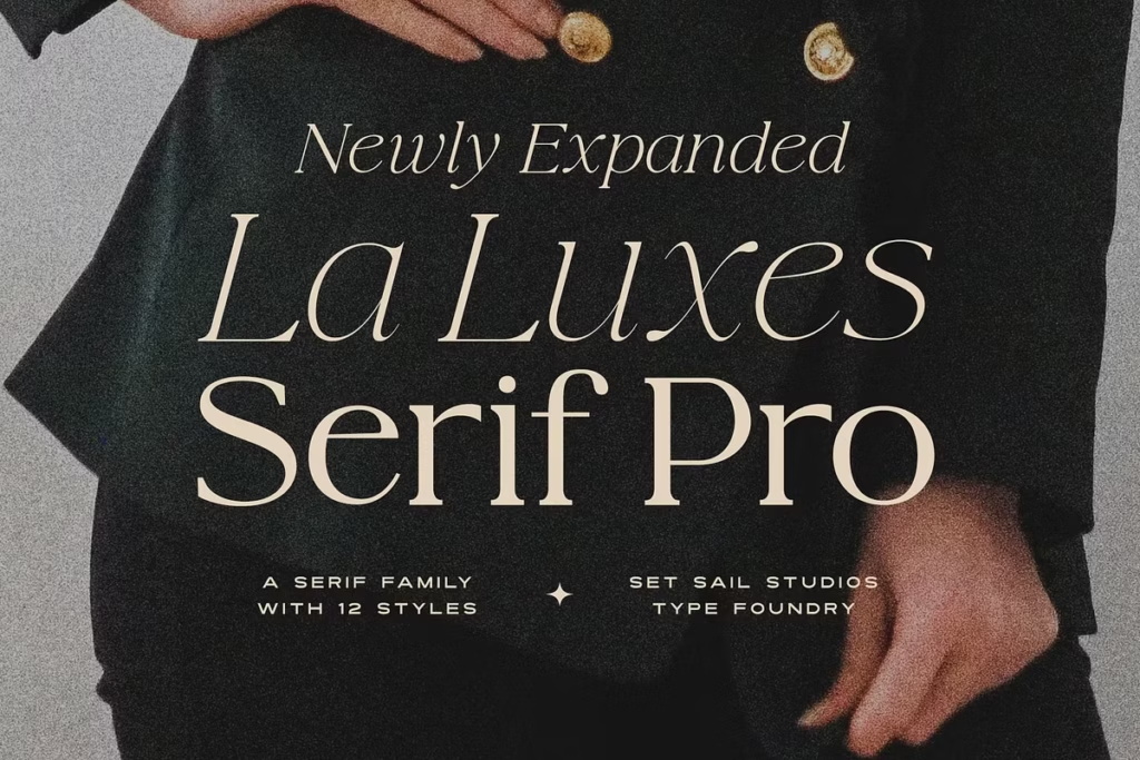
La Luxes Serif Pro 12 Font Family: Versatile Serif Fonts for Creative Design
The La Luxes Serif Pro font family is a great improvement on the original La Luxes Serif font. It now has 12 different fonts, with 6 weights and their italic versions. This makes the font much more versatile. Designers and typographers can use it to create beautiful logos, eye-catching headlines, and stylish branding materials. The possibilities are endless, whether you’re working on a simple project or something more complex. With La Luxes Serif Pro, you can add a touch of elegance to your designs. It’s perfect for creating sophisticated and dynamic visuals that grab attention. Overall, the La Luxes Serif Pro font family is a valuable tool for anyone looking to take their design work to the next level.
Design Style and Aesthetic
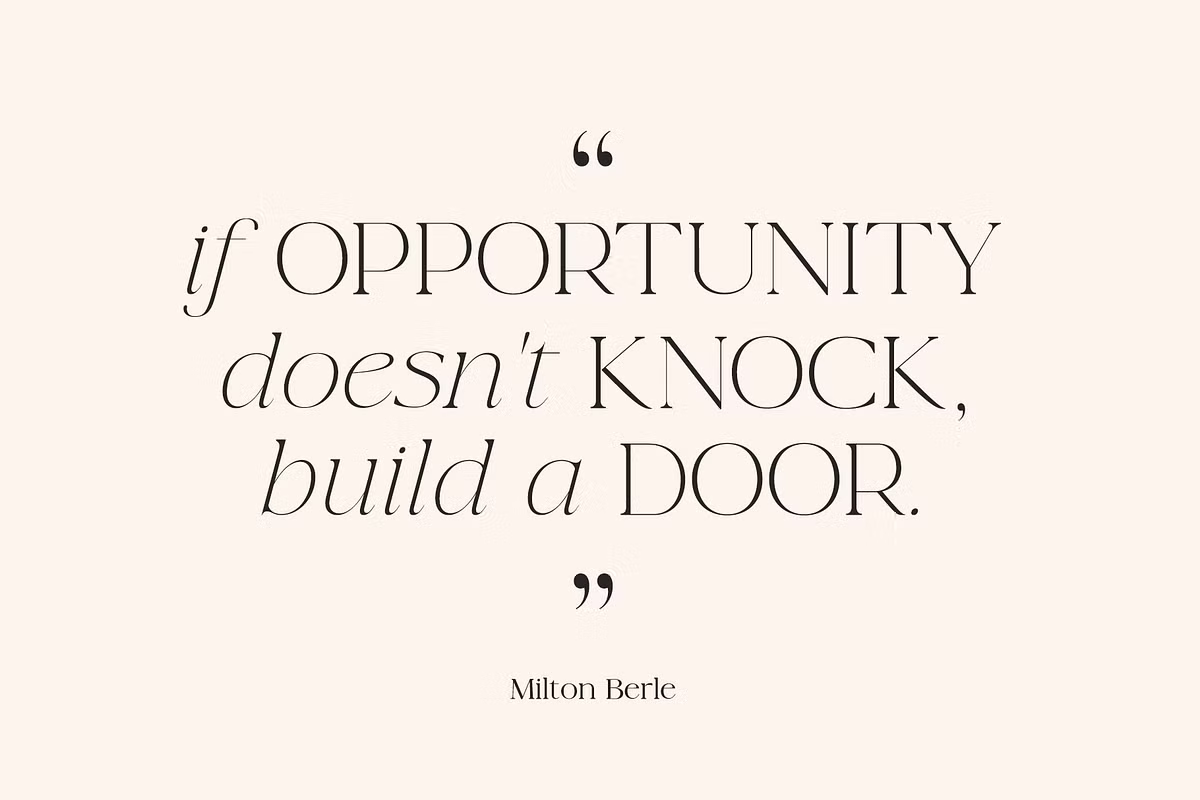
The La Luxes Serif Pro font has a really nice, modern look that’s also kind of classic. It’s got smooth curves and strong lines, which makes it great for lots of different design projects – whether you’re going for a traditional feel or something more modern. The serifs are fancy and add a bit of class, and because it comes in lots of different weights, you can use it for everything from quiet, elegant body text to big, bold headings. This means the La Luxes Serif Pro font is super versatile and can fit in with all sorts of design styles.
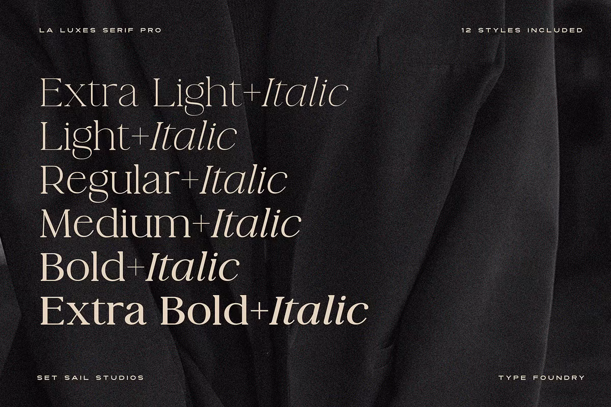
Versatile Weights for Diverse Applications
Featuring six different weights—light, regular, medium, bold, extra bold, and black—each with its italic counterpart, the La Luxes Serif Pro gives you the flexibility to choose the perfect weight for your specific design needs. A lighter weight might be ideal for delicate invitations, while a bolder weight can be more suitable for eye-catching headlines or promotional materials. This versatility makes it a go-to choice for many graphic designers.
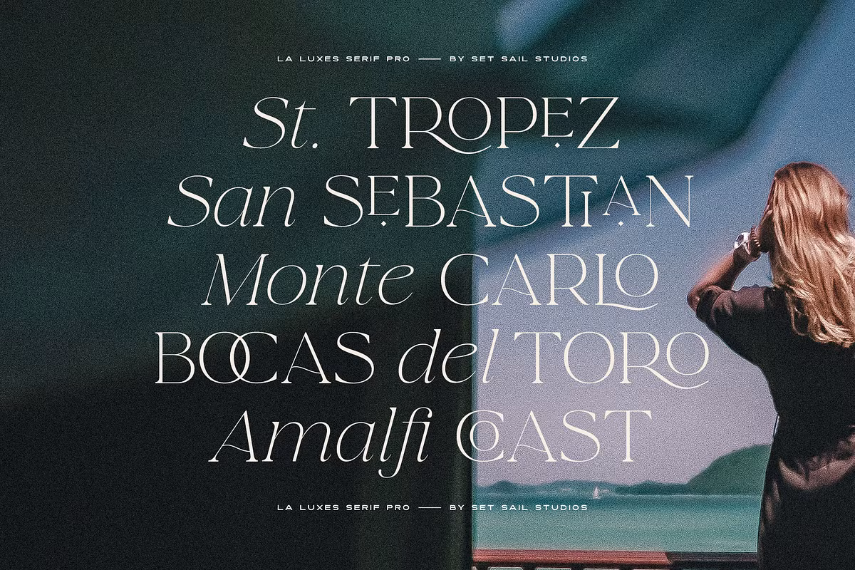
Character Sets and Special Features
The La Luxes Serif Pro font family has a lot to offer, especially when it comes to its character set. What really sets it apart is the huge range of ligatures that come with each of the 12 fonts. These ligatures are special pairs of letters that are connected in a unique way, which can really make your text stand out and look more beautiful. To use them, you just need to turn on the ‘Discretionary Ligatures’ feature in your design software, and you’ll be able to add a whole new level of customization to your typography. This can be a great way to give your text some extra flair and make it look more polished. With the La Luxes Serif Pro font family, you’ve got a lot of options to choose from, and the ligatures are just one of the many features that make it so versatile. Whether you’re working on a big project or just want to add some extra style to your writing, this font family is definitely worth checking out.
Accessing Special Characters
The La Luxes Serif Pro font has some great features that can help you create a more polished look in your designs. For example, it includes raised small caps that you can turn on by using the ‘Stylistic Alternates’ feature. This gives you a lot of flexibility to add some extra flair to your typography. You can also access all the characters, including ligatures and small caps, through the Glyphs panel, which makes it easy to add these unique elements to your work. Plus, the font is PUA encoded, which means you can easily copy and paste ligatures from the Character Map on Windows or Font Book on Mac into other software, like Canva, that might not support them otherwise. This makes it really convenient to use the font in a variety of different programs and still get great results.
Use Cases for La Luxes Serif Pro
The La Luxes Serif Pro font family is incredibly versatile, making it suitable for a wide range of use cases. Here are some practical applications where this font can shine:
- For a logo that looks classy and professional, try using La Luxes Serif Pro. This font has lots of different weights, so you can choose the one that’s just right for your design – whether you want to keep it subtle or make a bold statement.
- Make your print materials really pop with eye-catching brochures, flyers, and business cards. Using a serif font is a great idea because it keeps your text clear and easy to read, no matter how big or small it is. This means your message will come across loud and clear, no matter what format you use.
- To give your website a classy look, try using La Luxes Serif Pro for your headers and the main text. This font has a really elegant feel that can make your site stand out.
- Editorial Design: Whether for magazines or books, the font’s readability and character variations make it perfect for long-form content and eye-catching headlines.
Pairing Suggestions for Optimal Impact
To maximize the visual impact of your designs using La Luxes Serif Pro, consider pairing it with complementary typefaces. Here are some suggestions:
- For a modern look, try pairing La Luxes Serif Pro with a simple sans serif font like Montserrat or Open Sans. This combo works really well for creating a sleek and sophisticated feel that’s perfect for contemporary branding. The clean lines of the sans serif font complement the elegant lines of La Luxes Serif Pro, making it a great choice for brands that want to look fresh and stylish.
- To give your design a bit of an edge, consider mixing things up with a bold display font for headings, and then use La Luxes Serif Pro for the main body of text. This contrast between the two can really create a visually appealing hierarchy, making your design stand out.
- To give your designs a more personal feel, try combining La Luxes Serif Pro with a handwritten font, such as Pacifico or Dancing Script. This can make your design look softer and more approachable, creating a friendly vibe. It’s a great way to add some warmth and character to your work, making it stand out in a unique way.
Licensing and Availability
You can use the La Luxes Serif Pro font family for your own projects or for work you do for clients. They have different licensing options to fit your needs, whether you’re working on your own or as part of a team. Before you start using the font, take a look at the licensing terms so you know what you can and can’t do with it. This way, you can make sure you’re using the font in a way that’s okay with the people who made it.
Conclusion
So, what makes La Luxes Serif Pro 12 so special? For starters, it’s a big improvement on the original, with lots of new features that make it super versatile. You get a range of weights to choose from, which is really handy for creating different moods and atmospheres in your designs. Plus, it’s got a huge character set, which means you can use it for all sorts of projects, from fancy logos to elegant branding and eye-catching headlines. The design is really elegant and sophisticated, which makes it perfect for adding a touch of class to your work. Whether you’re a seasoned designer or just starting out, La Luxes Serif Pro 12 is definitely worth checking out – it’s got tons of potential for creative projects, and can really help take your typography to the next level. So why not give it a try and see what amazing things you can create with it?