Sans Serif
3.9
Sardin Rounded Bold: a chunky cartoon sans for logos and badges
Design style Sardin Rounded Bold sits squarely in the bubbly, thick-stroke sans lineage that traces back to 90s cartoon lettering…
 Tmfonts

Tmfonts reviews typefaces in depth — every font is tested in real branding, editorial and screen layouts before a word gets written. 555+ fonts reviewed and counting.
Design style Sardin Rounded Bold sits squarely in the bubbly, thick-stroke sans lineage that traces back to 90s cartoon lettering…
Tmfonts
Design style Cravelo sits at the intersection of two things that don’t often meet in one letterform: condensed vintage lettering…
Tmfonts
Design style Ugly Dave sets out to look wrong on purpose. The strokes wobble, baselines drift, and letterforms lean at…
Tmfonts
Design style Pieno is a bold, hand-drawn display face that leans into a mid-century, slightly childish energy without going full…
Tmfonts
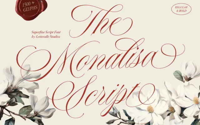
Design style Monalisa Script sits in the crowded field of fine-tipped calligraphy scripts, the kind built to look like it…
Tmfonts
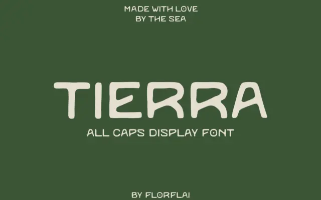
Design style Tierra reads as a sans, but it doesn’t behave like one. The name is the clue: it’s Spanish…
Tmfonts
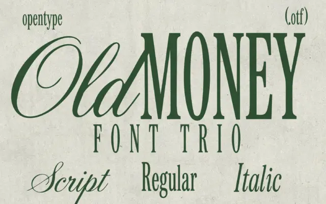
Design style Old Money is a three-piece family built around a tall, condensed serif with pronounced contrast between thick stems…
Tmfonts
Design style Sarin SVG is a condensed industrial sans with the corners knocked off. The skeleton is straightforward enough: narrow…
Tmfonts
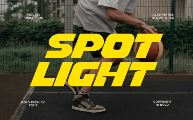
Design style Spot Light is a wide, heavily bolded sans with a forward slant baked into the letterforms rather than…
Tmfonts