
Biker Diamond Typeface Free Download
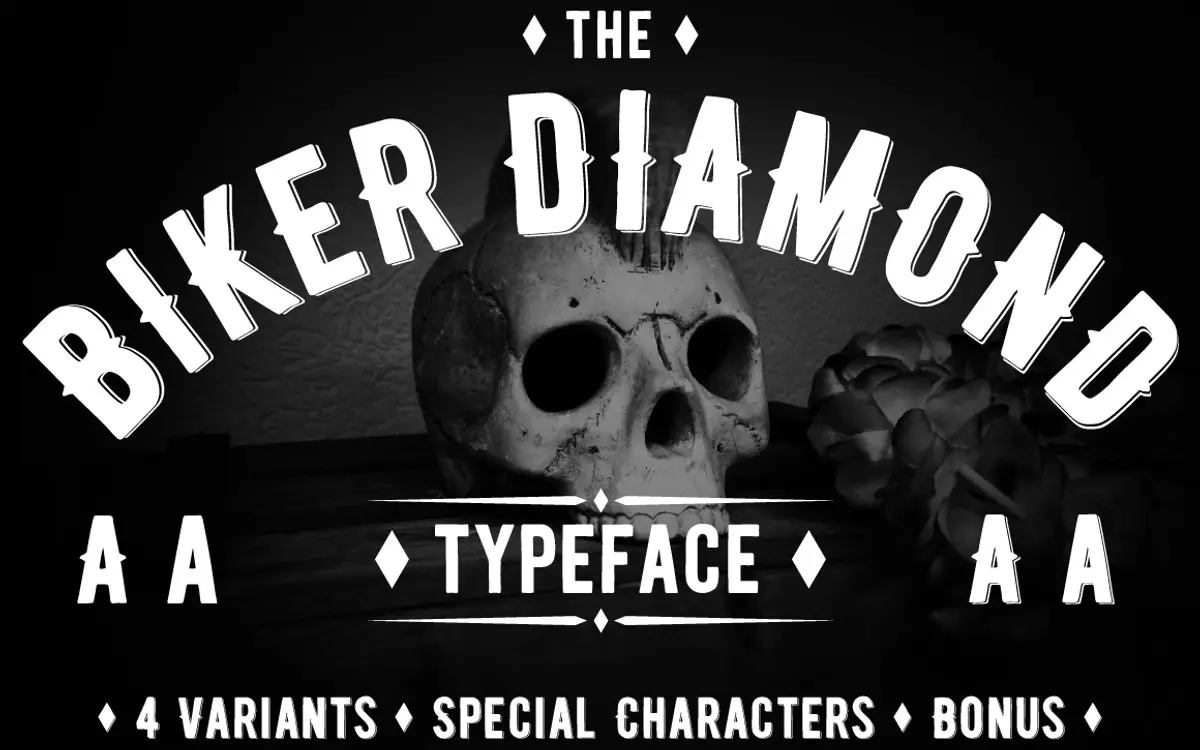
Is Biker Diamond Typeface free to download?
Biker Diamond Typeface is a commercial font sold on Creative Market, so the full version needs a paid license. Get it from the official listing: Biker Diamond Typeface download.
Need something free? These display fonts from Google Fonts are free for personal and commercial use:
Design style
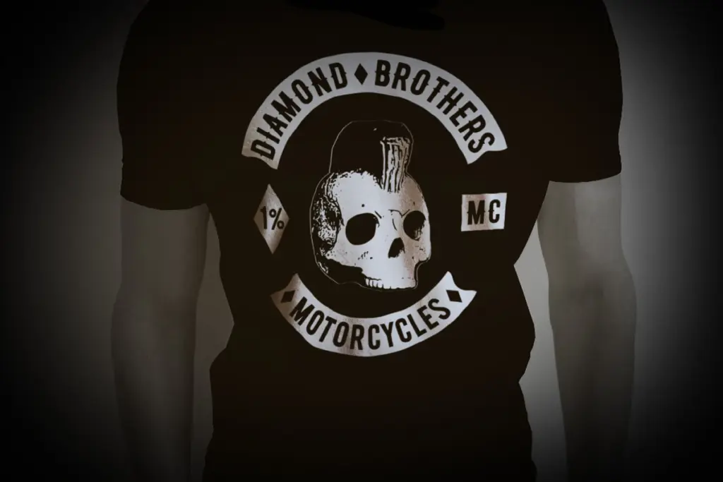
Biker Diamond Typeface belongs to the badge-and-patch school of lettering that grew out of motorcycle club insignia, varsity jackets and old tattoo flash. The letters are built from angular, diamond-cut strokes rather than smooth curves — you can see the hand construction in the way joints meet at hard points instead of rounded transitions. It reads as carved or engraved rather than drawn with a pen, which fits the biker-badge brief squarely.
The weight is heavy throughout, with thick strokes and minimal contrast, so the letters hold their own as standalone marks rather than needing a companion body text. There’s a rawness to the shapes — small irregularities in stroke width and corner treatment — that reads as intentional rather than sloppy, in keeping with the hand-made description the designer gives it. It won’t suit anyone looking for a clean geometric sans; this is a face with texture and attitude built in, and that’s the whole point of it.
Character set and features
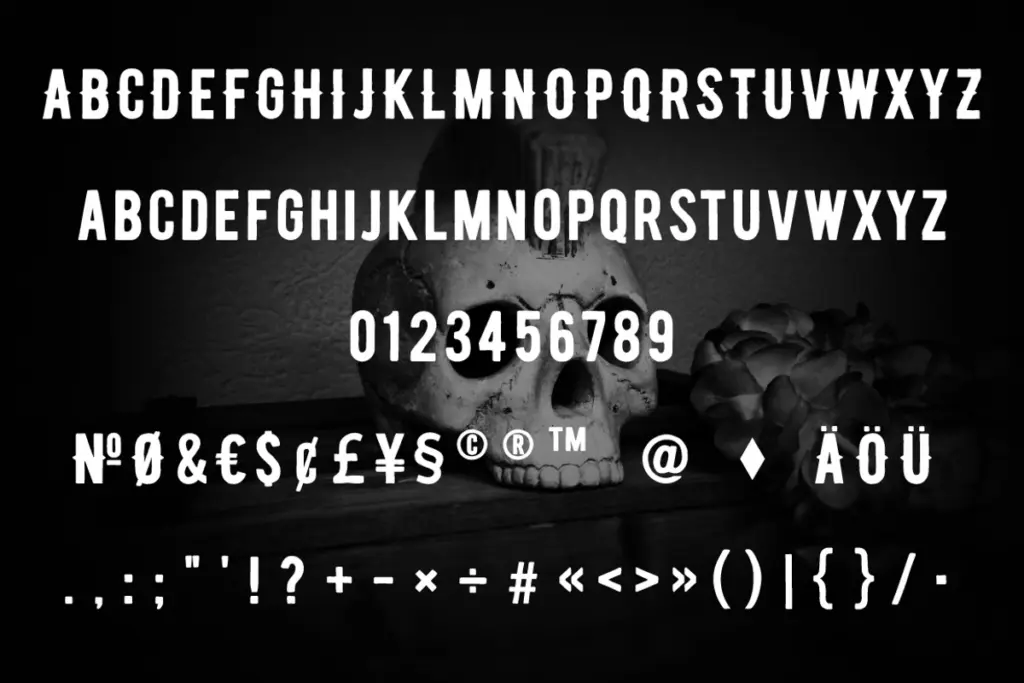
This is a display face in the narrowest sense: it exists to be set large, in short bursts, as a badge, a logotype or a single word of impact. Don’t expect the fine-grained OpenType apparatus of a text face — no stylistic alternates or ligature sets are indicated here, and the brief gives no detail on language coverage, so treat multilingual support as untested until you check the character map yourself.
What matters more than feature depth is how the letters behave next to each other at the sizes they’re meant for. Because every glyph is built from the same diamond-faceted vocabulary, the set holds together visually — round letters like O and C are squared off at their shoulders in the same way, so a full word doesn’t fall apart into mismatched shapes. That consistency is the real craft here, more than any technical feature list. Kerning at very large sizes should be checked manually, as hand-built display faces like this often need a nudge on tight pairs.
Use cases
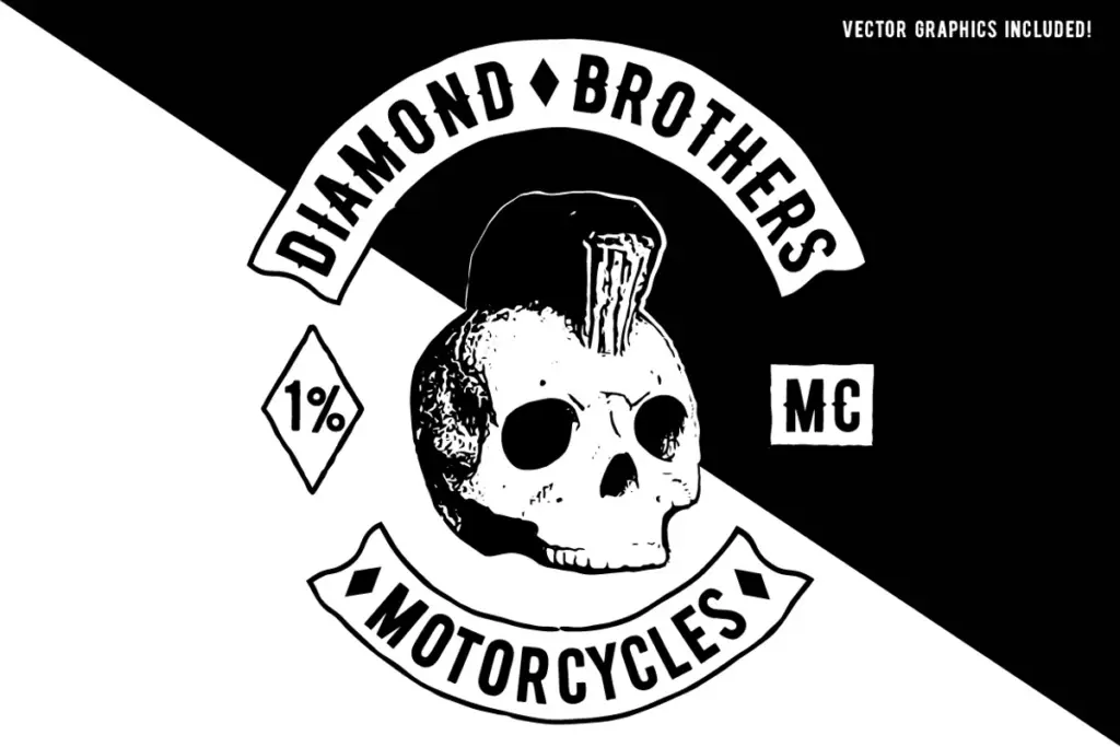
This is a one-job font, and it does that job well: motorcycle club branding, garage and workshop signage, patch and badge design, band merch, and any project chasing a rugged, outlaw, Americana feel. It also has legs for craft beer labels, tattoo studio identities and retro apparel graphics, anywhere a bold single word needs to look forged rather than typeset.
It is not a typeface for body copy, UI, or anything requiring a full-sentence read — the weight and angularity make lowercase-heavy paragraphs fatiguing fast, and it likely leans on uppercase forms anyway. Pair it with a plain, restrained sans or slab for supporting text and let this carry the headline. Used sparingly, at size, on a badge or lockup, it earns its keep; used for anything longer, it fights the reader.
What we liked, and what we didn’t
Strengths
- The diamond-faceted stroke construction gives a consistent, engraved look across the whole set
- Heavy weight makes it work as a standalone mark without needing supporting type
- Fits the motorcycle-badge and vintage-Americana brief precisely, without overreaching
Trade-offs
- No indication of alternates, ligatures or extended language support, so treat the character set as basic
- Weight and angularity make it unsuitable for anything beyond short headline-length use
Biker Diamond Typeface is a competent, single-purpose badge font that does its job with conviction. It's not built for anything beyond short, bold display use, but within that narrow lane the angular, hand-built construction gives it real character.

Tmfonts writes independent reviews of typefaces: what each font does well, where it falls short, what it suits, and where it is sold.