
Urban Neon Font Free Download
Is Urban Neon Font free to download?
Urban Neon Font is a commercial font sold on Creative Market, so the full version needs a paid license. Get it from the official listing: Urban Neon font download.
Need something free? These display fonts from Google Fonts are free for personal and commercial use:
Design style
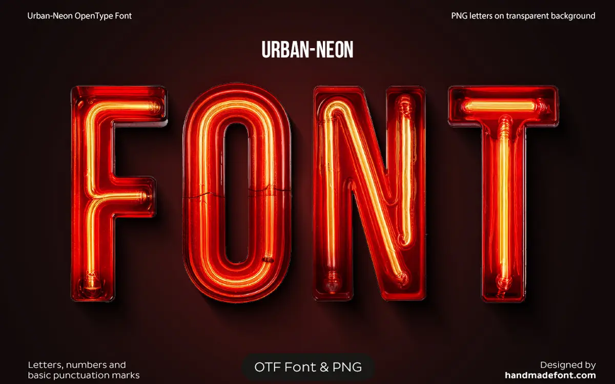
Urban Neon Font is a novelty display typeface built to mimic bent-tube signage rather than to behave like a conventional sans serif. Each letterform reads as a continuous glowing line, with the visual weight concentrated in a warm core and a softer halo bleeding outward, the way light scatters off actual neon glass in a photograph. The construction leans on single-stroke letterforms, which is the only honest way to fake tube bending, so the skeleton underneath is simple and rounded at the joints where a real glass bender would need slack to turn a corner.
The colour treatment is baked into the design rather than left to the user: a red tube traced by a yellow-orange glow, which means the typeface is really an image effect dressed up as a font. That is not a criticism of the drawing itself — the curves are consistent, the stroke width holds steady letter to letter, and the glow radius doesn’t blow out or collapse unpredictably — but it does mean you are buying a specific lighting mood, not a flexible letterform skeleton you can recolour freely without extra work.
Character set and features
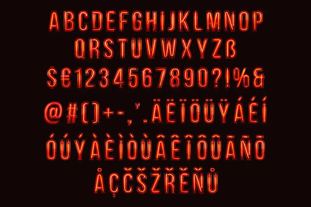
The set covers uppercase only, with a reasonably broad accented range for European languages (the usual Western diacritics plus a handful of Central European marks), full numerals, and a short list of punctuation and symbols including currency marks. There is no lowercase, so this is not a font for setting running text or even short sentences in mixed case — everything comes out shouting, which happens to suit the neon-sign conceit but limits what you can do with it typographically.
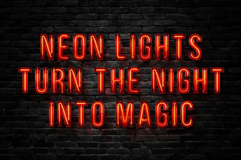
Because the glow is part of the glyph artwork, kerning and spacing need to be generous to stop the haloes from merging into a muddy strip of light, and at small sizes that glow is the first thing to degrade — it either disappears or turns into a fuzzy outline that no longer reads as neon at all. The bundled PNG set at 4000x4000px per character is the more useful asset here for most buyers: it lets you drop individual glowing letters into a layout at full resolution rather than relying on the OpenType file to hold up under scaling or recolouring.
Use cases
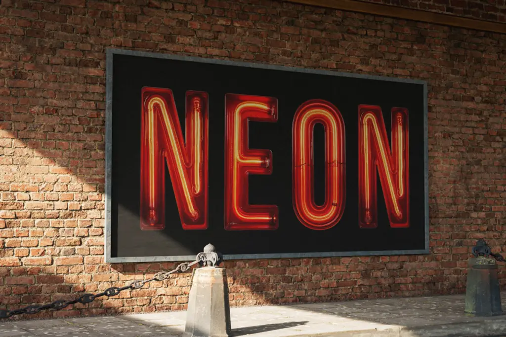
This is a prop typeface, and it should be judged as one. It does its job well for diner and bar signage mockups, retro Americana posters, late-night event flyers, and any packaging or menu design chasing a Vegas-marquee mood. Short words and single lines are where it earns its keep — a shop name, an
What we liked, and what we didn’t
Strengths
- Consistent tube-bend geometry keeps the glow effect believable letter to letter
- High-resolution individual PNGs give flexibility beyond the OpenType file
- Decent accented character coverage for a novelty display face
Trade-offs
- Uppercase-only character set rules out sentence-length or lowercase-dependent layouts
- Glow detail degrades quickly at small sizes, limiting it to large or isolated word use
Urban Neon Font does one job convincingly: it makes short words look like lit tube signage without a render pass. It has no lowercase, struggles below sign-sized use, and the glow effect locks you into a specific mood, so treat it as a prop rather than a general display font.

Tmfonts writes independent reviews of typefaces: what each font does well, where it falls short, what it suits, and where it is sold.