Sans Serif
3.7
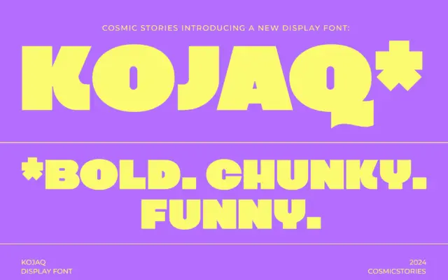
KOJAQ: a heavyweight extra-bold sans for headlines that need to shout
Design style KOJAQ is an extra-bold sans built around thick, even strokes and tight counters. The weight sits at the…
 Tmfonts

Design style KOJAQ is an extra-bold sans built around thick, even strokes and tight counters. The weight sits at the…
Tmfonts
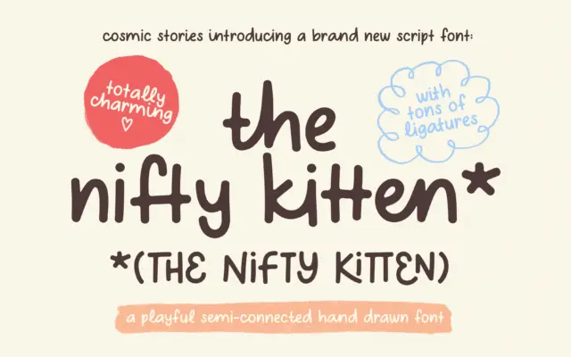
Design style The Nifty Kitten Script sits firmly in the handdrawn-script camp, but it leans harder into imperfection than most.…
Tmfonts
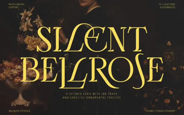
Design style Bellrose sits in the familiar territory of high-contrast display serifs built for headlines rather than paragraphs. The stroke…
Tmfonts
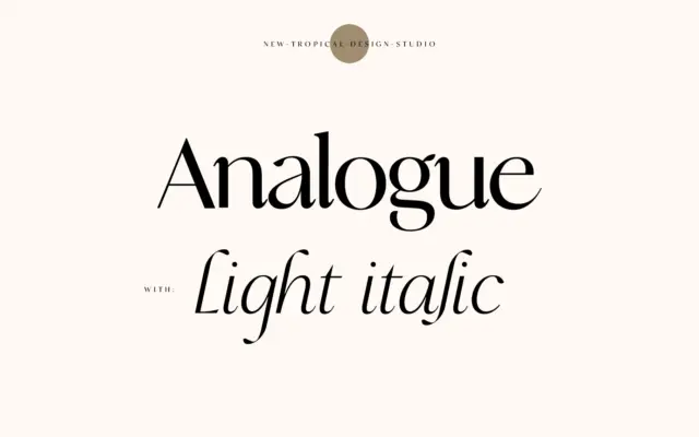
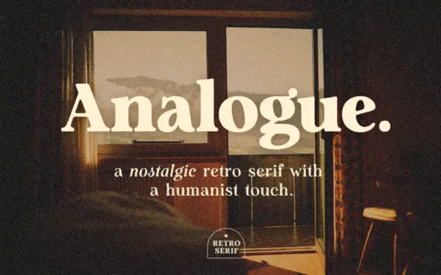
Design style Analogue sits in that familiar contemporary-serif territory: a high-contrast skeleton with curves that soften what could otherwise read…
Tmfonts
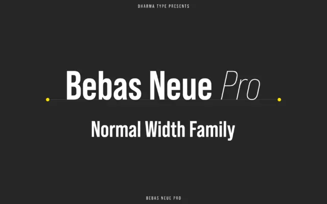
Design style Bebas Neue started life as a free single-weight capitals-only face, and it became one of the most overused…
Tmfonts
Design style Analogue sits in that familiar territory where retro signage lettering meets a humanist serif skeleton. The strokes carry…
Tmfonts
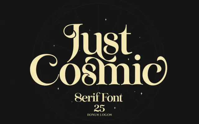
Design style Just Cosmic sits in that familiar territory of serifs built to look hand-finished rather than drafted with a…
Tmfonts
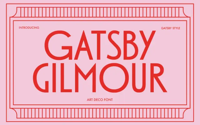
Design style Gatsby Gilmour is a geometric sans drawn from the Art Deco playbook: tall uppercase letters built on simple…
Tmfonts
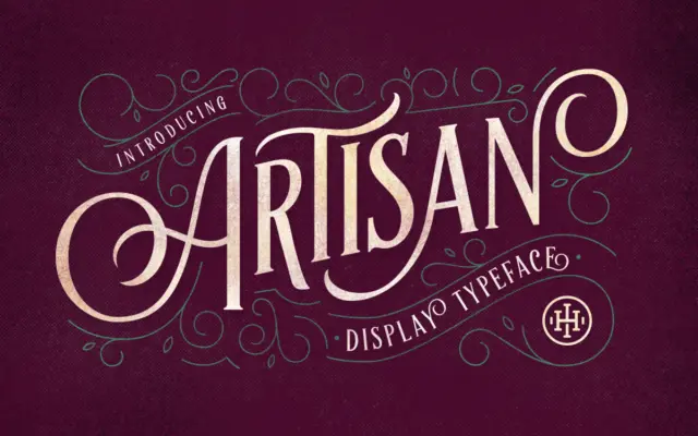
Design style Artisan Display Typeface is an uppercase-only serif built for signage-style composition rather than continuous reading. The letters lean…
Tmfonts