
Just Cosmic: a vintage-leaning serif with ligatures and premade logos
Design style
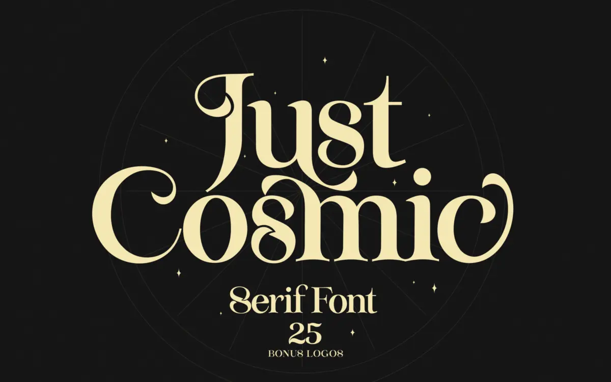
Just Cosmic sits in that familiar territory of serifs built to look hand-finished rather than drafted with a ruler. The letterforms carry a slight wobble to the strokes, tapered terminals, and joints that look cut rather than drawn — the kind of texture that reads as “vintage” without committing to any one historical model. It’s not a revival of anything specific; it borrows the mood of old letterpress serifs and softens it for contemporary branding work.
The serif weight is fairly light and the contrast between thick and thin strokes is moderate, which keeps the face from feeling heavy even though the letterforms have some rustic irregularity built into them. Where the design earns its keep is in the ligatures — pairs of letters fused into decorative cutout shapes that give the font a handlettered, almost stencilled quality when used in short bursts. These are clearly the centrepiece of the package, and they do most of the work of making the font feel distinctive rather than generic.
Character set and features
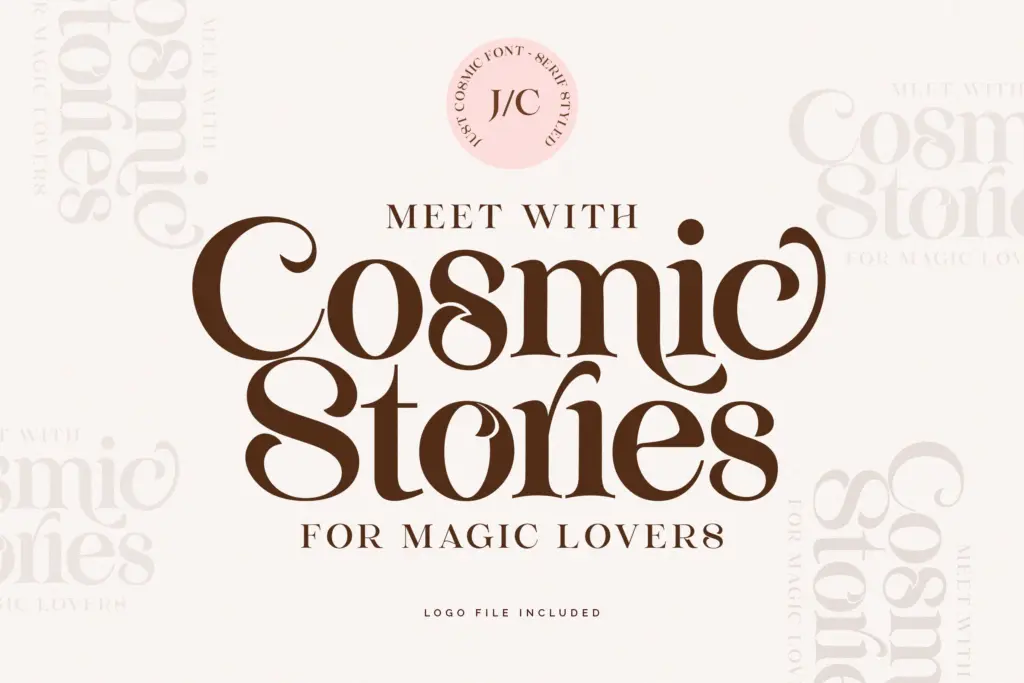
The set covers upper and lowercase with stylistic alternates for both cases, so there’s room to vary repeated letters across a headline without it looking copy-pasted. Ligatures are built in as OpenType features, along with kerning tuned for the serif family specifically — worth checking in your layout software, since ligature-heavy fonts can behave inconsistently across apps that don’t fully support discretionary ligatures.
Accented characters are included for a reasonable range of Western European diacritics, enough to set French, German, Spanish, or Portuguese text without hunting for substitutes. There’s no indication of extended Cyrillic, Greek, or other non-Latin support, so treat this as a Latin-script font for European markets.
The bundle also throws in 25 premade logo templates, editable in Photoshop or Illustrator. These are a convenience layer rather than part of the typeface itself — useful if you want a quick starting point for a boutique or jewelry mark, less useful if you’re building a identity from scratch and want full control over the mark’s construction.
Use cases
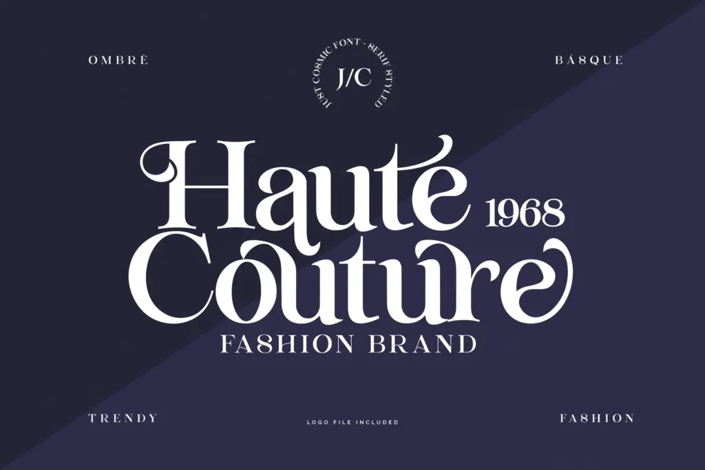
This is a display font first. The alternates and ligatures need room to breathe — a logotype, a product label, a wedding invitation headline, a quote card for social media. At small sizes or in dense paragraphs, the irregularity in the strokes and the decorative ligatures work against legibility; this isn’t a font for body copy or long-form text.
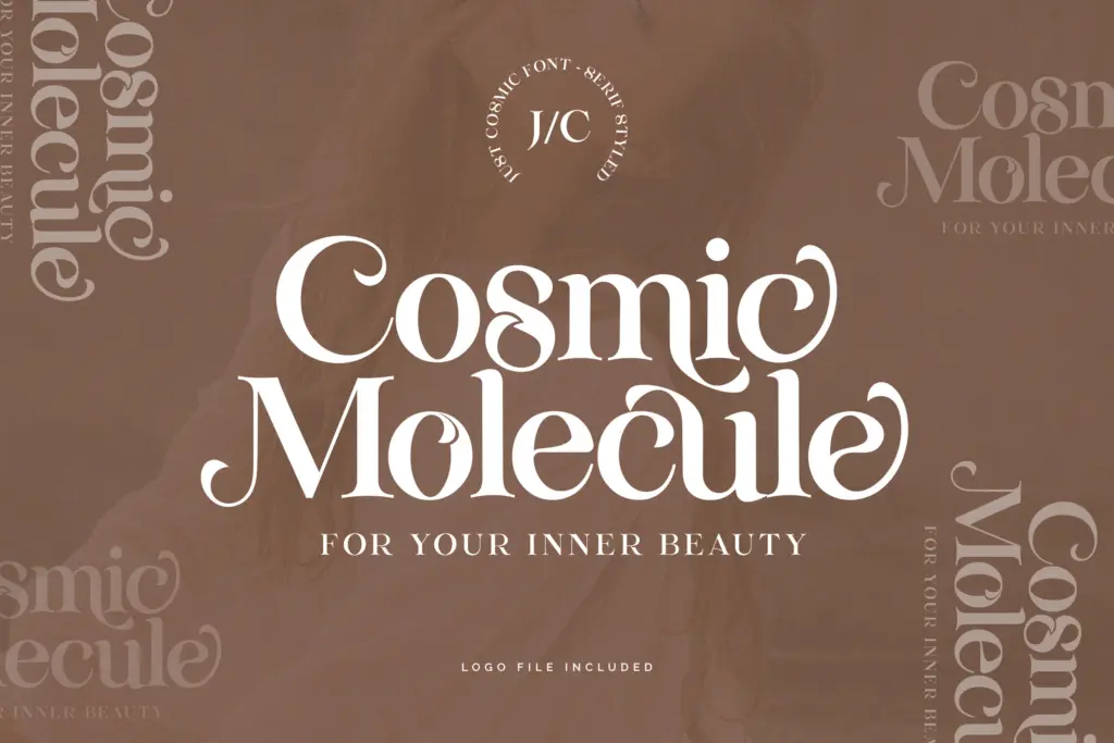
It suits the feminine, boutique, editorial end of branding: fashion labels, jewelry lines, Instagram quote graphics, invitation suites, packaging for a small cosmetics or lifestyle brand. Anywhere a designer wants a serif that feels a little handmade and a little precious, Just Cosmic delivers that mood reliably, provided the use case keeps the type large and the line count short.
What we liked, and what we didn’t
Strengths
- Decorative cutout ligatures give headlines a distinctive, handlettered texture
- Dual-case stylistic alternates let repeated letters vary across a layout
- Includes 25 editable logo templates as a practical starting point for quick branding jobs
Trade-offs
- Strokes and ligatures lose clarity at small sizes or in paragraph text
- No stated support beyond Western European Latin accents, so multilingual reach is limited
Just Cosmic is a decorative display serif that leans on its ligatures and alternates for personality, and it delivers a handmade, boutique mood when given generous space. It isn't built for small sizes or long text, and the bundled logo templates are a nice extra rather than a reason on their own to buy it.
Verdict

Tmfonts reviews typefaces in depth — every font is tested in real branding, editorial and screen layouts before a word gets written. 555+ fonts reviewed and counting.