
Analogue: a high-contrast serif for mastheads and editorial quotes
Design style
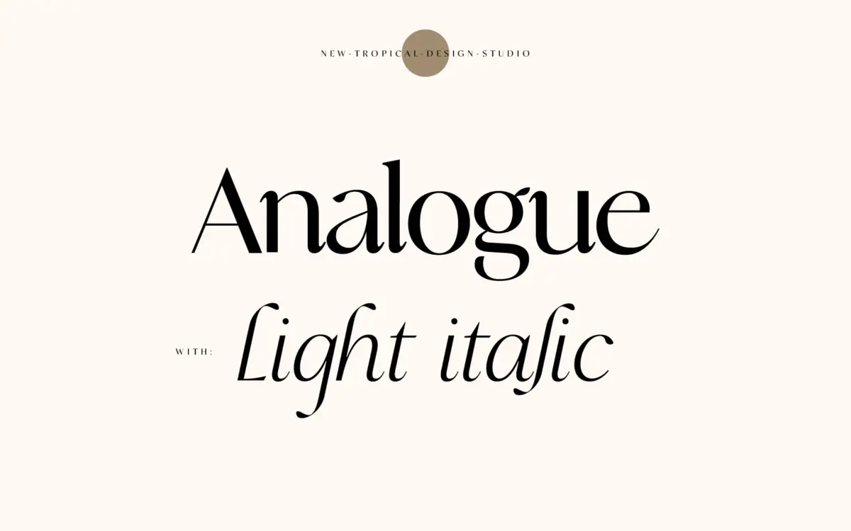
Analogue sits in that familiar contemporary-serif territory: a high-contrast skeleton with curves that soften what could otherwise read as a stiff display face. The seller calls it a mix of serif and sans serif, and that’s a fair description of the lowercase in particular — some letters carry only the faintest serif nub, while others resolve into a sharper finish. The contrast between thick stems and hairline strokes is pronounced, which gives the face its presence at larger sizes but also means it needs room to breathe.
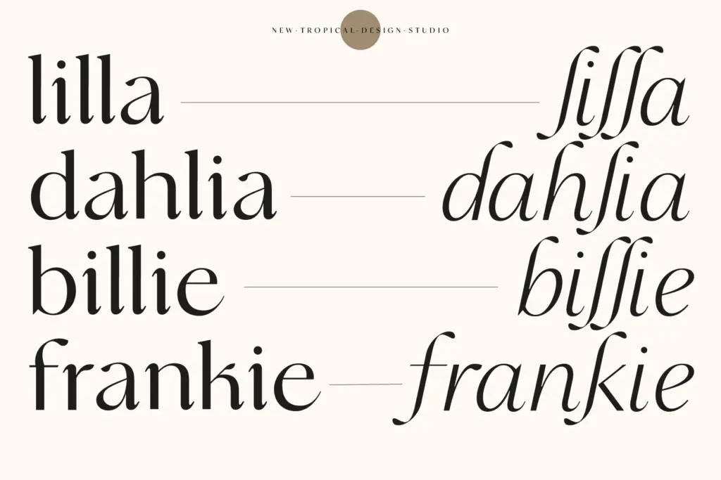
The italic is the more interesting half of the package. It’s drawn light, with a looser, more cursive rhythm than the upright, and it’s clearly meant to sit alongside the roman rather than simply slope it. That pairing is where the ‘stylish modern’ label earns itself — the roman does the structural work and the italic adds the editorial flourish, a pull-quote or byline treatment rather than a body-text workhorse.
Character set and features
Analogue ships with a full upper and lowercase set, numerals, punctuation and multilingual support, along with the usual spread of file formats for print and web. There’s no mention of extended OpenType features — no alternates, no ligature set beyond what’s structurally necessary — so this reads as a font built to be set cleanly rather than one offering a lot of typographic play. That’s not a criticism so much as a scope note: what you see in the specimen is largely what you get.
The high-contrast construction does put a ceiling on how small you can set it. Hairlines that look crisp in a headline start to disappear or clog at body-copy sizes, particularly on screen, where thin strokes are harder on anti-aliasing than they are in print. This is a display-weight character set in spirit, even where the files are labelled for body copy.
Use cases
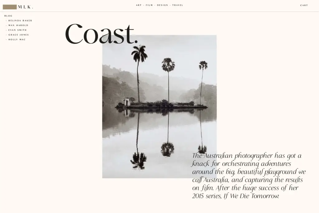
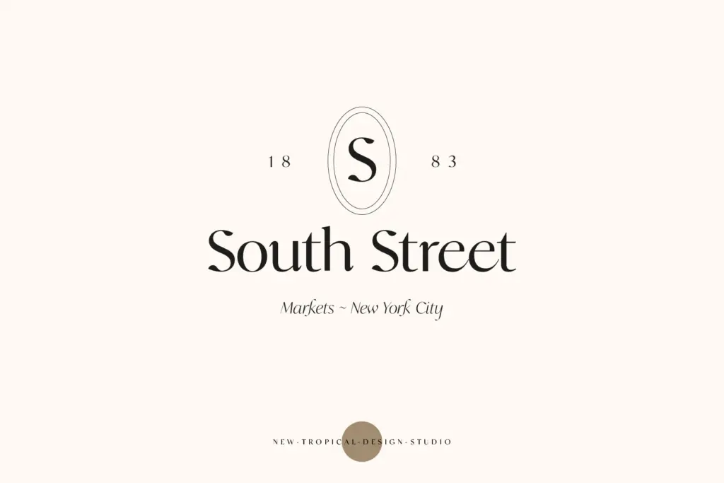
Where Analogue does its best work is in short-form, high-visibility settings: a masthead, a logotype, a single pulled quote set large, a wedding invitation’s lead line. The combination of soft curves and sharp contrast gives it a register that reads as considered rather than decorative, and the italic gives designers a second voice without reaching for an entirely different family. Fashion and lifestyle branding, editorial mastheads, and invitation suites are the natural fit.
It’s less suited to dense paragraph setting or long-form body copy, where the contrast will fight legibility rather than support it, and less suited to very small packaging text or UI work, where hairlines have nowhere to go. Treat it as a display and sub-display face with an italic partner, not as a full-range text system, and it performs well within that remit.
What we liked, and what we didn’t
Strengths
- The light italic offers a genuinely distinct second voice rather than a simple slant.
- High contrast gives it real presence in mastheads, logotypes and pull quotes.
- Soft curves keep the high-contrast structure from feeling cold or purely masculine.
Trade-offs
- Hairline strokes thin out at body-copy sizes, limiting it mostly to display use.
- No extended OpenType features such as alternates or stylistic ligatures.
Analogue is a confident display serif with a genuinely useful italic companion, built for headlines and short editorial moments rather than paragraphs. It looks sharp in a masthead or invitation but loses clarity fast once you push it down to body sizes. Buy it for its personality at large sizes, not for its range.
Verdict

Tmfonts reviews typefaces in depth — every font is tested in real branding, editorial and screen layouts before a word gets written. 555+ fonts reviewed and counting.