
Bebas Neue Pro: the original condensed headline face, now with lowercase
Design style
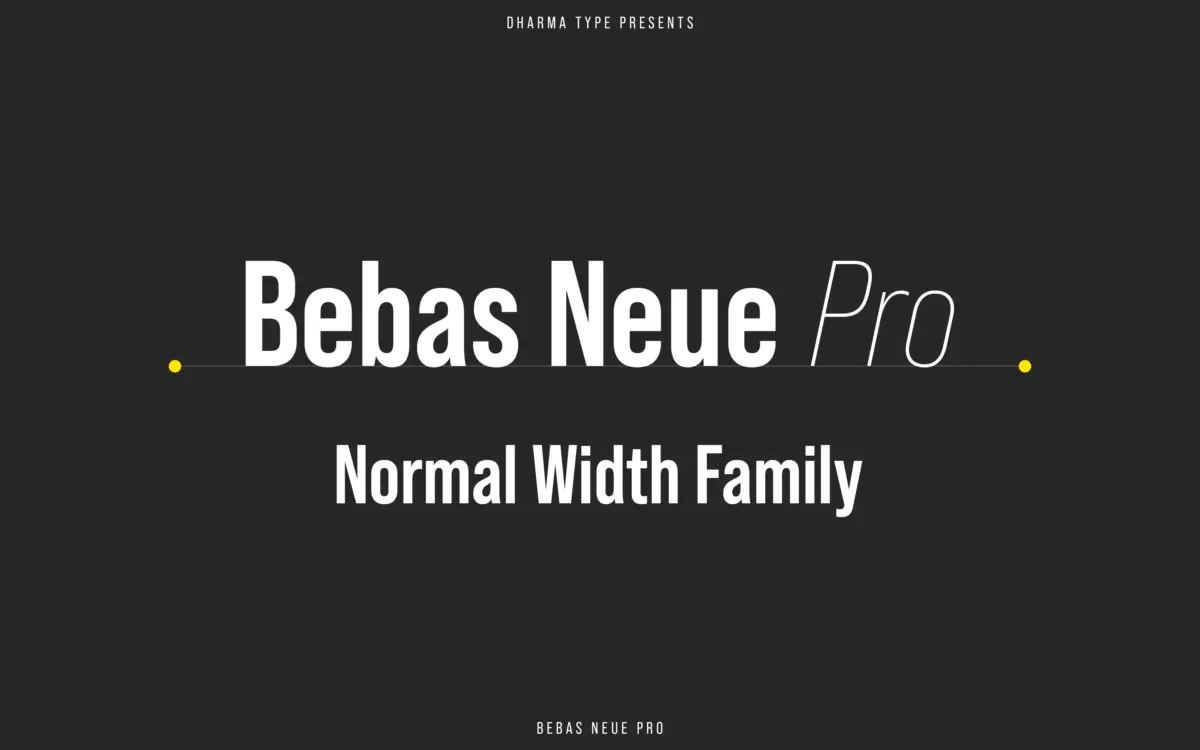
Bebas Neue started life as a free single-weight capitals-only face, and it became one of the most overused display fonts of the last decade precisely because it does one thing well: tall, narrow, geometric caps that read as confident without trying hard. This Pro Normal Width family is the professionalised version — the same bones, but stretched into a proper weight range from Thin to Bold, each with an italic, and crucially, a lowercase that never existed in the original.
The letterforms are built on strict verticals and a tight aperture. Curves are near-circular rather than true ovals, which is what gives the face its slightly mechanical, stencil-adjacent feel. Stroke contrast is minimal across the lighter weights and still fairly even at Bold, so the family doesn’t dramatise weight change the way a humanist sans would — it just gets heavier, not more expressive. That consistency is the point. This is a workhorse condensed gothic in the wood-type and early-20th-century poster tradition, cleaned up for screen and print alike.
Character set and features
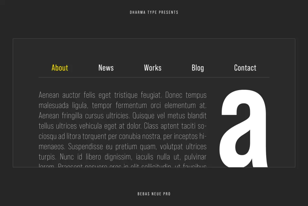
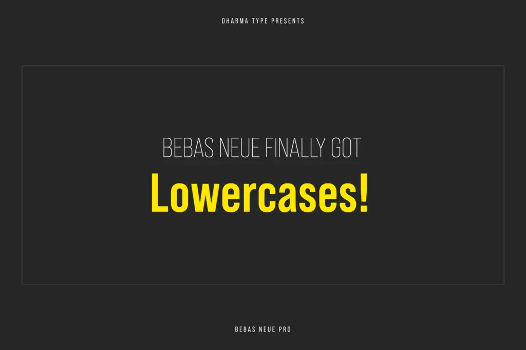
The addition of a genuine lowercase is the biggest practical change from the original Bebas Neue, and it’s handled carefully rather than as an afterthought. Ascenders and descenders are kept short to preserve the condensed, headline-height rhythm, and the lowercase shares the caps’ flat terminals and closed counters rather than softening them. The result is a lowercase that sits comfortably under the caps in a headline without suddenly looking like a different typeface stapled on.
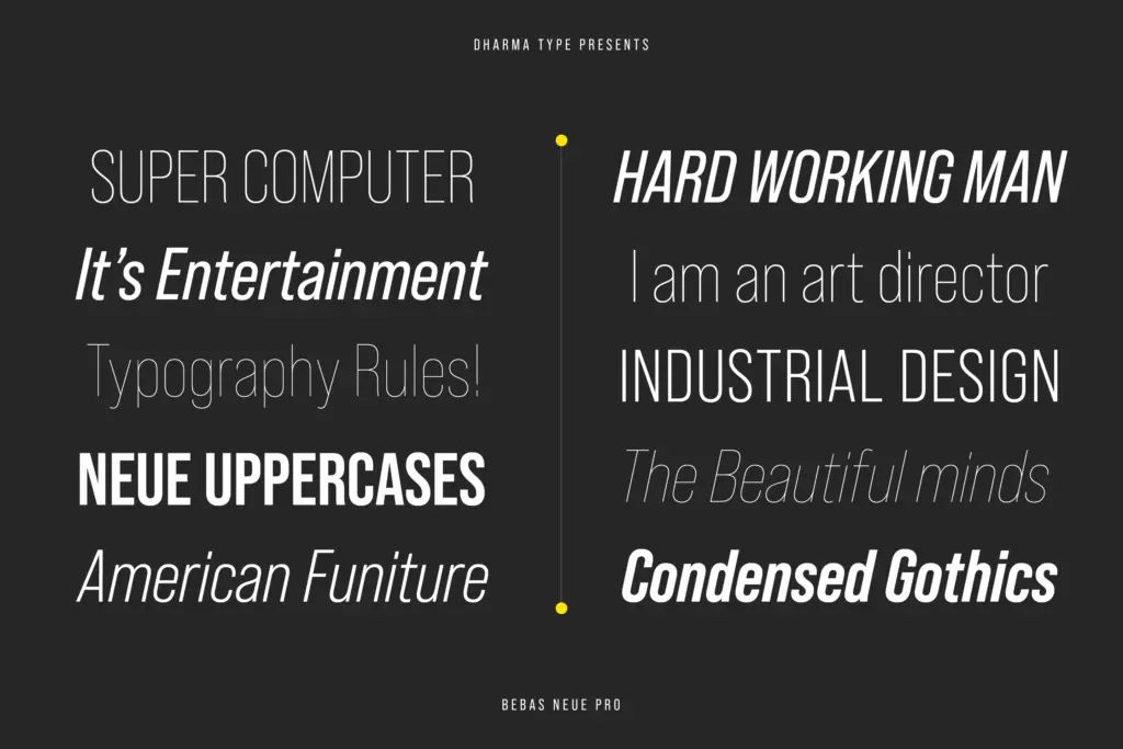
Five weights plus italics across this width alone gives you more range than the free original ever offered, and the seller notes a companion SemiExpanded width family exists alongside this Normal width package, so there’s room to vary proportions without changing voice. Cyrillic support is present, which matters if your work needs to run in markets beyond Latin-script Europe and the Americas. Don’t expect expressive swashes or alternates here — this is not that kind of family. It’s built for restraint: a tight, repeatable set of shapes that behaves the same way at five weights.
Use cases
Headlines are the obvious home — the name says as much, and the tall caps still do the job of a shouting, space-efficient news or editorial headline better than most condensed sans faces on the market. Logotypes and wordmarks benefit from the same tightness: letters interlock well at large sizes, and the geometric regularity keeps a brand mark looking engineered rather than hand-fitted. Letterheads, stamps, and packaging callouts lean on the lighter weights, where the condensed width saves space without the letters feeling starved.
Where it struggles is body text. Even with a lowercase now available, the condensed proportions and short x-height relative to cap-height make it tiring at paragraph sizes — this is a headline and label tool, not a reading face. Pair it with something more generous for long-form copy and let Bebas Neue Pro do what it was drawn for: short bursts, loud and square.
What we liked, and what we didn’t
Strengths
- Genuine lowercase added without softening the tight, mechanical caps that made the original recognisable
- Five weights with italics give real range for headline hierarchy, not just one loud voice
- Cyrillic support extends it beyond the Latin-only original
Trade-offs
- Short x-height and condensed proportions make it unsuitable for body text even with the new lowercase
- The ubiquity of the free original Bebas Neue means the family still risks feeling generic in headline use
Bebas Neue Pro takes a widely overused free display face and gives it the weight range, lowercase, and Cyrillic coverage it always needed. It's still a headline and logo tool rather than a reading face, but within that lane it's dependable and well-finished.
Verdict

Tmfonts reviews typefaces in depth — every font is tested in real branding, editorial and screen layouts before a word gets written. 555+ fonts reviewed and counting.