
Causten Round: a geometric sans with softened corners for branding work
Design style
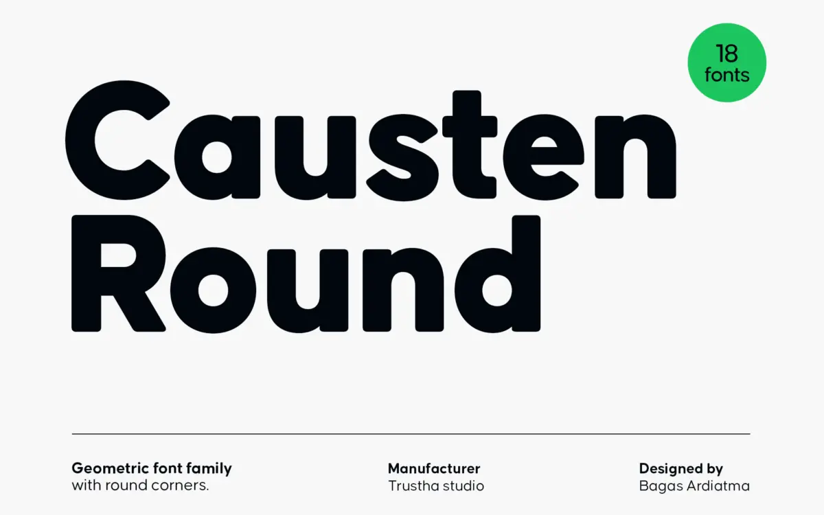
Causten Round takes a geometric skeleton — circular counters, even stroke widths, a constructed look — and files the corners down just enough to take the edge off. It’s a familiar move: the geometric sans has become the default voice of branding and identity work, and rounding the terminals is one of the few ways to give that voice some warmth without abandoning the structure. Here it’s done with restraint. The rounding is subtle rather than bubbly, so the family doesn’t tip into the cutesy territory that heavier round sans faces often land in.
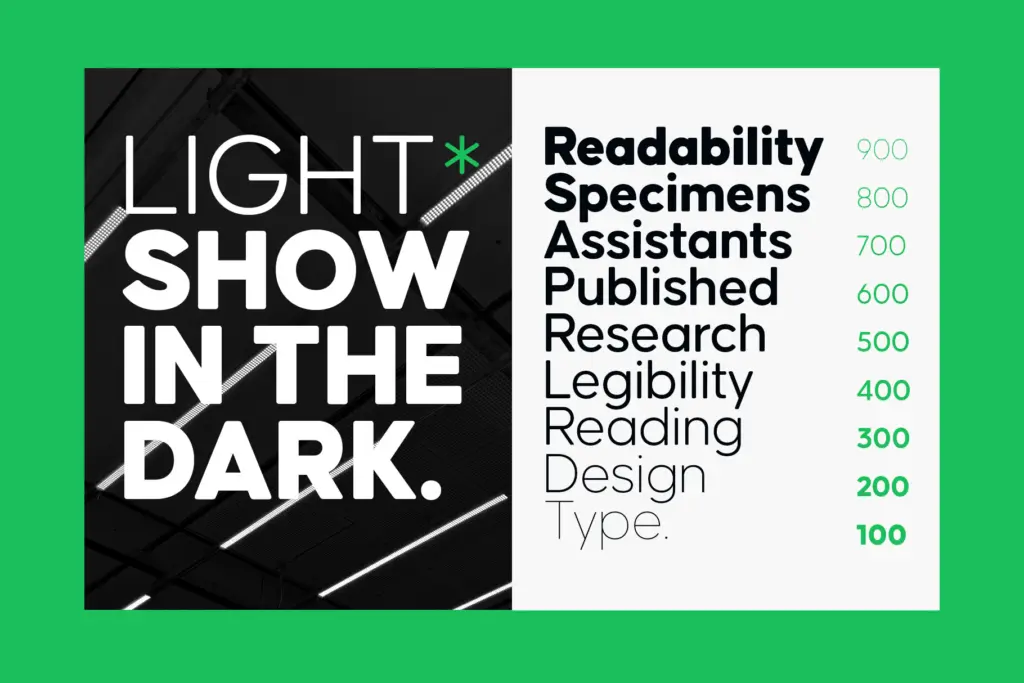
The forms stay close to true geometric proportions: the O is nearly circular, the A has a pointed apex, the lowercase a and g favour simpler constructions over humanist flourishes. Nine weights give a genuinely wide range, from hairline to black, and each has a matching oblique rather than a true italic, which is standard practice for this type of face and keeps the whole family consistent in tone rather than introducing a second personality at the lighter or heavier ends.
Character set and features
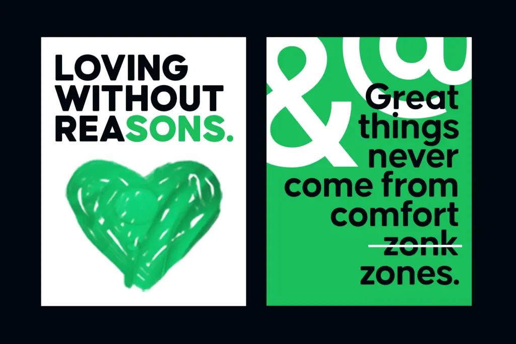
The set covers uppercase, lowercase, punctuation and symbols, with international character support for multilingual setting — useful if a brand is working across more than one language market. Stylistic sets and ligatures are included, which in a geometric sans usually means alternate forms for letters like a, g or t that can be swapped in to shift the tone slightly, from more businesslike to a touch more casual. These are worth testing in context rather than assumed to work everywhere; alternates in geometric faces can read as a nice detail in a headline and as inconsistent noise in body copy if applied carelessly.
At nine weights plus obliques, the family totals eighteen styles, which is a genuine asset for anyone building a layout system rather than picking a single display cut. The lighter weights thin out quickly and are not built for small text — they’re for big, confident headline moments. The middle weights are where the rounding reads most naturally and where most of the practical work will happen.
Use cases
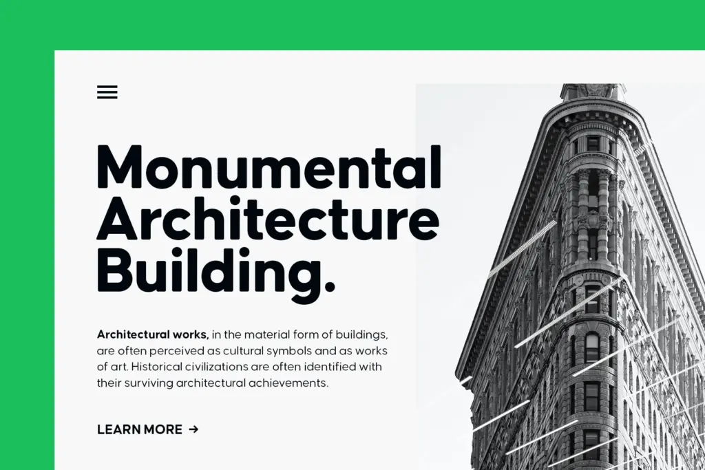
This is a branding and identity typeface first. The combination of geometric regularity and rounded terminals suits logotypes, app interfaces, packaging headers and editorial covers where a brand wants to feel clean and approachable at once — tech-adjacent, wellness, consumer products, that general territory. The wide weight range makes it workable as a sole typeface across a full identity system: black or bold for wordmarks, mid weights for subheads and short paragraphs, light weights reserved for large-scale display use.
It is less suited to long-form reading. Geometric sans faces generally ask more of the reader at small sizes than humanist ones do, because the even stroke widths and closed apertures reduce the letter-to-letter contrast that helps quick recognition. Causten Round doesn’t solve that problem, it just softens its edges. For body text in print or web, pairing it with a more conventional text face for paragraphs — and reserving Causten Round for headlines, labels and identity elements — will get more consistent results than trying to run an entire document in it.
What we liked, and what we didn’t
Strengths
- Nine weights plus matching obliques give real range for an identity system
- Rounding is restrained enough to avoid feeling novelty or juvenile
- Stylistic sets and ligatures offer tonal flexibility for logotypes and headlines
Trade-offs
- Lightest weights are display-only and unsuitable for small text
- Even geometric strokes keep small-size legibility behind more humanist designs
Causten Round does one thing well: it softens a geometric sans just enough to feel approachable without losing structure. It's a solid branding and headline tool across a genuinely wide weight range, but it's not built for long reading and the alternates need testing before they're trusted in a layout.
Verdict

Tmfonts reviews typefaces in depth — every font is tested in real branding, editorial and screen layouts before a word gets written. 555+ fonts reviewed and counting.