Sans Serif
3.7
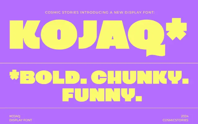
KOJAQ: a heavyweight extra-bold sans for headlines that need to shout
Design style KOJAQ is an extra-bold sans built around thick, even strokes and tight counters. The weight sits at the…
 Tmfonts

Design style KOJAQ is an extra-bold sans built around thick, even strokes and tight counters. The weight sits at the…
Tmfonts
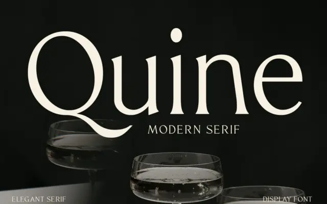
Design style Quine sits in the modern serif tradition that runs from Didone-era display faces through to today’s fashion-magazine mastheads.…
Tmfonts
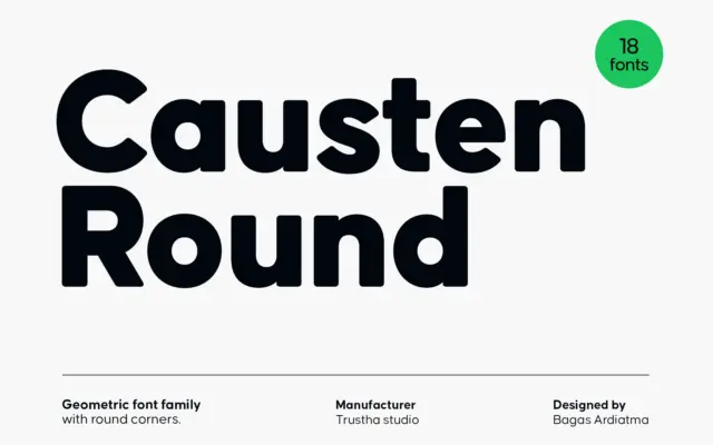
Design style Causten Round takes a geometric skeleton — circular counters, even stroke widths, a constructed look — and files…
Tmfonts
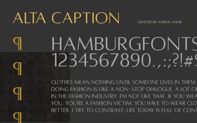
Design style Alta Caption sits squarely in the humanist sans tradition, and it wears its reference point openly: Hermann Zapf’s…
Tmfonts
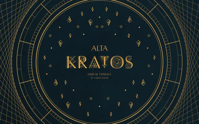
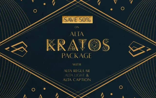
Design style Alta Kratos is an all-caps display typeface that works from the same structural idea that made Hermann Zapf’s…
Tmfonts
Design style Alta Kratos is the display member of the Alta family, and it wears its Optima debt openly. The…
Tmfonts
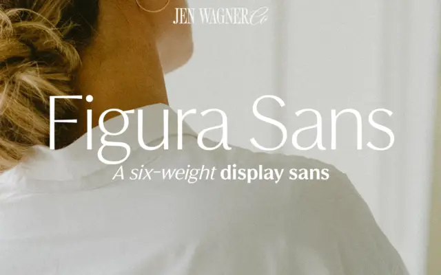
Design style Figura Sans belongs to the current run of “quiet luxury” sans serifs that trade on restraint rather than…
Tmfonts
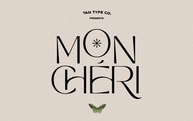
Design style Mon Cheri sits in that familiar TanType territory: geometric-leaning sans letterforms with a retro sensibility, pitched somewhere between…
Tmfonts
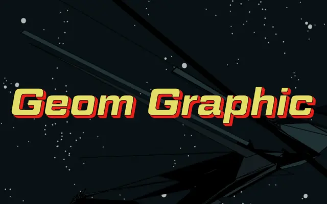
Design style Geom Graphic is a square geometric sans that wears its reference openly: 1980s Japanese mecha animation, the kind…
Tmfonts