
Alta Kratos Font Free Download
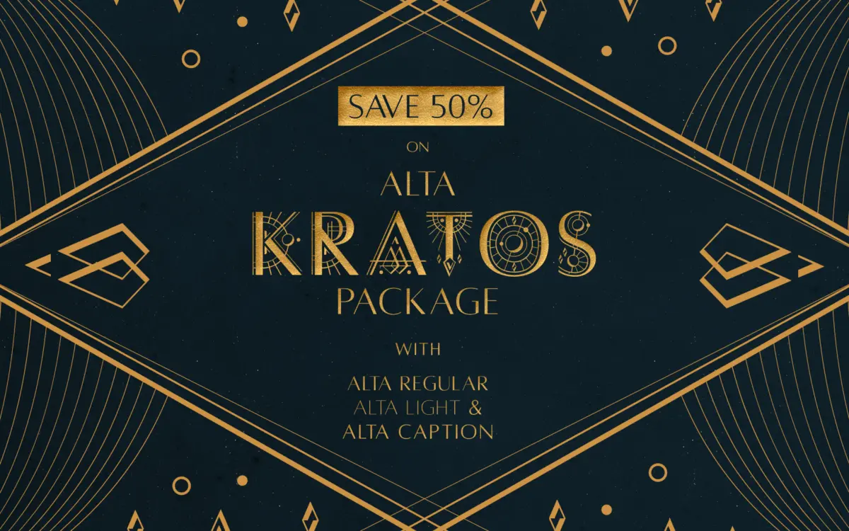
Is Alta Kratos free to download?
Alta Kratos is a commercial font sold on Creative Market, so the full version needs a paid license. Get it from the official listing: Alta Kratos font download.
Need something free? These sans serif fonts from Google Fonts are free for personal and commercial use:
Design style
Alta Kratos is the display member of the Alta family, and it wears its Optima debt openly. The flared, slightly waisted strokes that made Hermann Zapf’s original so distinctive are here in a more exaggerated, poster-ready form. Stems taper outward at the terminals without becoming serifs, giving the letters a structured, almost architectural presence rather than the warmth of a true humanist sans.
Because it’s drawn as an all-caps face, the proportions lean wide and even. There’s no lowercase to balance against, so the designer has been free to push the x-height-equivalent cap height and open up the counters. The result reads more like inscriptional lettering than a conventional sans — closer to carved stone capitals reinterpreted for screens than to a workhorse grotesque.
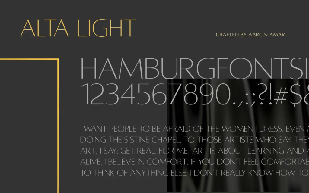
The flare is consistent across the weights included in the package (Regular, Light, Caption), which keeps the family cohesive, but it also means Kratos doesn’t soften much even at its lightest setting. This is a typeface with one clear idea, executed without much deviation.
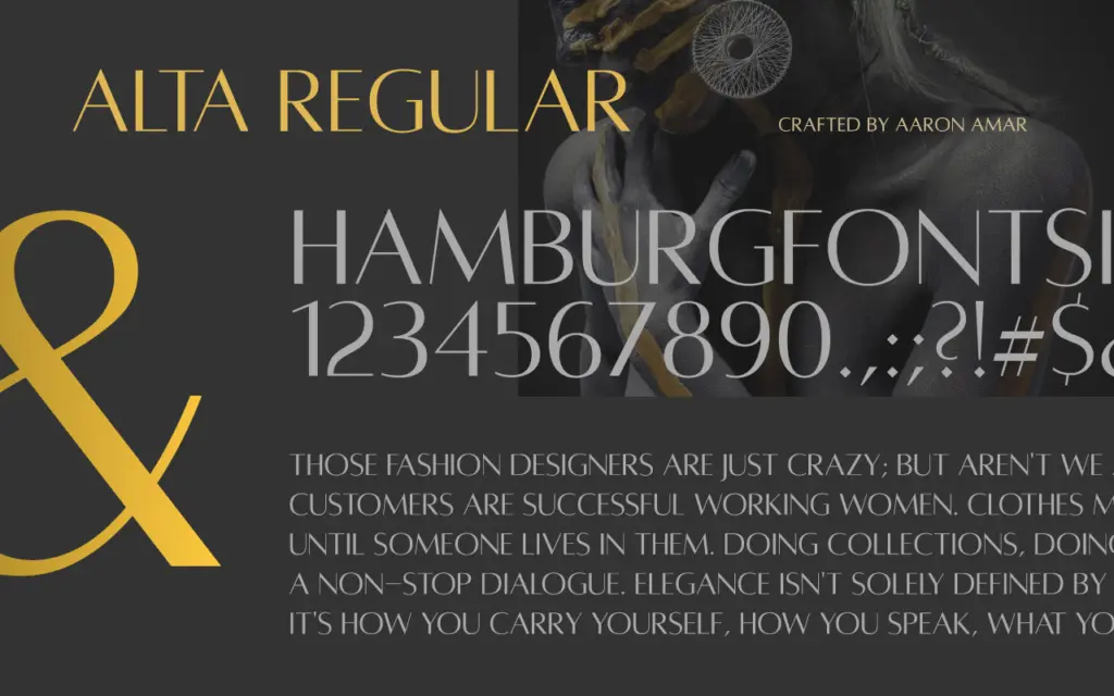
Character set and features
As an all-caps display font, Kratos covers uppercase letters, numerals and standard punctuation rather than a full upper-and-lowercase set. That’s a deliberate trade — what you gain is consistency of texture across a headline, since every letter sits at the same visual weight and height. What you lose is the option to build hierarchy within a single word using case alone, which some display typefaces rely on.
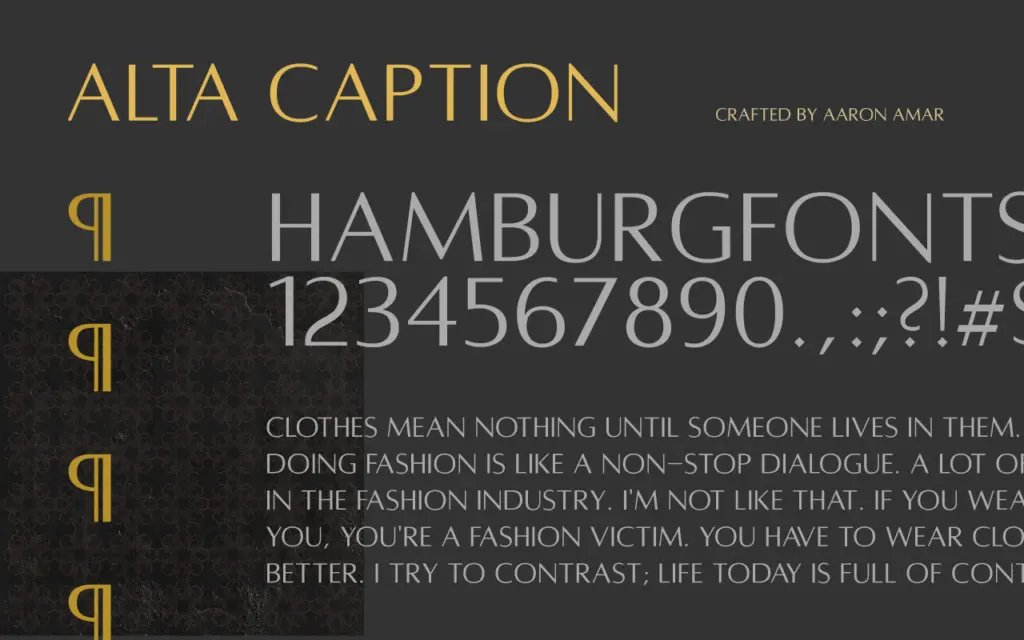
The Caption cut is the one worth testing first if you’re planning to use the package at smaller sizes; its proportions are adjusted to hold together better at reduced scale than the Regular cut, which is cut for larger display use. The Light weight thins the flares down but keeps the same stance, so it’s best treated as a tonal variant rather than a genuinely different voice.
Bundling Kratos with the existing Alta family (which does include lowercase weights) is useful in practice: it gives you a route to pair all-caps headlines with running text from the same stylistic family, without having to go hunting for a separate workhorse typeface to sit underneath it.
Use cases
Kratos is built for short runs of type set large — logotypes, wordmarks, cover lines, title treatments, packaging fronts. The flared stroke gives it a premium, slightly formal character that suits branding work aiming for restraint rather than novelty: skincare, architecture studios, hospitality, editorial mastheads.
It’s not a body-copy font and shouldn’t be asked to behave like one. All-caps setting at paragraph length fatigues readers regardless of how well the letterforms are drawn, so keep it to words and short phrases. Where it earns its keep is in a locked logotype or a title slide where every letter needs to carry the same even, structured weight — the kind of job where ordinary grotesques look generic and a script would look wrong.
What we liked, and what we didn’t
Strengths
- Flared stroke terminals give it a distinctive, structured character not found in generic grotesques.
- The Caption cut adapts the same design logic for smaller display sizes.
- Bundled with the Alta family's lowercase weights, it pairs naturally for headline-plus-body work.
Trade-offs
- All-caps only, so it can't carry hierarchy or long-form text on its own.
- The Light weight varies tone more than voice, limiting how different the cuts actually feel.
Alta Kratos takes Optima's flared-stroke idea and pushes it into a confident, consistent all-caps display face. It's well suited to logotypes and short display settings but it's a one-note instrument by design, and pairing it with the wider Alta family is the smart way to use it.

Tmfonts writes independent reviews of typefaces: what each font does well, where it falls short, what it suits, and where it is sold.