
Jeboy Typeface Free Download
Is Jeboy Typeface free to download?
Jeboy Typeface is a commercial font sold on Creative Market, so the full version needs a paid license. Get it from the official listing: Jeboy Typeface download.
Need something free? These script fonts from Google Fonts are free for personal and commercial use:
Design style
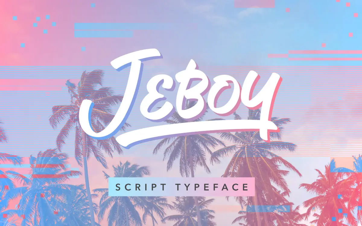
Jeboy is a casual script, pitched by its designer Aaron Amar as a summer-themed face, and that brief comes through in the loose, unhurried feel of the strokes. It has the look of a marker or brush script rather than a formal copperplate: letters lean slightly, joins are informal, and the baseline has a bit of bounce to it rather than sitting dead straight. That kind of movement is common in this genre, and Jeboy doesn’t try to reinvent it so much as execute it cleanly.
The stroke contrast is modest, which keeps the letterforms from feeling fragile at small sizes, but it also means Jeboy doesn’t have the dramatic thick-thin swing that some scripts lean on for drama. This is a font that reads as friendly and relaxed rather than luxurious or formal. If you’re picturing a beach logo, a lemonade label, or a casual product mark, that’s the register it’s built for.
Character set and features
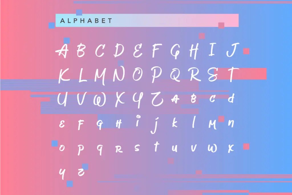
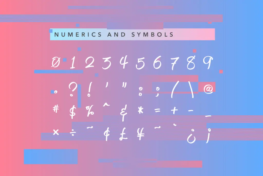
As a single script weight, Jeboy is best thought of as a mood-setter rather than a workhorse text face. The brief here doesn’t detail an extended character set, ligature set, or alternate glyphs, so buyers who need swash variants, multilingual diacritics, or contextual alternates should check the specimen closely before committing — none of that is confirmed, and it would be a mistake to assume it’s there just because it’s common in the category.
What can be said with confidence is that it’s a script built for short bursts of text. Scripts like this tend to lose legibility fast once you push them into paragraph lengths, and nothing in the description suggests Jeboy is an exception. Treat it as a display face for words, short phrases, and names rather than anything resembling body copy.
Use cases
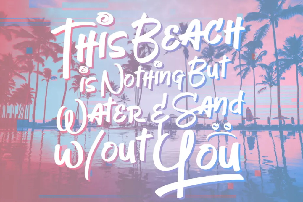
Jeboy’s natural home is branding work with a casual, warm-weather feel: packaging for drinks and snacks, surf and skate-adjacent apparel, summer event posters, or a logotype for a small food or lifestyle business that wants to feel approachable rather than polished. It would also work as a secondary accent on invitations or social graphics where you need a handwritten touch next to a cleaner sans or serif for actual reading text.
It’s less suited to anything that calls for restraint or formality — a law firm’s letterhead or a financial report won’t want this kind of looseness, and a wedding invitation aiming for elegance might find Jeboy too playful rather than romantic. The informal slant and bounce are assets in the right context and liabilities in the wrong one, so match the brief carefully before reaching for it.
Given the limited technical detail available, this is a font to buy for its mood rather than its feature set. If you need a casual, sunny script for a logo or a headline and you don’t require an extensive glyph set or multilingual support, Jeboy does the job it was built for.
What we liked, and what we didn’t
Strengths
- Loose, bouncy strokes give it a genuinely casual, unforced feel
- Modest stroke contrast keeps it legible at smaller display sizes
- Suits warm-weather branding, packaging, and apparel work well
Trade-offs
- No confirmed extended character set, alternates, or multilingual support
- Too informal for business or formal-event contexts, and not built for long text
Jeboy is a competent, informal script suited to summery branding and short display text. It doesn't offer much documented range beyond its single weight, so it works best as a mood-setting accent rather than a flexible system.

Tmfonts writes independent reviews of typefaces: what each font does well, where it falls short, what it suits, and where it is sold.