
Alta Caption Font Free Download
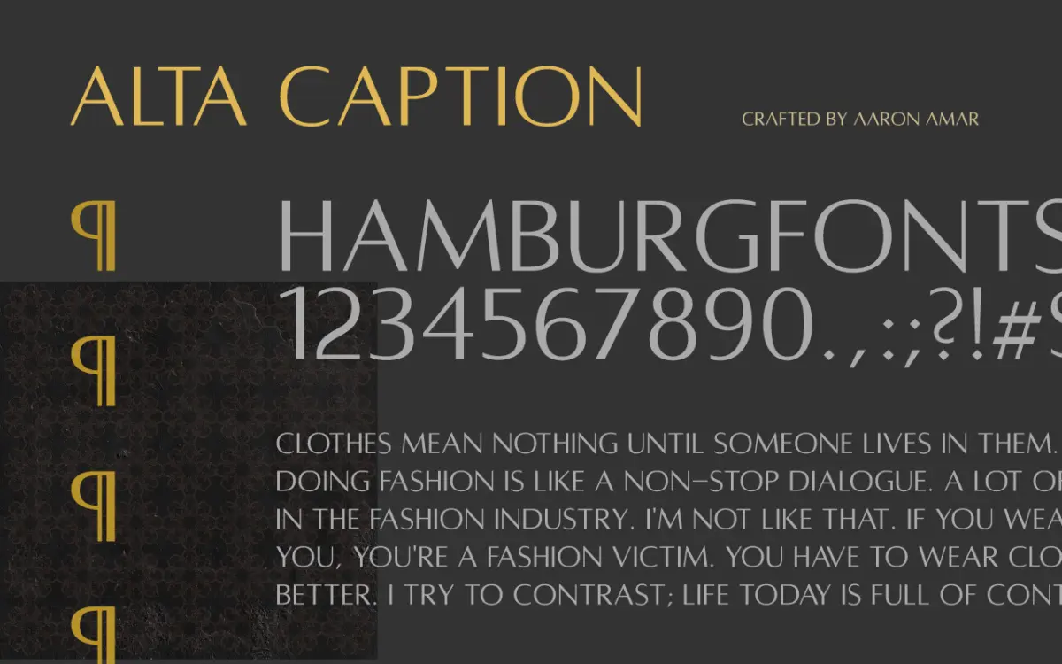
An Alta Caption free download does not exist from the designer: Alta Caption is a paid, all-caps humanist display style by Aaron Amar, and it is the one style that comes with every version of his Alta family. It costs a few dollars on its own, and the files are licensed for personal and commercial work.
Alta has three members in the files we checked: Light, Regular and Caption. If you only need one of them, Caption is the one the designer sells as the starting point, which is why it has its own listing as well as a place in the family package.
Alta Caption free download: what’s actually available
We found no official free or personal-use version. Aaron Amar does give away fonts, and his DaFont profile lists free ones such as Kawit, Hayskul and XOX, but Alta is not among them. Copies on free-font sites did not come from him and carry no licence.
What you can buy, from the designer’s Gumroad shop (prices checked 15 October 2026):
- Alta Caption on its own: $12
- Alta Regular + Alta Caption or Alta Light + Alta Caption: $15
- All three weights: $18
The product description says Alta is “available for Personal and Commercial Use.” Alta Caption is also sold as its own listing on Creative Market, where the price is shown at checkout.
Get Alta Caption — official listing
Alta Caption specimen and verified specs
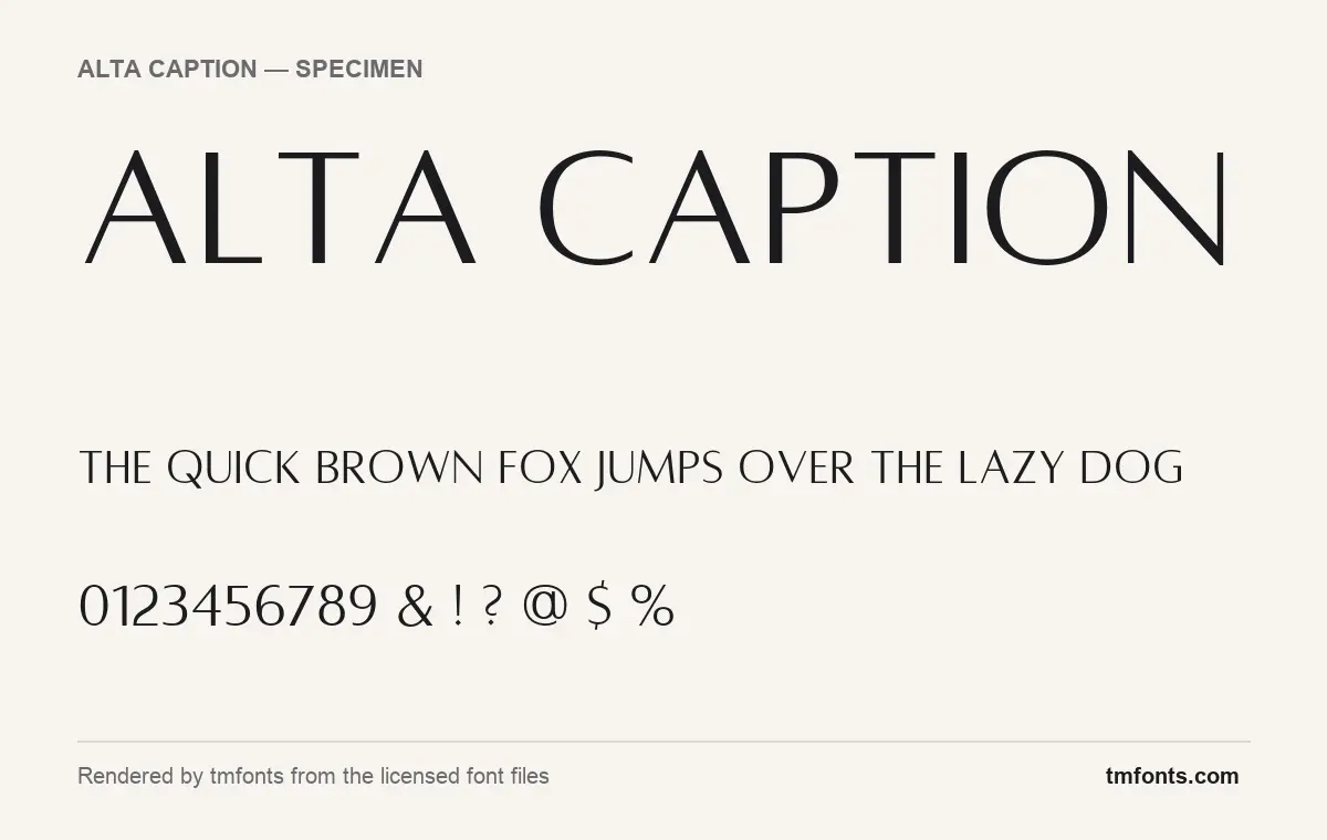
- Styles: 1 (Caption)
- File formats: OTF
- Glyphs: 205
- Language support: Basic Latin (English), Western European
- OpenType features: kerning
- Designer: Aaron Amar
- Case: All caps (lowercase keys type capitals)
Checked by tmfonts from the licensed font files.
How Caption differs from Alta Light and Alta Regular
All three Alta styles share one skeleton. The designer describes Alta as “a Sans-Serif All-Caps Display Humanist Typeface based on the aesthetics of Optima,” the 1950s design by Hermann Zapf. You can see that in the specimen above: strokes swell slightly toward their ends instead of staying the same width, so the letters feel carved rather than drawn with a ruler. There are no serifs, but the flared stroke endings stand in for them.
When we rendered the three family files at the same size, Caption stood apart. Light has very fine strokes, and Regular keeps thin hairlines on the horizontals. Caption is wider, more evenly weighted and more loosely spaced, so each letter keeps its shape when the line gets small. In type, “caption” usually means a cut meant for small text, and that matches what we see in the Caption file. If you will mostly set Alta small, in labels, credits or a tagline under a logo, Caption is the safest single choice.
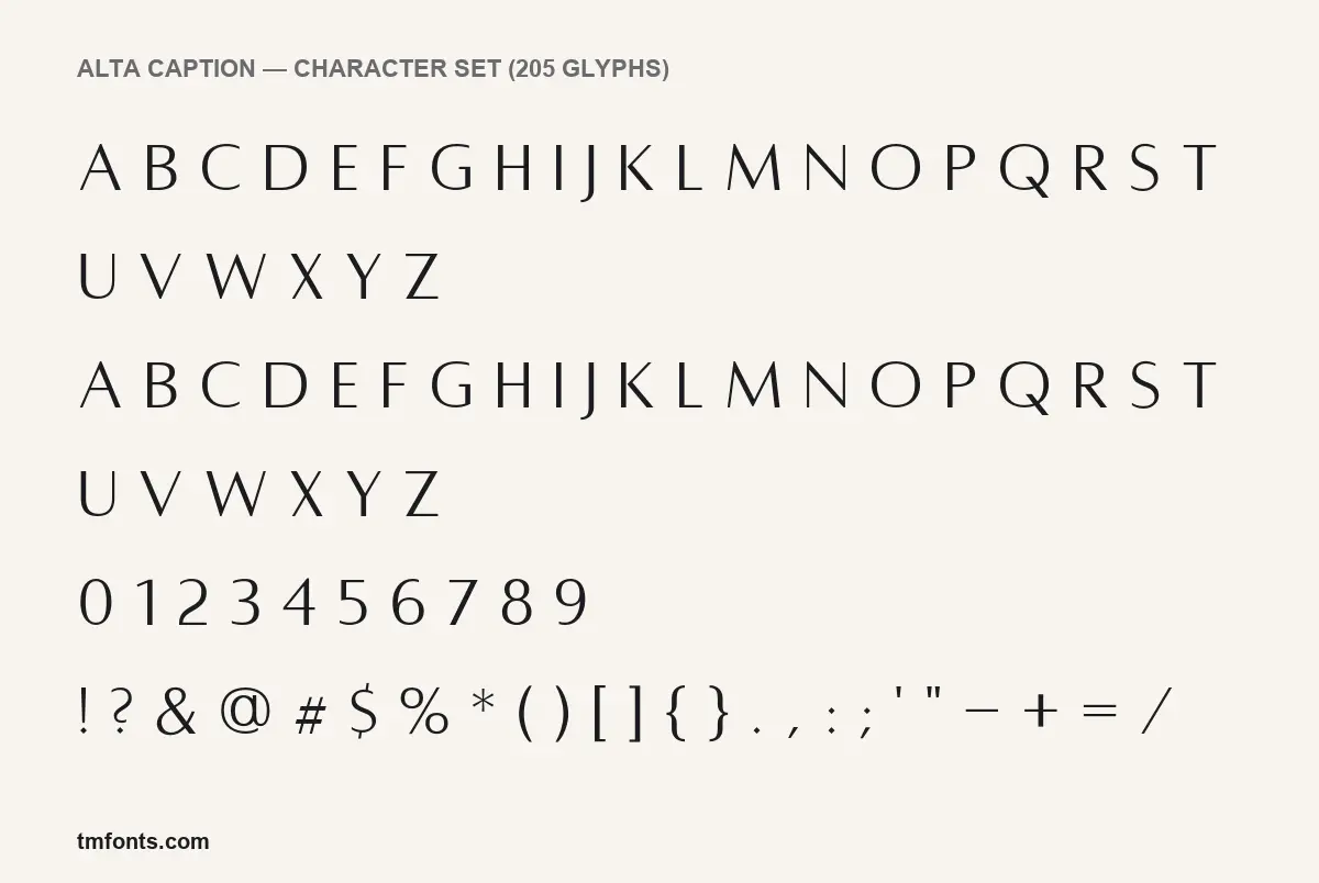
A few letters show the Optima influence clearly. The M has splayed outer legs, the N and W have tapering diagonals, and O, C and G are close to full circles. J drops below the baseline and Q has a long, low tail. The figures are lining. The 1 has a small flag, and the 2 ends in a gentle curve rather than a flat base.
What’s in the Alta Caption package
- One file: Alta_caption.otf, version 001.001, with Aaron Amar named as designer.
- Format: OpenType (OTF) only; the files we checked include no web font formats.
- 205 glyphs: A to Z, figures, punctuation and accented capitals.
- Caps only: the lowercase keys give you the same capitals as the uppercase keys, as the character set image shows. You cannot type a lowercase word by mistake.
- Font menu name: the file calls its family “Alta” and the style “Caption”, so in apps that group styles, look under Alta.
Language support and OpenType features
Alta Caption covers basic Latin for English and the Western European accented capitals used in languages such as French, Spanish, German and Portuguese. The only OpenType feature is kerning, which adjusts the space between awkward pairs like AV or LT. Nearly every app, including Canva, Word and Cricut Design Space, applies kerning automatically.
There are no alternates, ligatures or swashes, and no Private Use Area (PUA) characters. That means there is nothing hidden to unlock through a glyph panel: what you type is what you get, in any app.
Where Alta Caption works, and what to pair it with
Because it is caps only, the Alta Caption font is a display and labelling face. Good jobs for it:
- Small-caps-style labels: photo credits, captions, menu section heads, product names on packaging
- Wordmarks for fashion, beauty or interiors brands that want calm rather than sharp
- Letter-spaced taglines under a larger logo
You need a second typeface for body text. EB Garamond and Cormorant Garamond share Alta’s calligraphic roots and give you a real lowercase. For a cleaner look, set paragraphs in Source Serif 4 or Lora. Inside the family, Caption at small sizes works well with Alta Light set large for headlines; that is the main reason to buy the three-weight option.
Licensing: personal vs commercial use
The Gumroad description says Alta can be used for personal and commercial projects. Creative Market fonts come with that marketplace’s own licence terms, which usually cover desktop use for design work and charge extra for things like web embedding or apps. Before a large job such as broadcast, merchandise at volume or an app, read the licence that comes with your purchase or ask the designer. This is general information, not legal advice.
How to install Alta Caption
- Windows: after you download Alta Caption, unzip it, right-click Alta_caption.otf and choose Install (or Install for all users).
- Mac: double-click the OTF file and click Install in Font Book.
Restart any open design app so the font appears. In Canva, upload the OTF through Brand Kit (a Canva Pro feature); in Cricut Design Space it shows up as a system font once installed.
Free alternatives to Alta Caption
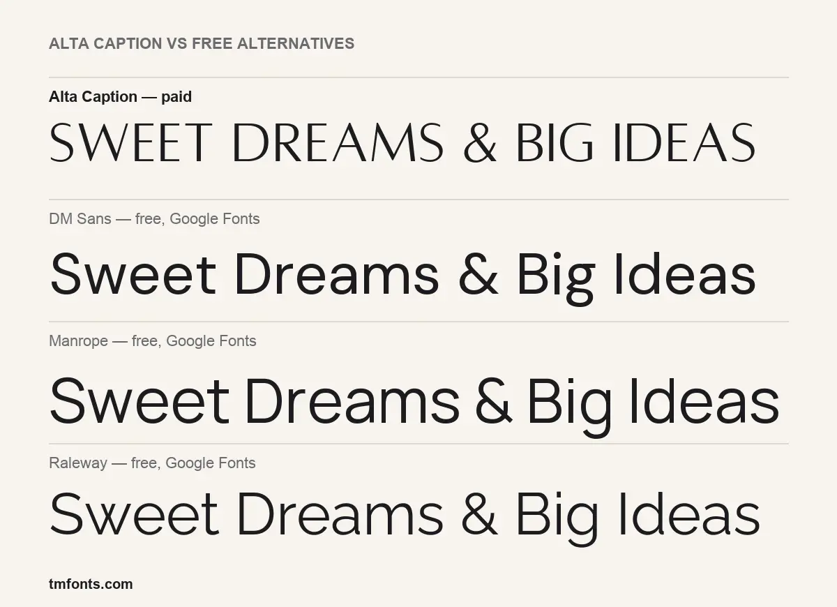
If you came looking for an Alta Caption free download because the budget is zero, these Google Fonts are legitimately free. None has Alta’s flared strokes, so treat them as stand-ins and set them in spaced capitals to get closer.
- DM Sans: a low-contrast geometric sans with round, open shapes. It is sturdier and more neutral than Alta Caption, and it comes with a full lowercase and many weights.
- Manrope: a little narrower and more technical. Its letters have flat, even strokes, so it reads as modern rather than classical.
- Raleway: the closest in mood of the three. Its lighter weights feel elegant in caps, but the strokes keep one even width and end square, with none of Alta’s swelling.
If the flare is the point, Google’s Marcellus SC is worth a look too: it is a flared, Roman-style capital face with a similar carved feel.
Alta Caption FAQ
Is Alta Caption free?
No. It is a commercial font, and any Alta Caption free download you find on a free-font site is not from the designer. His shop sells it on its own for $12.
Can I use Alta Caption commercially?
Yes, with a purchased licence. The designer’s product page states it is available for personal and commercial use.
What is the difference between Alta Caption and Alta Typeface?
Alta Typeface is the family name for three styles: Light, Regular and Caption. Alta Caption is one of those styles, sold separately. It is wider and more evenly weighted than the other two, which suits smaller sizes.
Does Alta Caption have lowercase letters?
No. Both cases on your keyboard give capitals, so pair it with a text face for paragraphs.
Who designed Alta Caption?
Aaron Amar, who is named as designer in the font file and sells Alta through his Gumroad shop and Creative Market.

Tmfonts writes independent reviews of typefaces: what each font does well, where it falls short, what it suits, and where it is sold.