
Everything’s Peachy Font Free Download
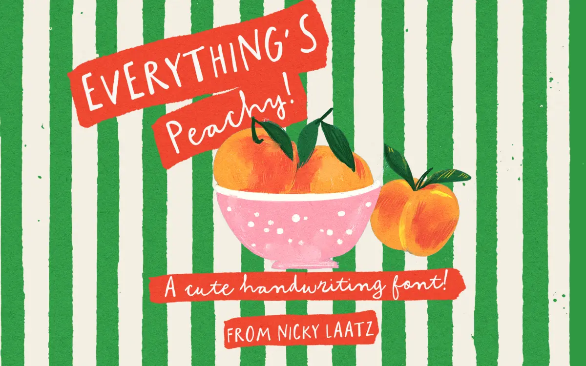
Is Everything's Peachy free to download?
Everything's Peachy is a commercial font sold on Creative Market, so the full version needs a paid license. Get it from the official listing: Everything's Peachy font download.
Need something free? These handwritten fonts from Google Fonts are free for personal and commercial use:
Design style
Everything’s Peachy belongs to the crowded but perennially popular world of childlike handwriting fonts, the kind built to look like a felt-tip marker rather than a pen nib. The letterforms are rounded, a little wobbly, and unapologetically informal. What sets it apart from the glut of similar scripts is the duo structure: the lowercase gives you a joined, looping script, while the uppercase switches to a separate all-caps style. Typing one or the other produces two distinct moods from a single file, which is a sensible bit of design economy rather than a gimmick.
The script lowercase has the loose, slightly uneven baseline that reads as hand-drawn rather than vectorised and tidy. Strokes are monoline, with no real contrast, which keeps the overall texture light and suits the bouncy, child-drawn character the font is going for. The caps are blockier and more stable, closer to a hand-lettered label style than a script, and they work well as a counterpoint when you want structure without losing the handmade feel.
Character set and features
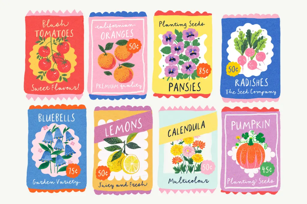
The OpenType features are where this font earns its keep beyond the basic letterforms. There are swash variants for the beginnings and ends of lowercase words, plus a set of common ligatures that smooth over awkward letter collisions and make the joins look more convincingly handwritten. These aren’t decorative add-ons you’ll never use — they’re the difference between a script font that looks like a font and one that looks like someone actually wrote it.
PUA encoding means the swash and ligature alternates are reachable in apps that don’t support OpenType features properly, Canva being the obvious example. That’s a practical decision rather than a flashy one, and it matters more than it sounds for a font pitched at this market, where a lot of buyers aren’t working in InDesign or Illustrator.
Language support covers a reasonable spread of Western European languages, including the accented characters needed for French, German, Nordic, and Iberian text, so the font isn’t limited to English-only projects.
Use cases
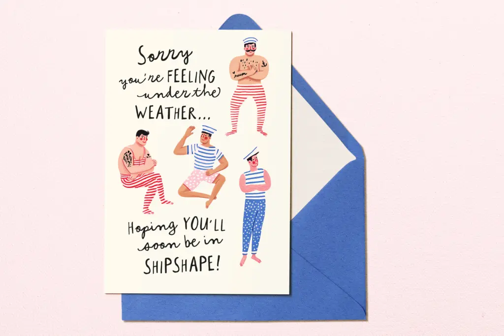
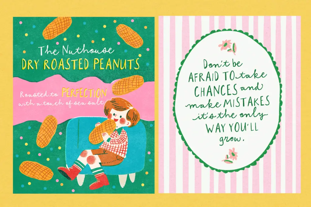
This is a font for small, warm, personal-feeling jobs: greeting cards, invitations, nursery or children’s branding, packaging for handmade goods, labels that want to feel friendly rather than corporate. The caps-and-script split gives you a built-in pairing for a logotype or card design — caps for a short name or headline, script for a tagline or signature line underneath — without having to hunt down a second typeface.
It’s not a font for body text or anything that needs to be read at length; the irregularity that makes it charming at display sizes becomes fatiguing in a paragraph. It also won’t suit a brand that wants to look grown-up, minimal, or premium — the childlike wobble is the whole point, and there’s no way to dial it back. Used within that lane, on short lines of text at generous sizes, it does its job cleanly and with more craft in the finishing than many competitors in the same category.
What we liked, and what we didn’t
Strengths
- The caps and lowercase scripts give two distinct looks from one font file
- Swash and ligature alternates genuinely improve the handwritten feel rather than sitting unused
- PUA encoding makes the extra characters accessible in apps like Canva that lack full OpenType support
Trade-offs
- The irregular baseline and monoline strokes become tiring at anything beyond short lines or headlines
- The childlike style locks it into a narrow stylistic lane with no way to look more restrained
Everything's Peachy does a well-worn job competently, with swash ligatures and PUA encoding that make it more usable in practice than many similar handwriting fonts. It's firmly a display font for short, playful lines, not a general-purpose typeface. If you need a cute, hand-drawn look for cards, labels or children's branding, it delivers exactly that and nothing more.

Tmfonts writes independent reviews of typefaces: what each font does well, where it falls short, what it suits, and where it is sold.