
National Park Font Bundle: five hand-drawn faces for outdoor and vintage branding
Design style
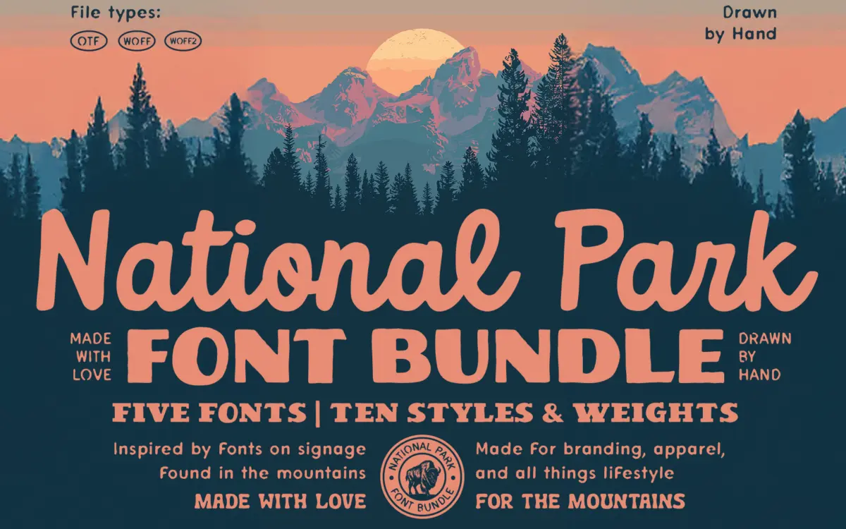
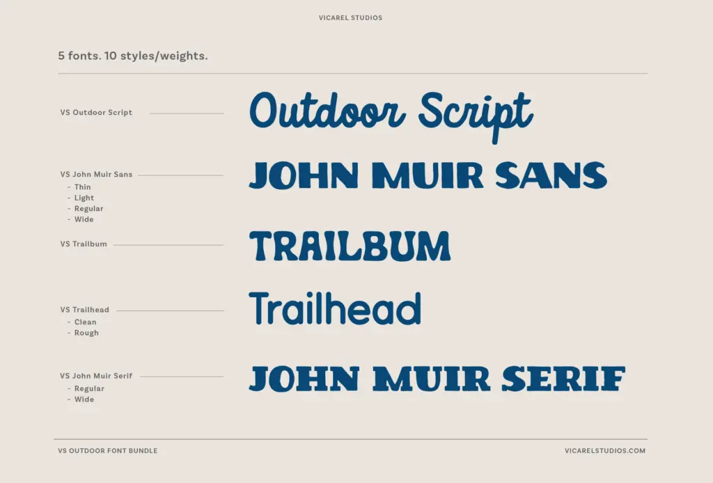
This is a bundle built around a single mood rather than a single construction principle: the worn, hand-cut look of mid-century national park posters and trail signage. Five typefaces are included — John Muir Sans, John Muir Serif, Outdoor Script, Trailbum and Trailhead — and they share a visibly hand-drawn origin. Strokes wobble just enough to read as lettered rather than vector-perfect, corners round off unevenly, and nothing in the set pretends to be a precision grotesque or a neutral text serif.
The sans and serif companions (John Muir Sans and John Muir Serif) are the steadiest pieces, with enough regularity to anchor a lockup. Trailbum and Trailhead lean further into the rustic, slab-adjacent display territory that reads instantly as park-sign lettering — thick, blunt, built for a few words at large sizes rather than for paragraphs. Outdoor Script is the loose, brush-inflected connector that ties the set together, closer to a signature than a formal calligraphic hand. None of these five typefaces is trying to be subtle; the whole point is a recognisable, slightly weathered Americana feel, and on that brief they’re consistent with each other.
Character set and features
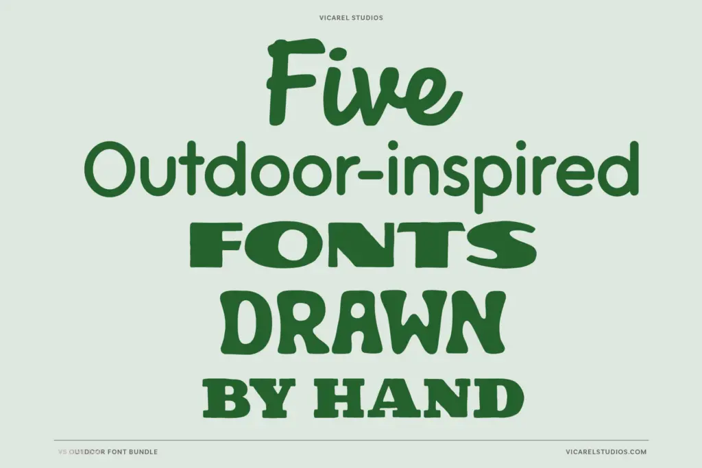
Across the ten included weights and styles, the seller notes that most fonts ship with alternates, ligatures and extra glyphs, though the exact set varies by typeface — worth checking the individual listings if a specific swash or connecting form matters to your layout. The script is where this kind of support earns its keep; a single fixed form for every letter would make a hand-lettered script feel stiff, so alternates are what let it avoid repetition across a line of type.
Files come as OTF, WOFF and WOFF2, so the set is usable in both print-oriented design software and on the web without conversion. Because the five faces are designed to be mixed, don’t expect each one to carry a full paragraph of body copy on its own — the display faces in particular are drawn for short runs: a logotype, a headline, a product name stamped on a label. Pushed into long-form text they lose the hand-drawn charm and start to look busy.
Use cases
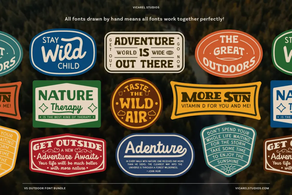
The obvious fit is exactly what the name promises: outdoor brands, trail and park merchandise, camp-adjacent apparel, and any packaging or label design chasing a rugged, vintage-outfitter look. Beer and coffee packaging, patch and sticker design, hiking gear branding, and seasonal park-themed posters all sit comfortably in this font’s wheelhouse. The combination of a script, a serif, a sans and two slab-ish display options means a single project can pull a logotype from one, a tagline from another, and body text from a third without hunting for a separate pairing.
It’s less suited to anything that needs to read as corporate, minimal or digital-native — the hand-drawn irregularity works against a clean tech or SaaS identity. And because the whole bundle commits hard to one aesthetic, it’s not a toolkit for a brand that might later want to pivot away from the rustic-outdoors look; swapping it out means swapping the whole visual identity, not just a font.
What we liked, and what we didn’t
Strengths
- Five faces designed to work together, so a single project can source its whole type system from one bundle
- Alternates and ligatures in the script keep repeated letters from looking mechanical
- Delivered in OTF, WOFF and WOFF2 so it works equally in print layouts and on the web
Trade-offs
- The display faces are built for short bursts of text and lose their charm in longer copy
- The hand-drawn rustic look is a strong, singular aesthetic that won't suit brands needing a neutral or minimal register
A cohesive set of five hand-drawn faces that commit fully to a rustic national-park aesthetic, with a sans, serif, script and two display options designed to mix and match. It's a strong pick for outdoor, camp and vintage-outfitter branding but a poor fit anywhere that calls for restraint or long-form reading.
Verdict

Tmfonts reviews typefaces in depth — every font is tested in real branding, editorial and screen layouts before a word gets written. 555+ fonts reviewed and counting.