
Wrangler & Extra: a rugged Western trio built for rodeo and ranch branding
Design style
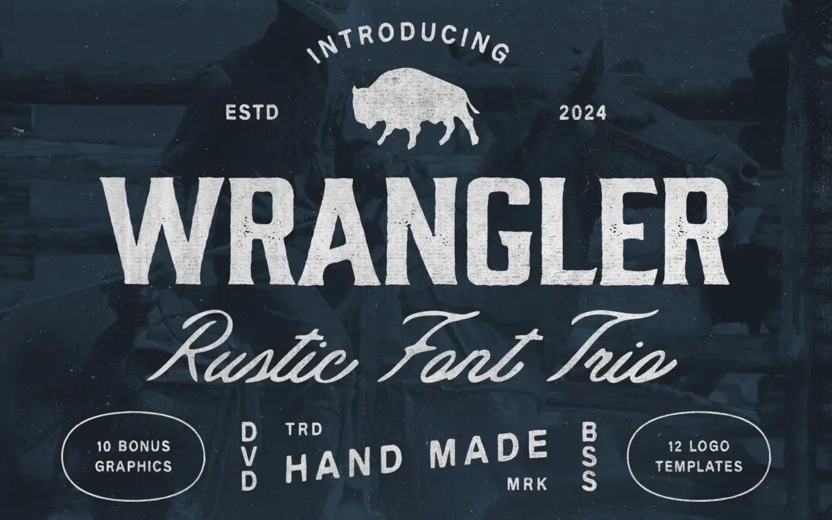
Wrangler & Extra is a three-way family pitched squarely at Western and frontier branding: a bold Display face, a flowing Script companion, and a Condensed cut for tighter settings. The Display carries the weight of the set, with thick, slightly uneven strokes that read as hand-cut rather than vector-perfect. Corners are blunt, stems taper unevenly, and the overall texture leans toward the carved-wood-sign look that Western branding relies on. The Script is looser and more casual, with connecting strokes that wobble just enough to suggest a brush or marker rather than a plotter. The Condensed is the most restrained of the three, narrowing the letterforms without losing the handmade roughness, useful where the Display would feel too heavy.
None of the three styles aim for precision. The irregularity is the point — this is a family built on the assumption that a design needs grit, not polish. That’s a legitimate design decision, but it does mean the typeface commits hard to one mood. There’s no clean, neutral mode to fall back on if a project needs it.
Character set and features
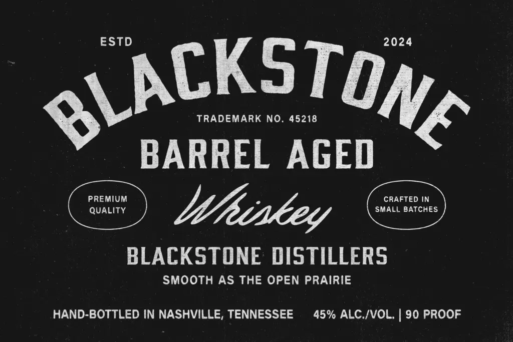
Each style covers the standard Latin character set along with numerals and basic punctuation, enough for the badges, labels, and signage this font is designed to produce. The ten hand-drawn illustrations — cacti, horseshoes, longhorn skulls, that general territory — are clearly meant to be dropped alongside the type rather than used as a separate asset, and the twelve logo templates function as starting layouts rather than fonts in their own right. They’re a genuine time-saver for someone building a badge logo from scratch, but they’re also the kind of bundled extra that dates a design quickly if used verbatim — distinctive illustration styles get recognised fast once they’re attached to a popular font pack.
The three-style structure is the more durable asset here. Having Display, Script, and Condensed drawn to the same rough, handcrafted logic means a designer can build a full badge — bold word at the centre, script flourish underneath, condensed fine print around the rim — without reaching for a second typeface. That internal pairing is well thought through, even if each individual style is fairly narrow in what it can do.
Use cases
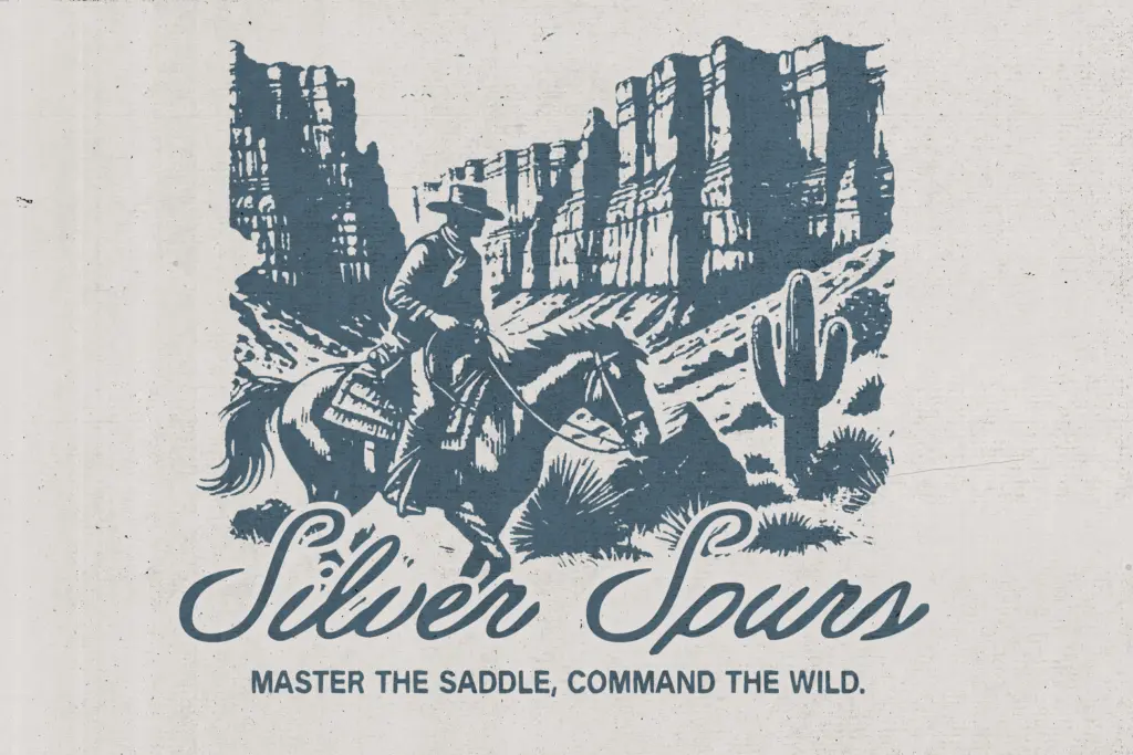
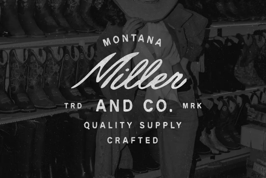
This is a font for a specific job: craft beer labels, farm and ranch branding, rodeo posters, denim and leatherwork packaging, Americana-themed restaurant signage. Anywhere the brief calls for
What we liked, and what we didn’t
Strengths
- The three styles are drawn to share the same rough, hand-cut logic, so they combine cleanly into one badge composition
- Condensed cut gives genuine flexibility for tight spaces without losing the handmade texture
- Bundled illustrations and logo templates speed up a first draft for ranch or rodeo branding
Trade-offs
- The deliberate roughness means there's no clean, neutral mode if a project needs restraint
- Bundled illustration assets will become recognisable once the pack sees wide use, undercutting uniqueness
Wrangler & Extra does one job well: rough, handmade Western branding with a built-in Display/Script/Condensed pairing for badge logos. It's not a typeface for anything outside that lane, and the bundled illustrations risk looking familiar once the pack circulates. For ranch, rodeo, or Americana packaging work, it's a solid, honest tool rather than a remarkable one.
Verdict

Tmfonts reviews typefaces in depth — every font is tested in real branding, editorial and screen layouts before a word gets written. 555+ fonts reviewed and counting.