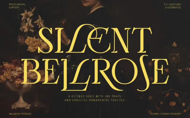
Bellrose: an ornamental display serif for editorial and luxury branding
Design style Bellrose sits in the familiar territory of high-contrast display serifs built for headlines rather than paragraphs. The stroke…
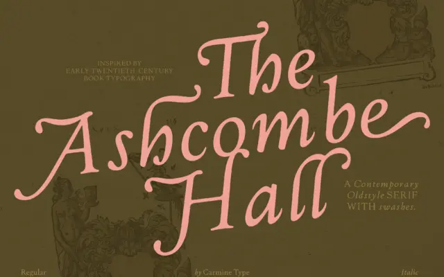
Design style The Ashcombe Hall sits in the oldstyle tradition: moderate stroke contrast, angled stress, bracketed serifs, and a lowercase…
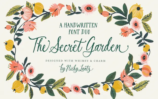
Design style The Secret Garden is a two-face duo built around a hand-lettered script with deliberately rough, broken edges, paired…
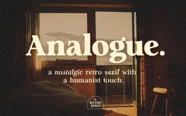
Design style Analogue sits in that familiar territory where retro signage lettering meets a humanist serif skeleton. The strokes carry…
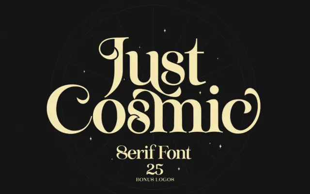
Design style Just Cosmic sits in that familiar territory of serifs built to look hand-finished rather than drafted with a…
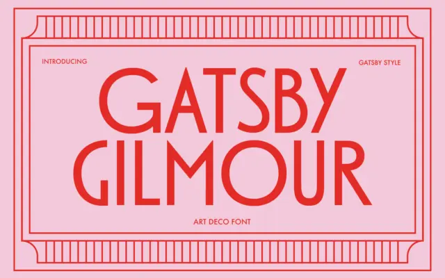
Design style Gatsby Gilmour is a geometric sans drawn from the Art Deco playbook: tall uppercase letters built on simple…
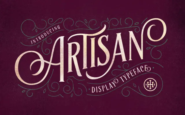
Design style Artisan Display Typeface is an uppercase-only serif built for signage-style composition rather than continuous reading. The letters lean…
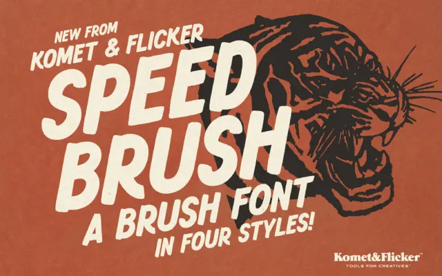
Design style Speed Brush leans into the lettering tradition of hand-painted signage and old speed-shop decals: loaded brushes, uneven pressure,…
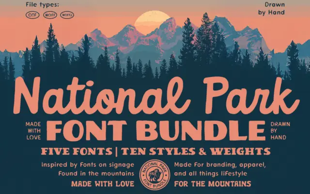
Design style This is a bundle built around a single mood rather than a single construction principle: the worn, hand-cut…