
Gatsby Gilmour: a geometric Art Deco display face for luxury branding
Design style
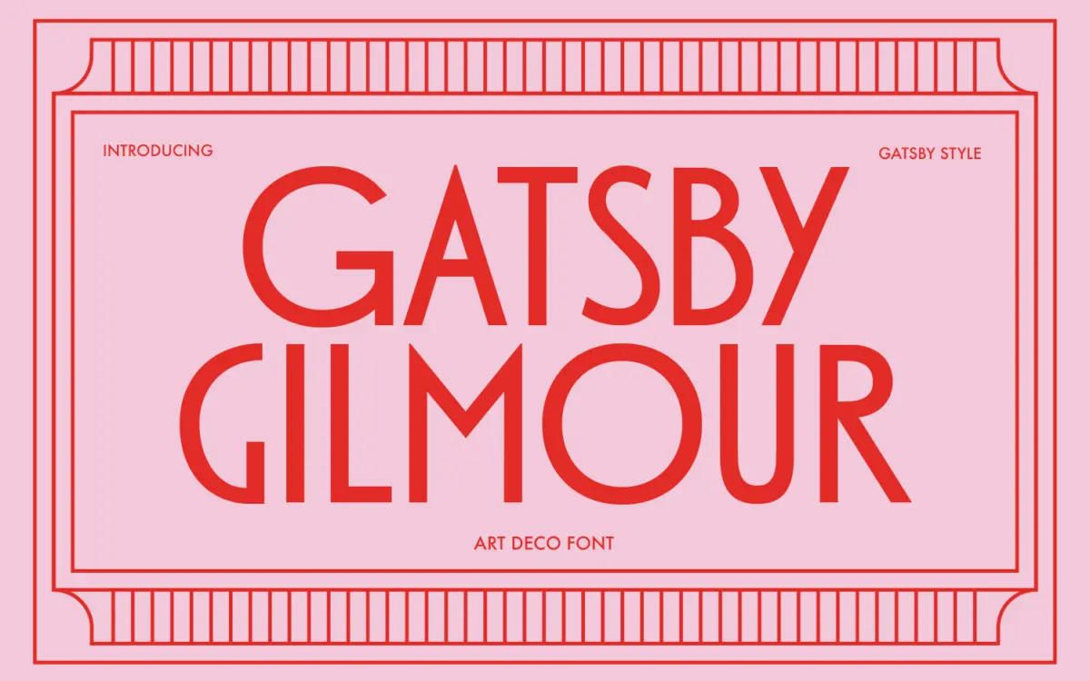
Gatsby Gilmour is a geometric sans drawn from the Art Deco playbook: tall uppercase letters built on simple circles and straight diagonals, with the kind of even, confident stroke weight you’d expect on a 1920s theatre marquee. The geometry is the whole point here. Round letters like O and Q read as near-perfect circles, the M splays its legs wide, and verticals hold a consistent weight that gives the whole set a stamped, architectural feel rather than a drawn one.
It leans more decorative than the average geometric sans. Several characters carry small flourishes or an extra stroke detail that nods to the era rather than the strict Bauhaus geometry you’d see in a more utilitarian face. That mix of mechanical precision and ornamental touch is where the Deco reference actually lives, rather than just in the marketing copy.
Character set and features
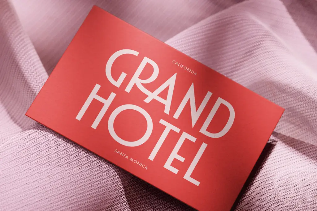
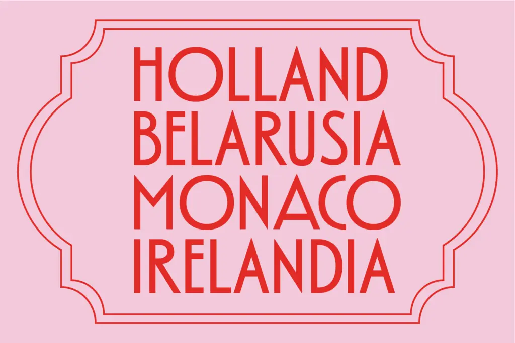
The design is built around its capitals, and that’s where the effort clearly went. Letterforms are tall, evenly spaced, and designed to be read large rather than set in paragraphs. There’s no sense that this was drawn with a lowercase-heavy text setting in mind, and a typeface this geometric in its capitals often loses some of its character once you’re forced into smaller, denser sizes.
Spacing between letters has been set generously, which suits a face meant for short words and headline treatments — tracking out a geometric Deco cap at small sizes is a common fix, and Gatsby Gilmour seems to have accounted for that already. There isn’t anything here that suggests extensive language support or an extended family of weights; treat it as a single-style display tool rather than a flexible text system.
Use cases
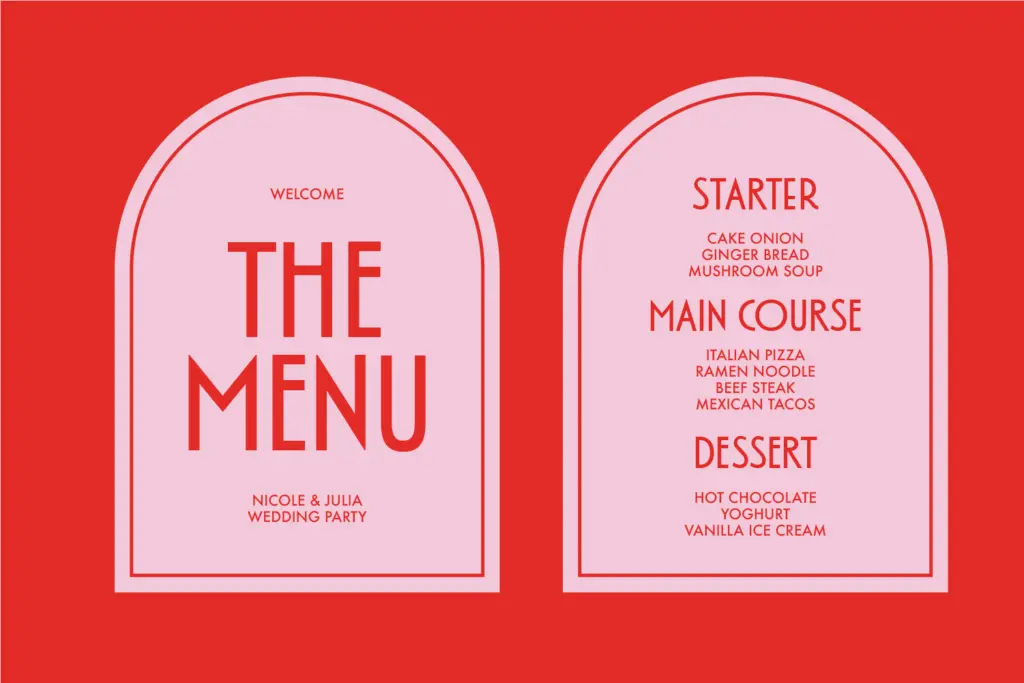
This is a logotype and headline font first. Short words — brand names, event titles, poster headers — are where the geometric rhythm reads cleanly and the Deco references land. Think cocktail bar signage, boutique hotel branding, wedding invitation headers, or packaging for a product that wants to signal old-world glamour rather than contemporary minimalism.
It will struggle anywhere you need it to carry a sentence. Set this in a paragraph and the uniform stroke weight and tight geometric shapes start to work against reading speed; your eye has to do more work distinguishing letters that are built from the same handful of circular and straight components. Pair it with a plainer serif or sans for body copy and let Gatsby Gilmour handle the words that need to be looked at rather than read quickly.
For designers working on vintage-themed identity projects, this is a reasonable shortcut to the Deco mood without having to draw custom lettering. It won’t flex into a modern minimalist brand system, and it isn’t trying to — the value is in how specifically it commits to one visual era and does it without diluting the reference.
What we liked, and what we didn’t
Strengths
- Confident, consistent geometric construction that reads clearly as 1920s Deco
- Generous default spacing suited to short headline and logotype use
- Distinct period character without feeling like a costume cliché
Trade-offs
- Not built for body text — legibility drops quickly in paragraph settings
- Limited apparent range of weights or language support compared to a full family
Gatsby Gilmour commits fully to its Art Deco reference with clean geometric capitals that work well in short headline settings. It's a single-purpose display tool, not a flexible text system, so judge it on that basis rather than expecting it to carry body copy.
Verdict

Tmfonts reviews typefaces in depth — every font is tested in real branding, editorial and screen layouts before a word gets written. 555+ fonts reviewed and counting.