Sans Serif
3.7
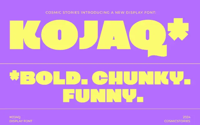
KOJAQ: a heavyweight extra-bold sans for headlines that need to shout
Design style KOJAQ is an extra-bold sans built around thick, even strokes and tight counters. The weight sits at the…
 Tmfonts

Design style KOJAQ is an extra-bold sans built around thick, even strokes and tight counters. The weight sits at the…
Tmfonts
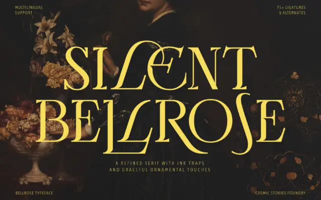
Design style Bellrose sits in the familiar territory of high-contrast display serifs built for headlines rather than paragraphs. The stroke…
Tmfonts
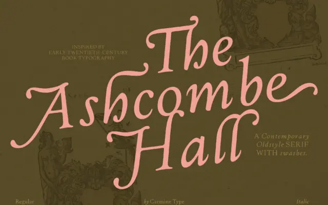
Design style The Ashcombe Hall sits in the oldstyle tradition: moderate stroke contrast, angled stress, bracketed serifs, and a lowercase…
Tmfonts
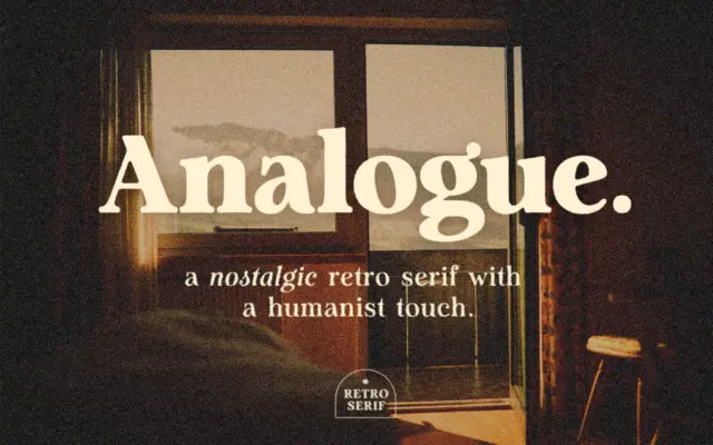
Design style Analogue sits in that familiar territory where retro signage lettering meets a humanist serif skeleton. The strokes carry…
Tmfonts
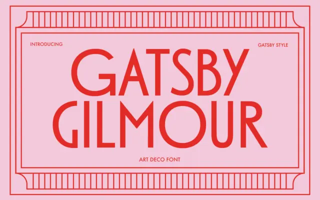
Design style Gatsby Gilmour is a geometric sans drawn from the Art Deco playbook: tall uppercase letters built on simple…
Tmfonts
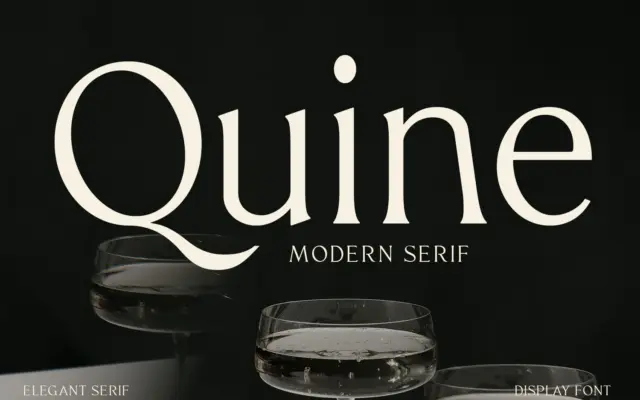
Design style Quine sits in the modern serif tradition that runs from Didone-era display faces through to today’s fashion-magazine mastheads.…
Tmfonts
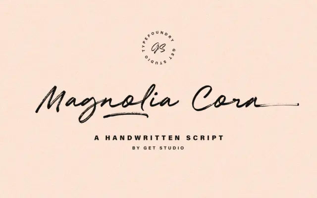
Design style Magnolia Cora Script is built around the idea of a dry brush dragged across paper rather than a…
Tmfonts
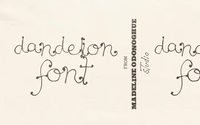
Design style Dandelion is a hand-drawn display font built around a loose, botanical line. The strokes wobble slightly, the stems…
Tmfonts
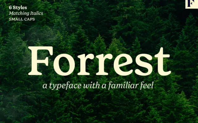
Design style Forrest is a serif built on nostalgia rather than novelty. The letterforms read as a reworking of old…
Tmfonts