
Forrest Friendly Serif: a warm, archive-inspired serif for brands with a story
Design style
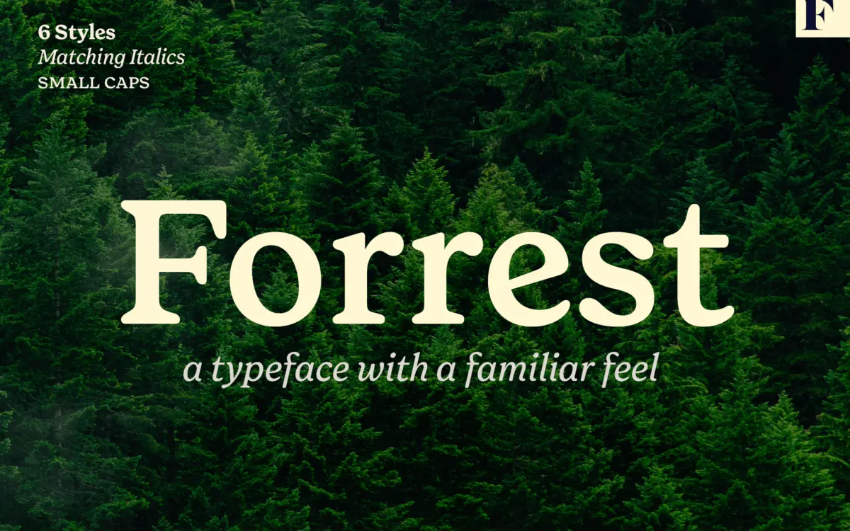
Forrest is a serif built on nostalgia rather than novelty. The letterforms read as a reworking of old bookmaking types — moderate contrast, bracketed serifs, and a slightly condensed rhythm that feels more hand-set than digitally optimised. There’s warmth in the curves: bowls are slightly irregular, terminals are blunt rather than sharp, and the whole family avoids the clinical precision you’d get from a more geometric revival. It doesn’t try to be clever. It tries to feel familiar, and mostly succeeds.
Where it earns its keep is in the details that separate a generic serif from one with a point of view: the swash capitals have enough swing to feel considered without tipping into decorative excess, and the small caps are genuinely small caps — not scaled-down regulars — so they sit comfortably next to lowercase text. The old style figures, with their varying heights, do a lot of the heavy lifting in giving Forrest its editorial, slightly bookish character. It’s a design that rewards close reading rather than a glance from across the room.
Character set and features
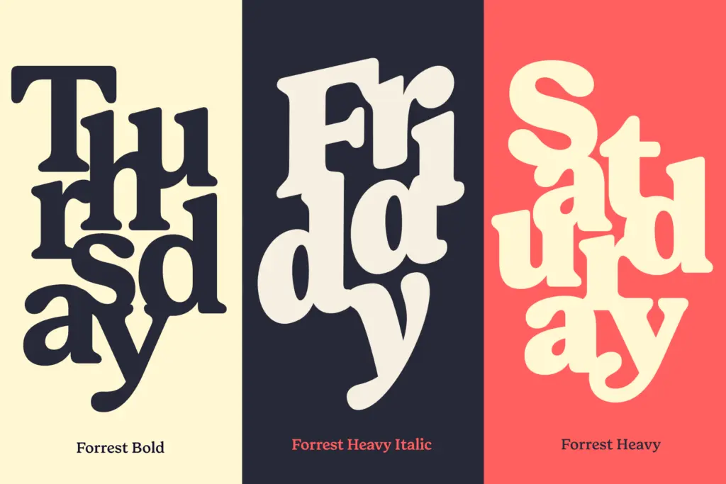
The family leans on OpenType features to do its storytelling: contextual swashes, alternates, and the small caps mentioned above are all accessed through features rather than built permanently into the default glyphs, which keeps the base set calm and usable. That’s a sensible structure — you get a clean working serif by default, with the flourish available when a layout calls for it, rather than forced on every word.
The alternates are worth exploring rather than ignoring. Swapped letterforms on certain capitals and a handful of lowercase characters give headlines a bit of personality without requiring a second typeface. The old style figures are a genuine asset for anyone setting running text with numerals — invoices, editorial body copy, price lists — where lining figures can feel visually loud. None of this is groundbreaking; it’s competent, well-judged craft rather than invention, which is really what the brief for a typeface like this calls for.
Use cases
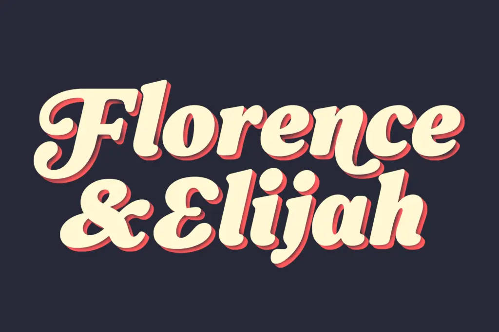
Forrest is suited to branding and identity work that wants to borrow credibility from the past — heritage food and drink labels, independent publishing, craft retail, anything that benefits from a sense of having been around a while even if it hasn’t. The swashes and small caps make it a reasonable choice for packaging and logotype work where a single distinctive word needs to carry weight.
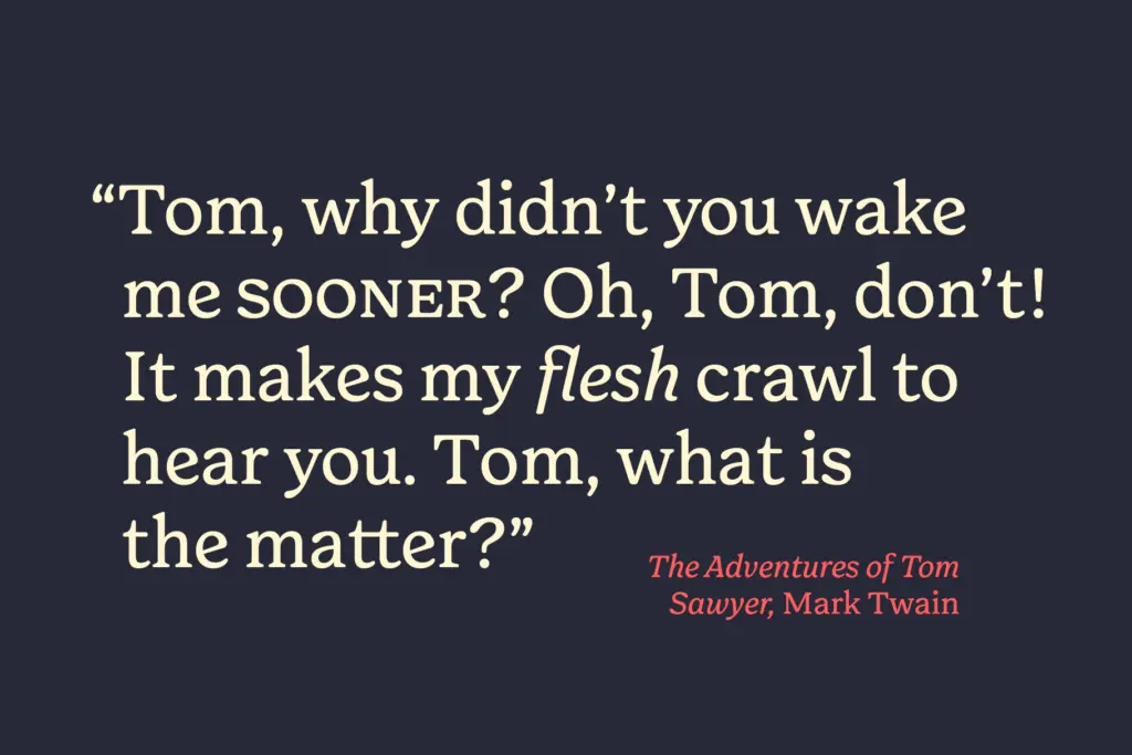
In long-form editorial settings it holds up at body text sizes reasonably well, though its slight condensation and moderate contrast mean it wants generous line spacing to avoid feeling cramped in narrow columns. It’s less convincing as a pure display face pushed to very large sizes — the charm is in the texture of the whole word, not in any single dramatic letterform, so it can look slightly flat blown up huge on its own with no supporting elements. Pair it with a plain, unfussy layout and let the serif do the talking; surround it with too much other ornamentation and the effect gets muddy.
What we liked, and what we didn’t
Strengths
- Old style figures and genuine small caps give it real editorial utility
- Swash alternates add personality without overwhelming the base design
- Moderate contrast and bracketed serifs make it comfortable at body text sizes
Trade-offs
- Loses impact at very large display sizes when used alone
- Condensed rhythm needs generous line spacing in narrow columns
Forrest Friendly Serif is a dependable, well-crafted serif with enough old-fashioned character to stand out from the flood of minimal revivals, without reinventing anything. It's best suited to branding and editorial projects that want warmth and a sense of history rather than a bold display statement. Not groundbreaking, but honest and usable.
Verdict

Tmfonts reviews typefaces in depth — every font is tested in real branding, editorial and screen layouts before a word gets written. 555+ fonts reviewed and counting.