
Gistesy Signature Collection: a brush-style signature script for branding and invitations
Design style
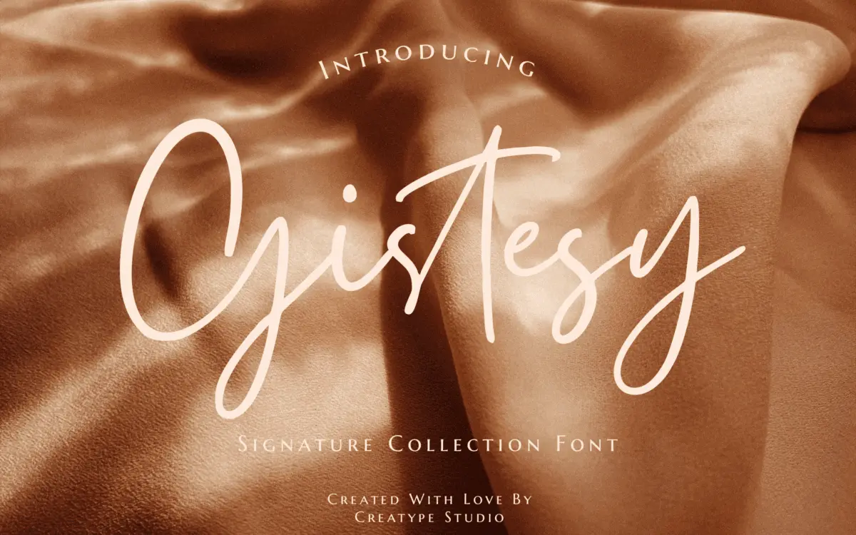
Gistesy belongs to the crowded family of signature-style scripts built to look like a fast, confident hand with a brush or soft-tipped pen. The strokes swell and taper quickly, the baseline dips and rises letter to letter, and the overall impression is of something dashed off rather than ruled. It leans casual rather than formal, closer to a flourished autograph than to a copperplate hand. There’s nothing severe or especially inventive in the construction — the entry strokes, the loop shapes, the way descenders curl back on themselves all sit within territory this genre has covered many times — but the drawing is even and the slant is consistent, which keeps the
What we liked, and what we didn’t
Strengths
- Consistent slant and even stroke weight keep words from looking patched together
- Ligature set smooths over the usual awkward letter collisions in script faces
- PUA encoding means every alternate is reachable without a glyphs panel
Trade-offs
- The letterforms don't distinguish themselves from dozens of similar signature scripts on the market
- Legibility drops quickly below display sizes, limiting it to short settings
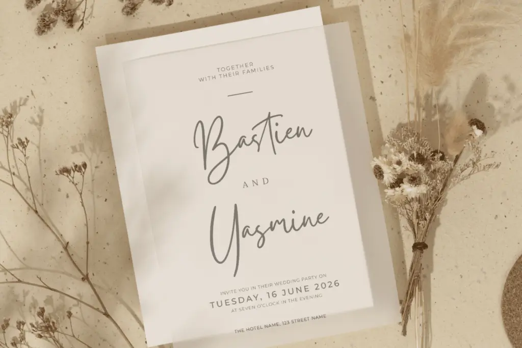
Gistesy is a competent signature-style script that does the job asked of it without pushing the genre forward. It reads well as a short logotype or a line of invitation copy, but strain shows at small sizes or in long sentences. Fine for branding and one-off social graphics, unremarkable as a general-purpose script.
Verdict

Tmfonts reviews typefaces in depth — every font is tested in real branding, editorial and screen layouts before a word gets written. 555+ fonts reviewed and counting.