
The Secret Garden Font Duo: a rough-edged script and serif pairing for rustic branding
Design style
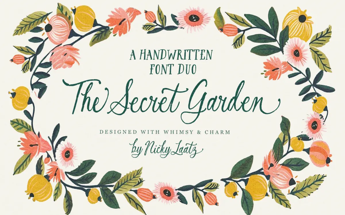
The Secret Garden is a two-face duo built around a hand-lettered script with deliberately rough, broken edges, paired with a matching serif. The script leans into an unpolished, slightly textured line — strokes thin and thicken unevenly, as if drawn with a worn nib rather than a brush, and the connections between letters have a loose, hand-done quality rather than the smoothed-over flow you get from more commercial script faces. It reads as storybook rather than formal: there’s a cottage-garden, old-paper feel to it that sits closer to illustration than to calligraphy.
The companion serif is drawn with the same whimsical hand, low contrast, slightly irregular axis, letterforms that wobble just enough to feel handmade without tipping into illegibility. A heavier cut of the serif is included with less contrast, intended for smaller sizes — a sensible nod to the fact that rough, textured letterforms tend to clog or disappear as text shrinks.
Character set and features
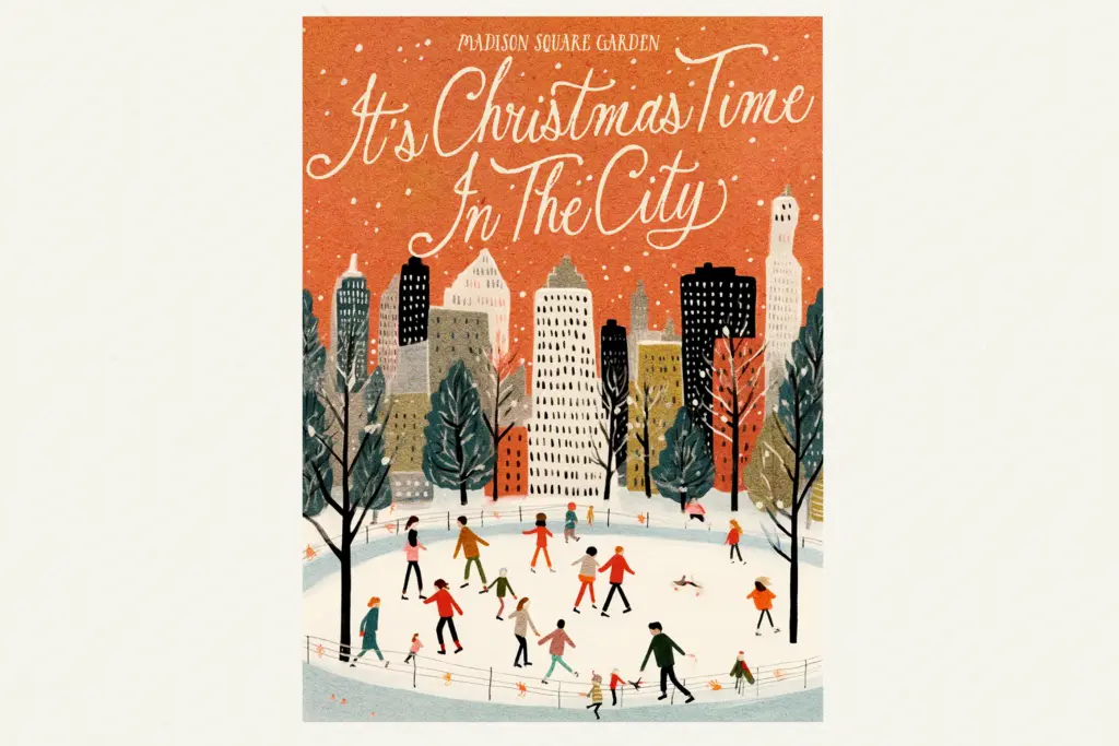
The script carries a genuinely deep alternate set — around ninety letter alternates by the designer’s count — along with swashed end letters and double-letter ligatures. In practice this means a word like “little” or “garden” can be set without repeating the same letterform twice, which matters a great deal in a face this characterful, since repetition is what exposes a script’s limits fastest. The two optional script variants, differing slightly in height and slant, give you a second flavour of the same idea without having to rebuild a layout from scratch.
Access to the extended character set is via PUA encoding, which means the alternates and ligatures sit outside standard OpenType feature panels and are reached by copying glyphs from a character map app rather than toggling stylistic sets in design software. That’s a workable system, but it’s manual — there’s no automatic contextual substitution, so getting the full benefit of the alternates means setting each word by hand and swapping letters in deliberately. Worth knowing before you commit to a long piece of running text. Language support covers a reasonable spread of Western European languages, including several with specific diacritic needs like Danish, Norwegian and Luxembourgish.
Use cases
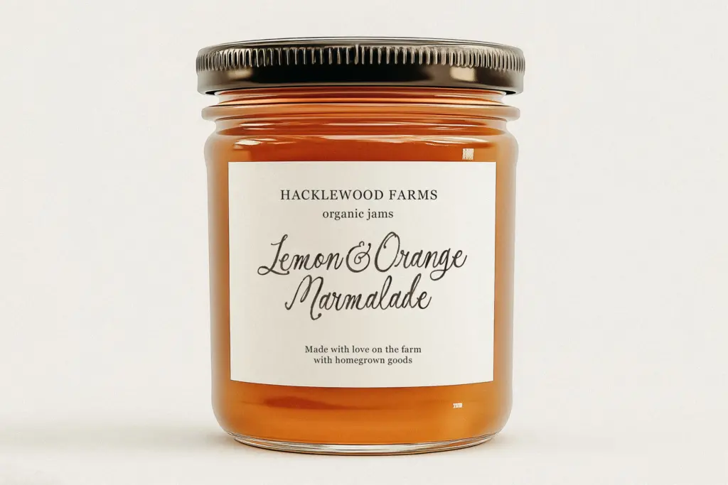
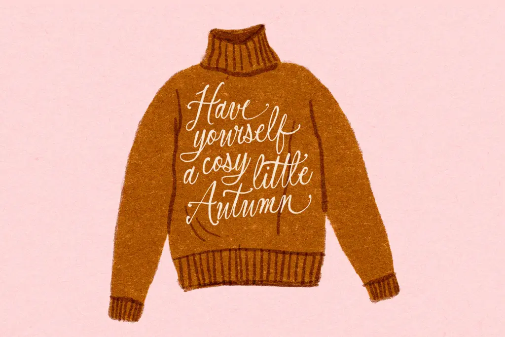
This duo is built for short, decorative settings rather than body copy: greeting cards, rustic product labels, invitations, farmhouse-style signage, packaging for small-batch goods, the kind of branding that wants to feel hand-finished rather than manufactured. The script works best at display sizes where its rough edges and alternates can actually be seen and appreciated — shrink it too far and the texture that gives it character starts to read as noise. The heavier serif cut earns its keep here, functioning as a legible companion for body text, taglines or secondary information where the lighter serif would start to feel fragile. Together they suit single-page pieces — a label, a card front, a logotype — more comfortably than a multi-page document, where the manual nature of the alternates would become a slog to maintain consistently.
What we liked, and what we didn’t
Strengths
- Deep alternate and ligature set helps avoid repeated letterforms in a single word
- Heavier serif cut gives a legible option for smaller sizes where the lighter serif thins out
- Two script variants offer a quick way to shift mood without rebuilding a layout
Trade-offs
- PUA-only encoding means alternates must be copied in manually rather than toggled as OpenType features
- Rough, textured strokes lose definition quickly below display sizes
The Secret Garden Font Duo is a characterful, hand-drawn script and serif pairing with a genuinely deep alternate set, well suited to short, decorative work like labels and invitations. Its PUA-only access to alternates and ligatures means real manual effort for full-length pieces, and the rough texture that gives it charm limits how small it can go. A solid pick for rustic branding, less so for anything needing fluent long-form typesetting.
Verdict

Tmfonts reviews typefaces in depth — every font is tested in real branding, editorial and screen layouts before a word gets written. 555+ fonts reviewed and counting.