
The Ashcombe Hall Oldstyle Serif: an editorial serif built for swashes and ligatures
Design style
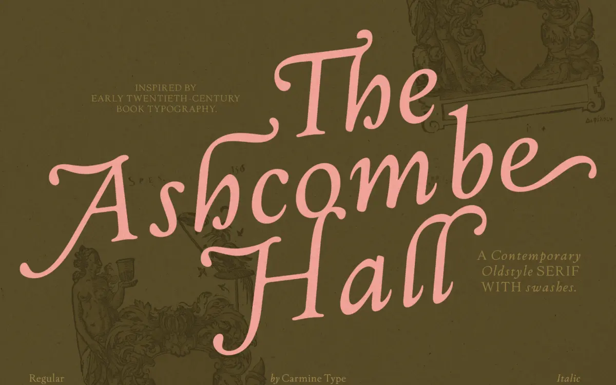
The Ashcombe Hall sits in the oldstyle tradition: moderate stroke contrast, angled stress, bracketed serifs, and a lowercase that reads warm rather than mechanical. It leans on the look of early twentieth-century book faces without trying to be a strict revival. The proportions are generous — wider counters than you’d expect from something marketed as luxury or editorial — which keeps the text colour even rather than fussy.
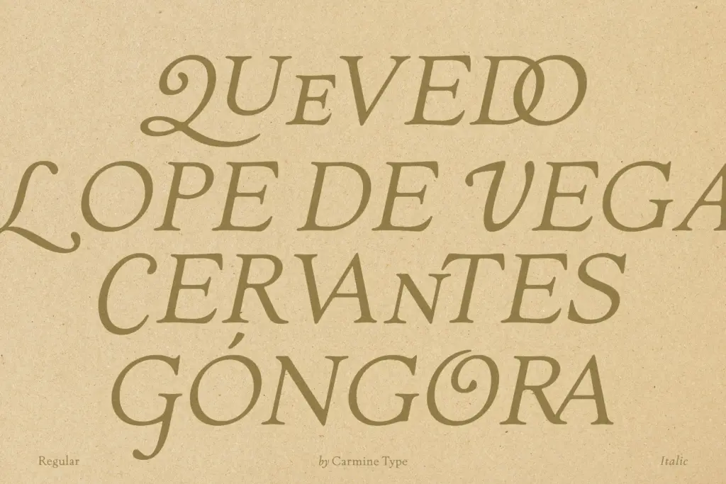
Where it departs from a plain book serif is in the amount of calligraphic detail layered on top. Swash capitals, flowing ascenders and descenders, and alternates borrowed from pen lettering are all present, and they are drawn with some care — the swashes taper properly rather than just curling off the end of a stroke. This is clearly a typeface designed to be shown off at display sizes as much as read in paragraphs.
Character set and features
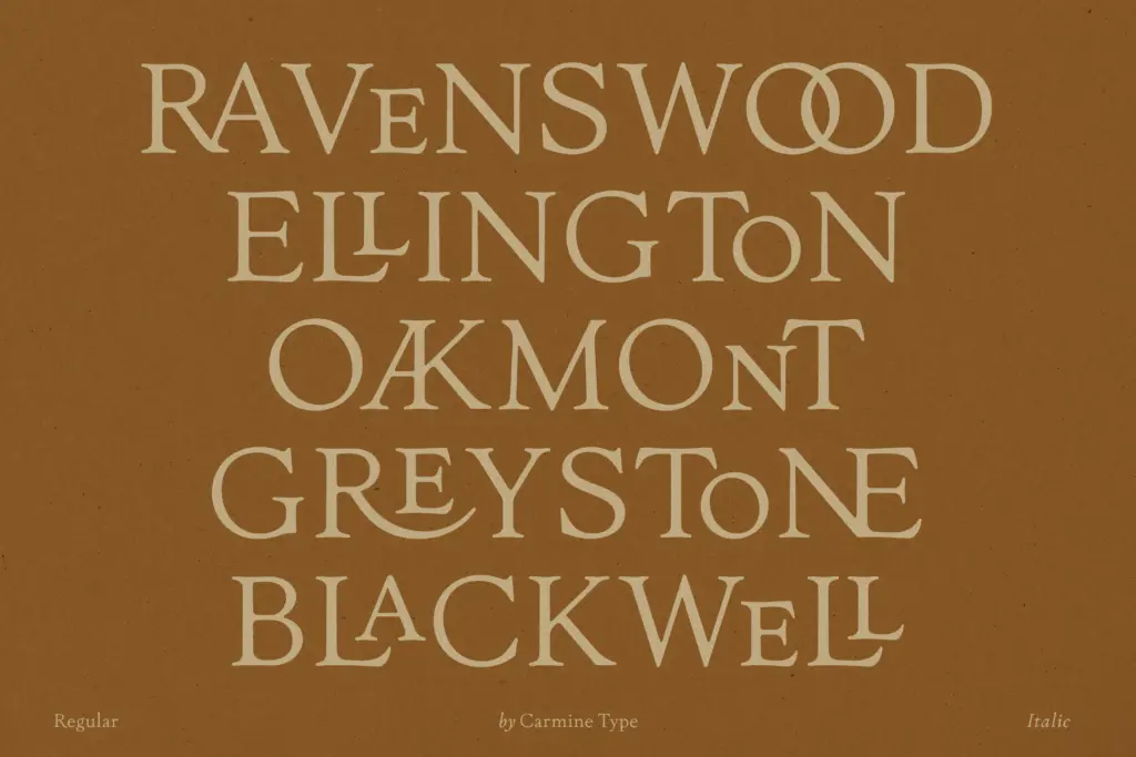
The headline feature here is the ligature set: over 100 per style, more than 200 across the family. That is a large number, and it shows in how many letter combinations have been considered — not just the usual ct, st, fi, fl pairs but longer, more theatrical joins intended for wordmarks and short headlines. Used sparingly, these give a logotype or a cover line a handmade quality that a plain serif can’t fake. Used carelessly, they’ll fight each other on the page, and setting a full paragraph with alternates switched on will read as noisy rather than elegant — this is a font that rewards restraint from the person typesetting it, not one that looks after itself.
Beyond the decorative layer, the family includes oldstyle figures, which sit happily inline with lowercase text in running copy, dates and prices. Fractions, superscripts and subscripts round out the editorial toolkit, and broad multilingual support is listed, which matters if you’re setting text beyond English. The core letterforms, stripped of swashes, are legible and reasonably restrained — the ornamentation is additive, not baked into every glyph, so you can dial the personality up or down depending on the OpenType features you activate.
Use cases
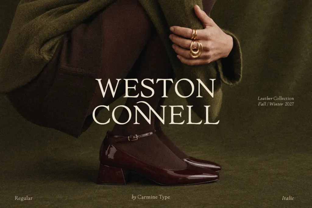
This is a font for projects where typography is allowed to be a visual element rather than just a vehicle for text — wedding stationery, packaging for a boutique product, a masthead, a brand identity that wants some old-world warmth. The swash capitals and ligatures do real work in a logotype or a short headline where you can afford to pick and choose glyphs by hand.
For long-form editorial setting — body copy in a magazine or book — the plain, undecorated forms hold up fine at text sizes, and the oldstyle figures and fractions suggest the designer had that use in mind too. But the feature set is really calibrated for display and branding work; anyone setting large amounts of body text should expect to use the restrained default glyphs and leave the swash alternates for pull quotes, drop caps or the title page.
What we liked, and what we didn’t
Strengths
- Large, genuinely varied ligature and swash set rather than a token handful
- Oldstyle figures and fractions make it workable for editorial detail work
- Plain letterforms underneath the ornamentation stay legible and even at text sizes
Trade-offs
- Heavy use of alternates across running text quickly becomes visually noisy
- Its strengths are concentrated in display and branding use, less distinctive as a pure body-text serif
The Ashcombe Hall Oldstyle Serif pairs a solid, warm book-serif skeleton with an unusually deep library of swashes and ligatures. It's at its best in branding, packaging and headline work, where the decorative glyphs can be chosen deliberately rather than applied wholesale.
Verdict

Tmfonts reviews typefaces in depth — every font is tested in real branding, editorial and screen layouts before a word gets written. 555+ fonts reviewed and counting.