
Bellrose: an ornamental display serif for editorial and luxury branding
Design style
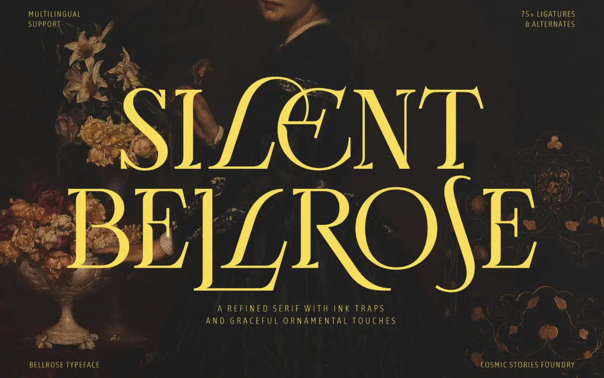
Bellrose sits in the familiar territory of high-contrast display serifs built for headlines rather than paragraphs. The stroke contrast is pronounced — thin hairlines pulled against thicker stems — and the ink traps at the joins are doing real work here, not just decoration. At large sizes those traps read as crisp notches that keep the letterforms from looking soft or melted where curves meet stems.
The vintage reference is there but it’s not laid on thick. Terminals are sculpted rather than blunt, and there’s a slight formality to the rhythm of the lowercase that recalls engraved typography without copying it outright. It’s a font with a clear point of view: controlled, a little theatrical, happy to be looked at rather than skimmed. Where it occasionally overreaches is in the more ornamented alternates, where the flourish can tip from confident into fussy if used without restraint.

Character set and features
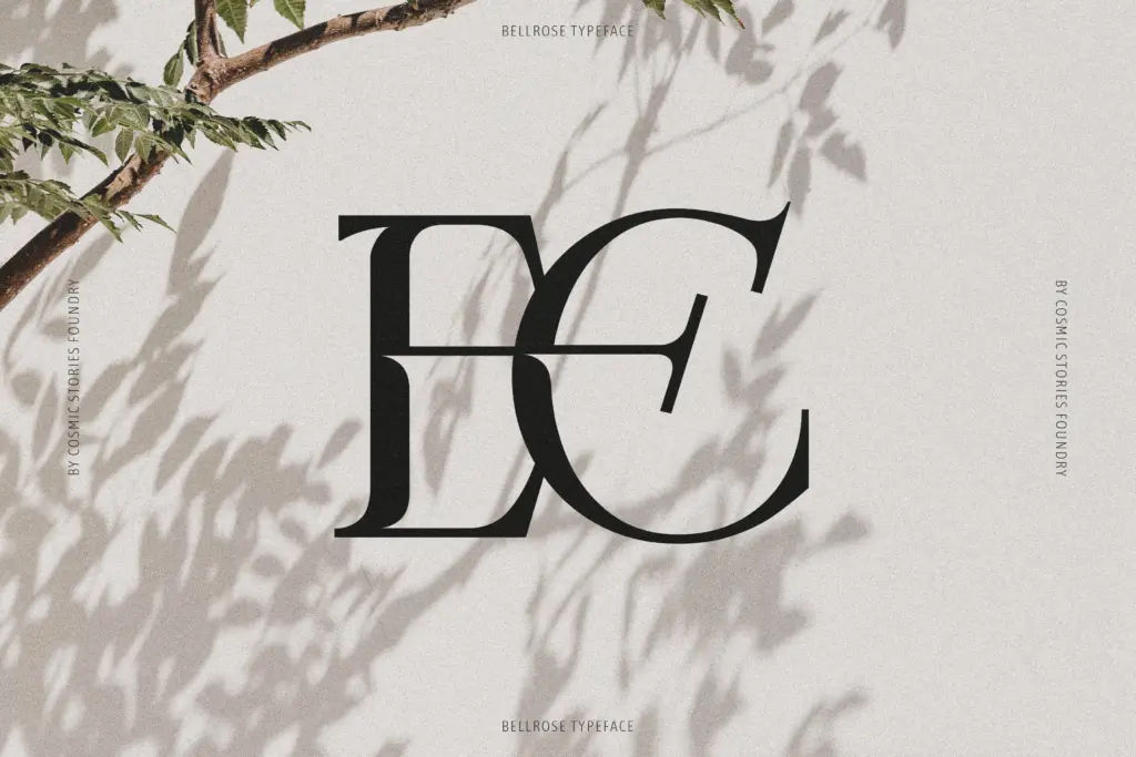
The ligature set is the main technical selling point, and it’s a generous one — the brief cites over 75, which suggests the designer was thinking about connective tissue between letters as much as the letters themselves. Used well, these ligatures smooth out awkward pairings that plague most display serifs (double f’s, th, ct combinations) and give the typeface a handwritten continuity it wouldn’t otherwise have. Stylistic sets add further variation for anyone wanting to dial the personality up or down within the same composition.
Multilingual support covering Western, Central and Eastern European languages is a practical plus for anyone working across European markets, and it means accented characters have been drawn with the same care as the base set rather than bolted on as an afterthought. As a display face, don’t expect it to do heavy lifting at body-copy sizes — the contrast and ink traps that make it distinctive at 60pt will start to clog and blur well before you reach paragraph scale.
Use cases
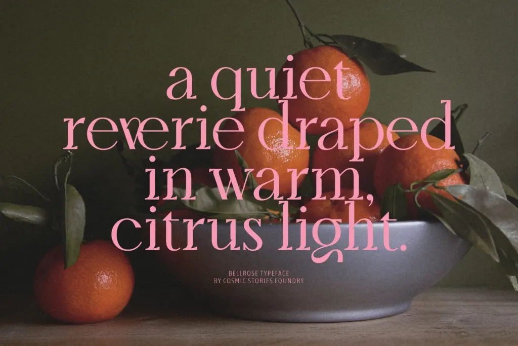
Bellrose is built for headlines, mastheads, logotypes, and the kind of short-form luxury copy that gets set once and looked at for a long time: a fashion editorial’s opening spread, a packaging label, a wedding invitation’s lead line. Its drama is quiet rather than loud, so it works best when given space — generous tracking, plenty of white around it, and nothing competing for the eye on the same page.
It’s less suited to anything that needs to carry a lot of text or hold up at small sizes, and it’s not a typeface for brands wanting to feel contemporary or neutral — the ornamentation and historical references are doing deliberate work and will push a design toward heritage, craft, and formality whether or not that’s the intended message. For the right brief, that specificity is the whole appeal.
What we liked, and what we didn’t
Strengths
- Ink traps and contrast are drawn with real precision rather than applied as a filter
- The ligature set genuinely smooths awkward letter pairings instead of just adding flourish
- Multilingual character support makes it usable beyond a single market
Trade-offs
- Legibility drops off quickly below display sizes, so it's unsuitable for body text
- Heavy ornamentation can tip into fussiness if alternates and ligatures aren't used with restraint
Bellrose is a confident, well-drawn display serif with genuine ornamental craft in its ligatures and ink traps. It's built for headlines and branding moments, not for reading at length, and its heritage-leaning character narrows the range of brands it will suit. For editorial titles, packaging, and fine stationery, it earns its drama.
Verdict

Tmfonts reviews typefaces in depth — every font is tested in real branding, editorial and screen layouts before a word gets written. 555+ fonts reviewed and counting.