
Analogue: A Humanist Retro Serif for Nostalgic Branding and Editorial Work
Design style
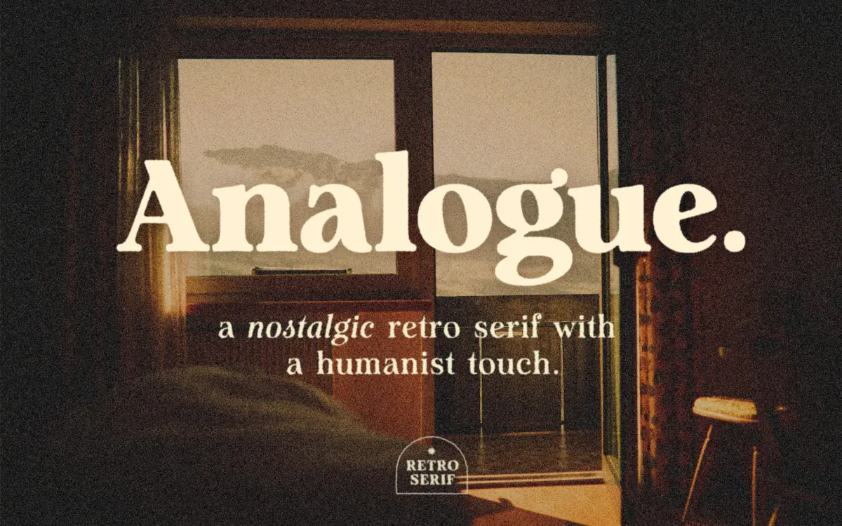
Analogue sits in that familiar territory where retro signage lettering meets a humanist serif skeleton. The strokes carry moderate contrast, not the high-drama swing of a display didone, but enough to give the letters some shape under pressure. Terminals are rounded rather than sharp, and the overall rhythm leans warm rather than mechanical. It reads as a typeface built to evoke mid-century print without copying a specific historical source too literally.
What keeps it from feeling like a costume piece is the restraint in the detailing. The serifs are bracketed and modest in length, the x-height is generous enough to carry weight at smaller sizes, and the bowls on letters like b, d, and g avoid the exaggerated curves that would tip it into novelty territory. It is a design with a clear mood, but the mood doesn’t come at the expense of structure.
Character set and features
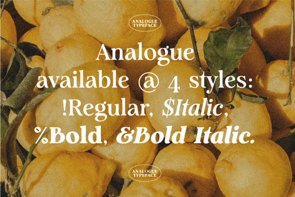
The family ships as four styles: Regular, Italic, Bold, and Bold Italic. That’s a workable range for a project that needs a serif text face with a bit of character rather than a full editorial system with multiple optical sizes. The italic is worth checking before committing — true italics on retro-inspired serifs often diverge more in personality from the roman than designers expect, and it’s the style most likely to carry the font’s warmth into running text.
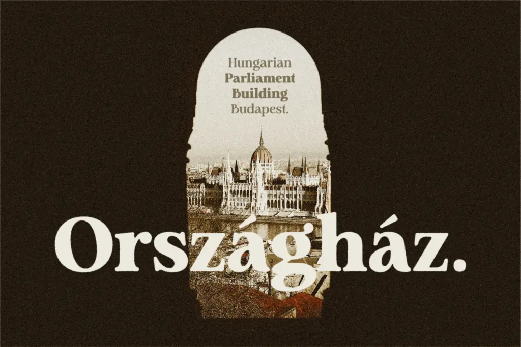
Language support covers European languages and Vietnamese, which is a reasonable spread for branding and packaging work aimed at those markets, though anyone working in Greek, Cyrillic, or other non-Latin scripts will need to look elsewhere. The listing mentions a set of standard ligatures accessible through OpenType, with Illustrator’s Glyphs panel called out specifically as the place to trigger them — worth testing in your actual production software before you plan a layout around them, since support varies.
There’s no mention of variable font technology or an extended weight range here, so this is a four-style family rather than a flexible axis system. For some projects that’s plenty; for others, particularly larger editorial systems, it may feel limiting.
Use cases
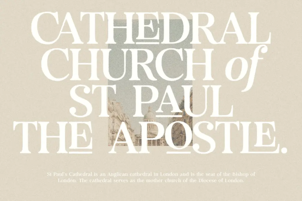
Analogue’s natural home is anywhere a brand wants to suggest heritage without going full vintage pastiche — craft packaging, small-batch food and drink labelling, independent retail branding, editorial headers for lifestyle or culture pieces. The humanist warmth in the letterforms also makes it a reasonable candidate for body copy in short-form editorial contexts, like a product label’s descriptive text or a magazine pull-quote, where the retro cues add flavour without working against readability.
It’s less suited to dense, long-form body text at small sizes — the moderate stroke contrast and retro detailing will read fine in a paragraph or two, but a full article set this way asks more of the reader than a plainer text serif would. Four styles also means it won’t flex into a full corporate identity system on its own; it’s better deployed as a flavour font alongside a more neutral workhorse for the heavy lifting.
What we liked, and what we didn’t
Strengths
- Rounded terminals and moderate contrast give it warmth without sacrificing structure
- Generous x-height keeps it legible at smaller display sizes
- Bracketed serifs feel restrained enough for both logotypes and short text passages
Trade-offs
- Only four styles, so it won't scale into a full editorial or corporate system on its own
- Ligature support depends on specific OpenType-aware software, which may limit some workflows
Analogue delivers a credible retro mood without tipping into pastiche, and its humanist structure keeps it usable beyond logotypes. Four styles and a modest language set mean it's best suited to branding, packaging, and short editorial work rather than a full-scale type system.
Verdict

Tmfonts reviews typefaces in depth — every font is tested in real branding, editorial and screen layouts before a word gets written. 555+ fonts reviewed and counting.