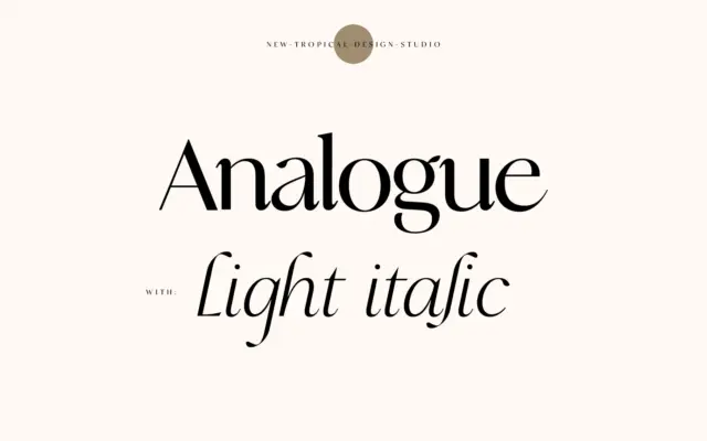
Analogue: a high-contrast serif for mastheads and editorial quotes
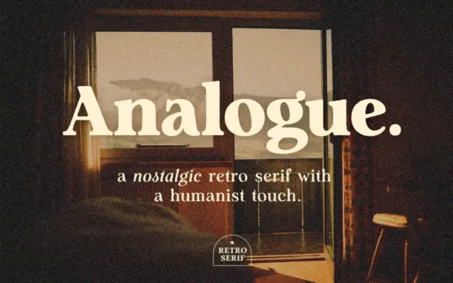
Design style Analogue sits in that familiar contemporary-serif territory: a high-contrast skeleton with curves that soften what could otherwise read…
Design style Analogue sits in that familiar territory where retro signage lettering meets a humanist serif skeleton. The strokes carry…
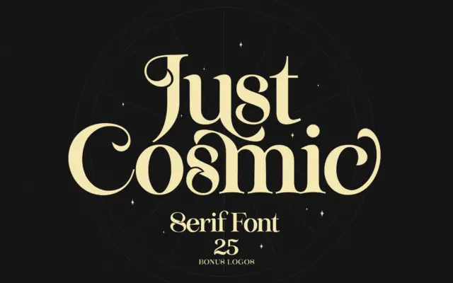
Design style Just Cosmic sits in that familiar territory of serifs built to look hand-finished rather than drafted with a…
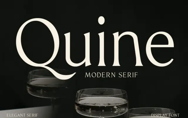
Design style Quine sits in the modern serif tradition that runs from Didone-era display faces through to today’s fashion-magazine mastheads.…
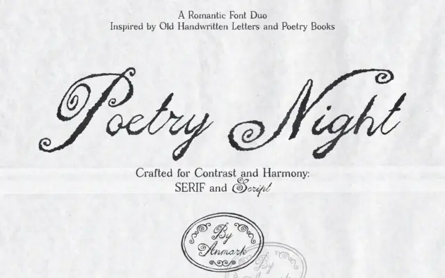
Design style Poetry Night pairs a loose, handwritten script with a companion serif, both leaning on the look of old…
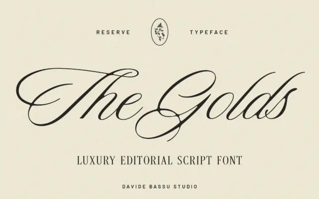
Design style Reserve sits in the calmer end of the script spectrum. Rather than chasing the loose, brush-pen energy that…
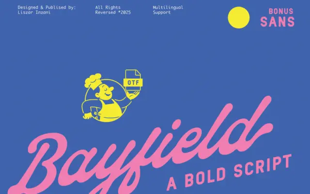
Design style Bayfield is a two-piece family: a thick, bouncy script and a plain, no-fuss sans serif built to sit…
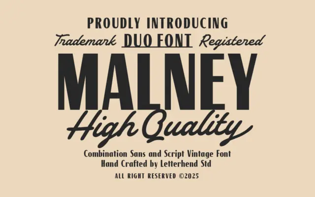
Design style Malney Classic is built as a two-part system: a sturdy sans serif for structure and a brush-style script…
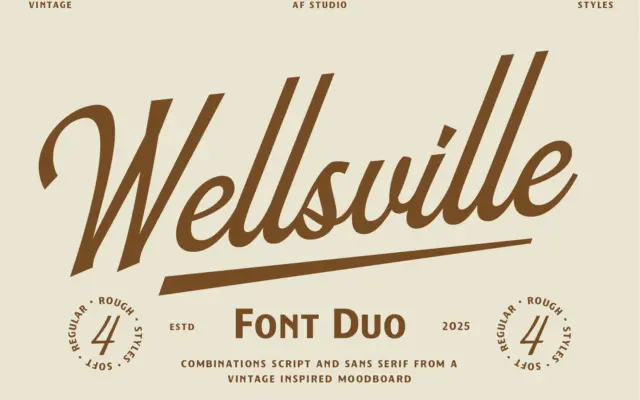
Design style Wellsville leans into the same well-worn territory as most retro Americana releases: a connected script set beside a…