
Poetry Night: a vintage script and serif duo for wedding stationery
Design style
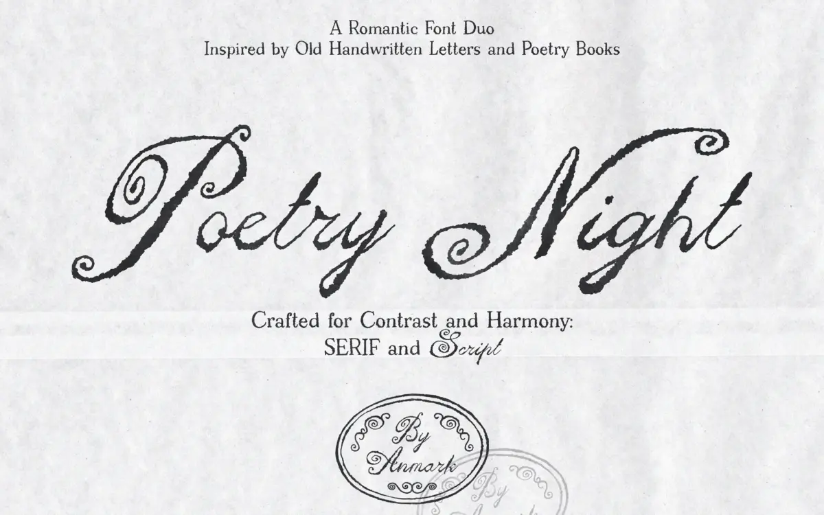
Poetry Night pairs a loose, handwritten script with a companion serif, both leaning on the look of old letters and worn printed pages. The script doesn’t try to be tidy. Strokes vary in weight, joins loosen and tighten, and the baseline drifts slightly rather than snapping to a grid. That looseness is the point: it reads as a hand moving at writing speed rather than a hand tracing a template, and it’s a more convincing version of the “romantic ink” genre than most scripts in this category manage.
The serif plays a quieter role. It’s built around old printed-page proportions, with uppercase letters that carry a bit of weight contrast and modest serifs rather than hairline ones. On its own it reads closer to a classic display serif than a strict text face, and the pairing works because it never competes with the script for attention. It sits underneath, structuring what the script gestures at.
Where the duo earns its keep is in the contrast between the two: one loose and personal, one upright and composed. That’s a familiar formula in script-and-serif pairs, but the texture of the ink — the inconsistency in stroke weight, the soft, rounded terminals on the script — gives it a specific, slightly worn character rather than the generic polish you see in a lot of wedding-market scripts.
Character set and features
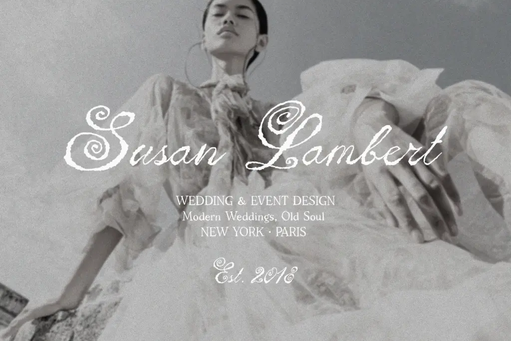
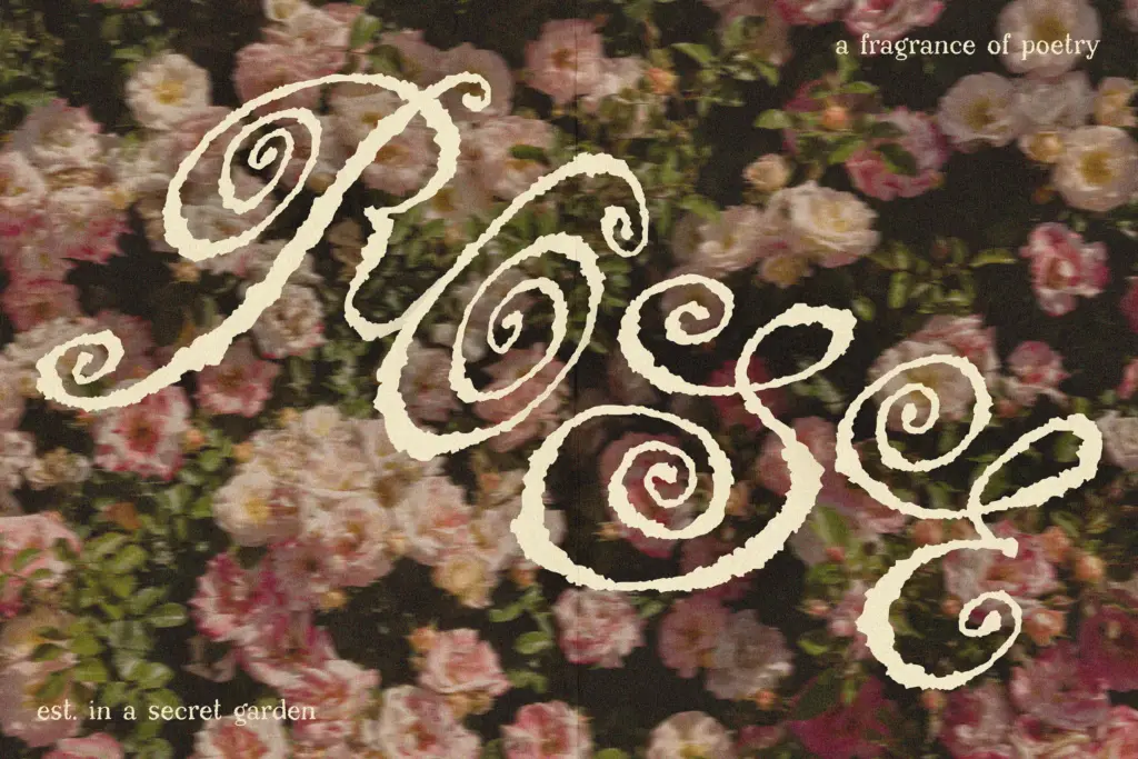
The script’s swashes and flourishes are its main currency. Expect generous entry and exit strokes designed to be used selectively — on initial capitals, end-of-word flourishes, or monogram treatments — rather than switched on wholesale across a paragraph. Used sparingly, they add the romantic flourish the font is built for; used everywhere, the texture gets noisy and the words start to run together.
The serif’s uppercase set is the more dependable workhorse here. It holds up at small sizes and short lengths — the kind of single words or short lines you’d set in a header or a logo lockup — better than the script does. Neither face is pitched as a general-purpose text font, and nothing in the brief suggests extended multilingual support, so test your specific character needs before committing to long-form copy in either style.
Use cases
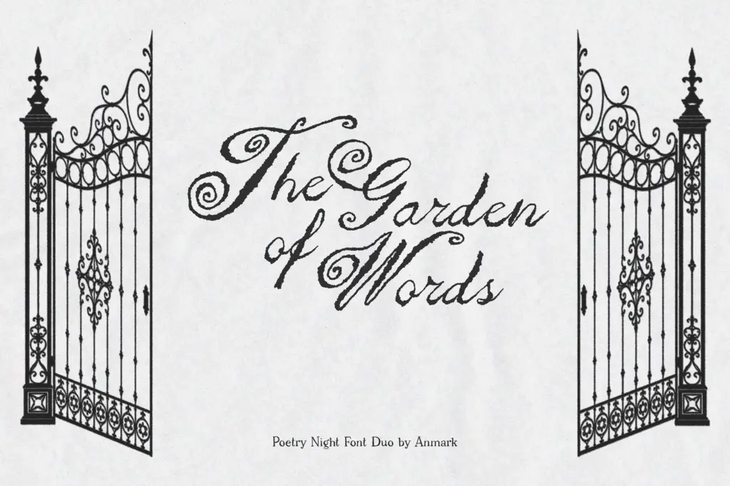
This is squarely a stationery pairing. Wedding invitations, save-the-dates, and monogram work are the obvious fits — the script for names and verses, the serif for details and dates. It also does reasonable work in logo design and branding where a handmade, old-fashioned mood is the goal: boutique labels, packaging that wants a personal rather than corporate feel, editorial pull-quotes.
It’s less suited to anything requiring clean, modern minimalism, or to interfaces and body text where consistency matters more than character. The imperfection that makes it feel handwritten is the same quality that limits it to display and short-form settings. Keep it to headlines, names, and short lines, and let the serif carry anything that needs to be read quickly.
What we liked, and what we didn’t
Strengths
- The script's inconsistent stroke weight reads as genuinely handwritten rather than templated
- The serif's uppercase set is clean enough to anchor logo lockups and headers on its own
- The contrast between loose script and composed serif is well judged rather than arbitrary
Trade-offs
- Heavy flourish use on the script quickly turns legible words into decorative noise
- Neither face is suited to extended text or interface use, limiting it to display settings
Poetry Night delivers a convincingly imperfect, ink-and-paper romanticism that stands out from the cleaner scripts flooding the wedding market. It's built for short-form, display use — names, verses, monograms — and shouldn't be asked to do more than that.
Verdict

Tmfonts reviews typefaces in depth — every font is tested in real branding, editorial and screen layouts before a word gets written. 555+ fonts reviewed and counting.