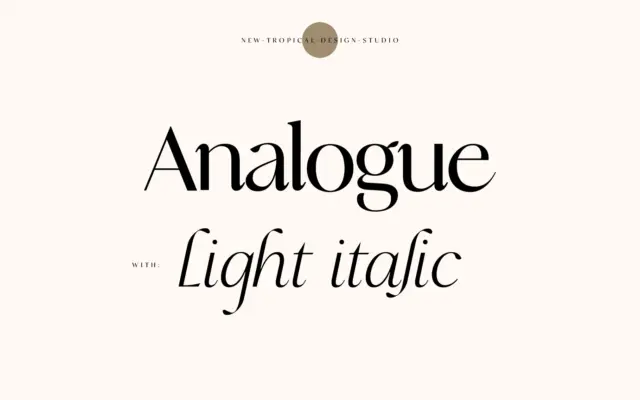
Analogue: a high-contrast serif for mastheads and editorial quotes
Design style Analogue sits in that familiar contemporary-serif territory: a high-contrast skeleton with curves that soften what could otherwise read…
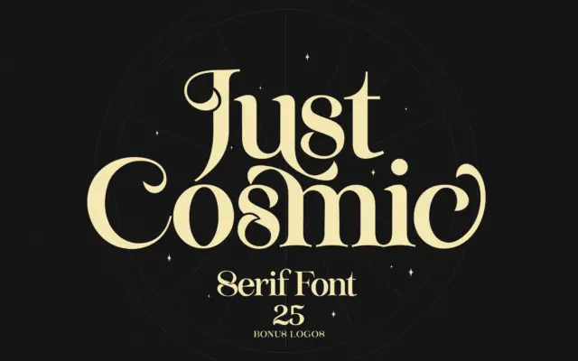
Design style Just Cosmic sits in that familiar territory of serifs built to look hand-finished rather than drafted with a…
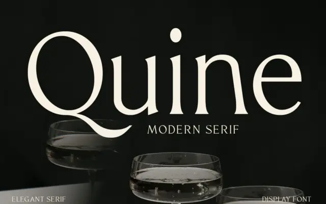
Design style Quine sits in the modern serif tradition that runs from Didone-era display faces through to today’s fashion-magazine mastheads.…
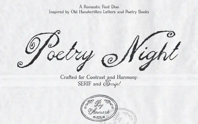
Design style Poetry Night pairs a loose, handwritten script with a companion serif, both leaning on the look of old…
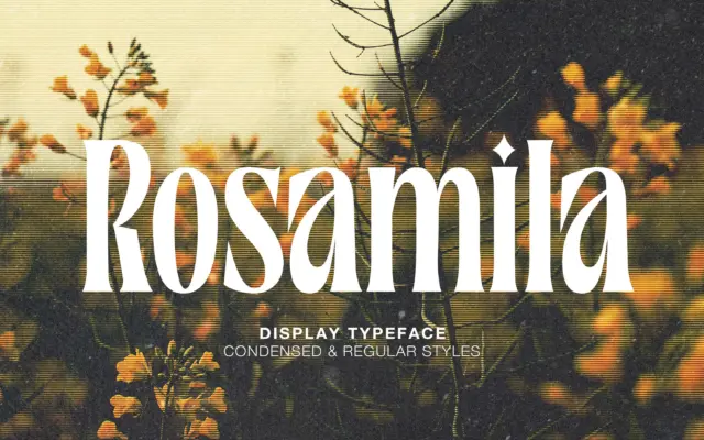
Design style Rosamila Display sits in that familiar territory of high-contrast serifs built for headlines rather than paragraphs. The strokes…
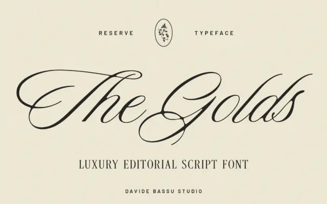
Design style Reserve sits in the calmer end of the script spectrum. Rather than chasing the loose, brush-pen energy that…
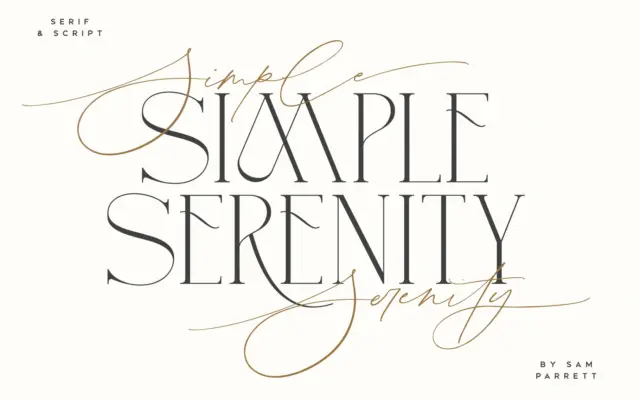
Design style Simple Serenity is a two-part set: a fine, hand-drawn script and an uppercase-only serif built to sit alongside…
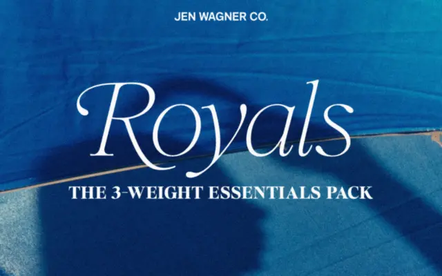
Design style Royals Serif belongs to the current wave of boutique serifs built for branding kits rather than long-form reading.…
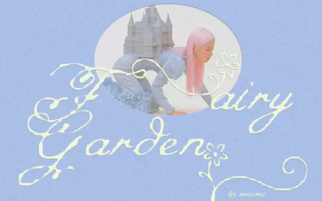
Design style Fairy Garden sits in the crowded whimsical-script category, but it leans harder into irregularity than most. The baseline…