
Fairy Garden Font Free Download
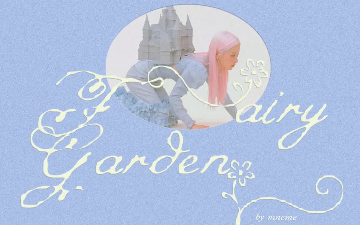
Is Fairy Garden free to download?
Fairy Garden is a commercial font sold on Creative Market, so the full version needs a paid license. Get it from the official listing: Fairy Garden font download.
Need something free? These script fonts from Google Fonts are free for personal and commercial use:
Design style
Fairy Garden sits in the crowded whimsical-script category, but it leans harder into irregularity than most. The baseline wanders rather than holds, strokes swell and thin with a handwritten inconsistency that reads as deliberate rather than sloppy, and the swashes extend well beyond the letter body on ascenders and descenders. There’s a looseness to the joins — some letters nearly touch, others leave a gap — that gives the whole thing a drawn-with-a-twig feel rather than a calligraphic one. It’s not refined in the way a formal script is refined; it’s closer to a decorated note than a monogram.
The floral flourishes are the most distinctive part of the design. Small leaf and bloom details sit on terminals and swash ends, which is a nice touch but also means the font rarely wants to be used plain. Strip away the alternates and the base letters feel a little thin on personality — the decoration is doing a lot of the work.
Character set and features
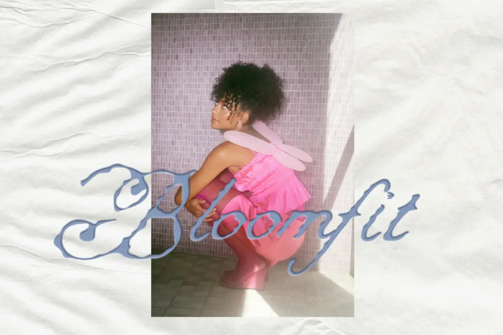
The set covers uppercase, lowercase, numbers and punctuation, plus a batch of decorative alternates for building bespoke-looking words. The alternates are the real reason to buy this over a plainer script — swapped capitals and swash variants let you break up repetition in a short word or name, which matters because the default glyphs alone would get monotonous fast in anything longer than a few words.
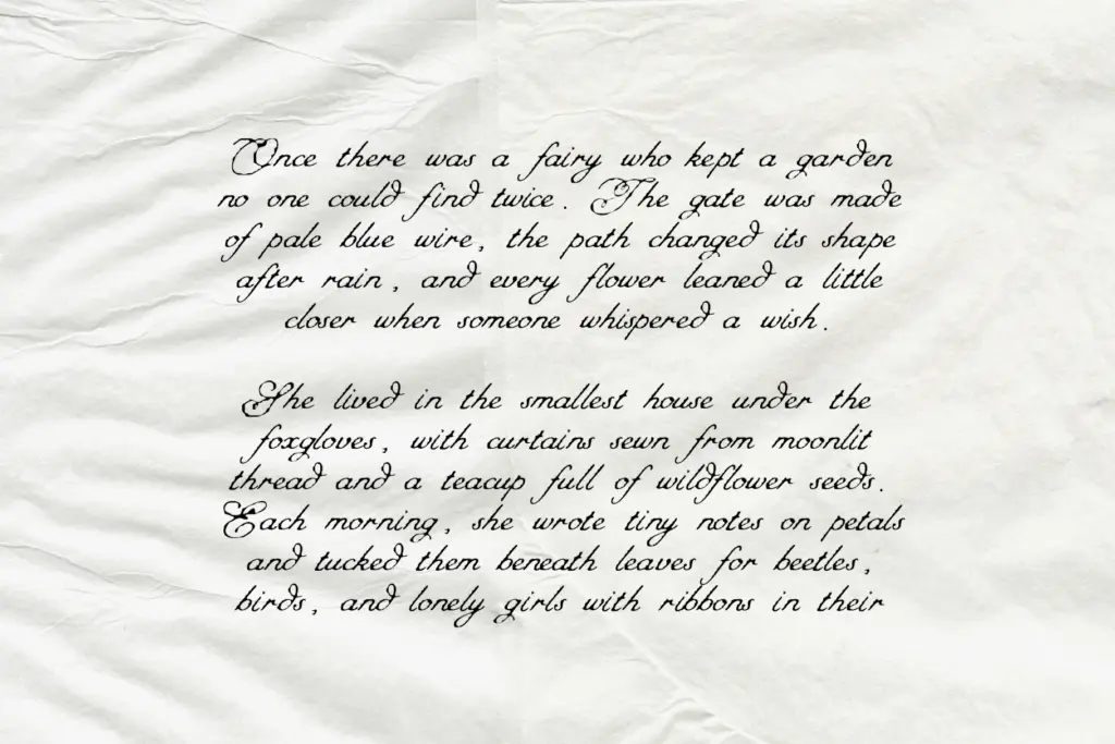
At small sizes the swashes start to crowd each other, especially in setting where letters sit close together — tracking needs opening up noticeably before the curls stop colliding. This isn’t a font for paragraph-length use regardless of tracking; it’s built for single words, short phrases, or names, and it knows it. Kerning between some letter pairs is a little uneven, which is typical of scripts this ornamented and something to watch when setting longer phrases — expect to nudge a pair or two by hand.
Use cases
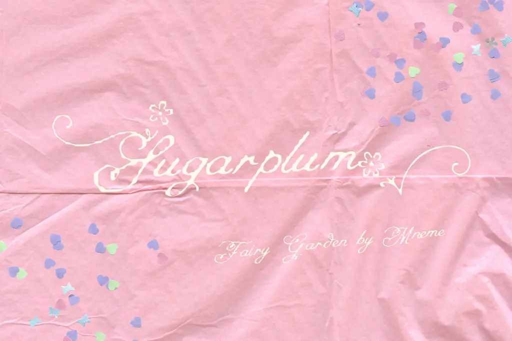
This is a font for a specific mood: pastel palettes, fairycore aesthetics, boutique branding that wants to feel hand-touched rather than corporate. It does well on packaging labels, stationery, invitation suites, and social graphics where a single word or a short phrase needs to carry warmth and a bit of magic. Logo work is plausible if the name is short — three or four letters give the swashes room to breathe without turning into visual noise.
It’s less suited to anything requiring restraint or formality — a corporate deck, a legal document header, anything that needs to read instantly at a glance. The decorative density also means it competes with busy backgrounds; it wants clean, pale space around it to do its job. Used within that narrow lane — children’s projects, wedding details, dreamy moodboards — it does exactly what it sets out to do.
What we liked, and what we didn’t
Strengths
- Floral swash details give short words a distinct, hand-decorated character
- Decorative alternates let you vary repeated letters within a single name or phrase
- Clear fit for a specific pastel, fairycore aesthetic rather than a vague 'pretty script' catch-all
Trade-offs
- Swashes crowd together at small sizes or tight tracking, limiting legibility
- Kerning between some pairs needs manual adjustment in longer phrases
Fairy Garden delivers exactly the pale, floral whimsy it promises, with alternates that help short words feel bespoke rather than templated. It's not built for long-form setting or formal contexts, and the swash density demands generous spacing to avoid clutter. Best treated as a specialist font for a specific fairycore aesthetic rather than an everyday script.

Tmfonts writes independent reviews of typefaces: what each font does well, where it falls short, what it suits, and where it is sold.