
Haglos Bold Script Font Free Download
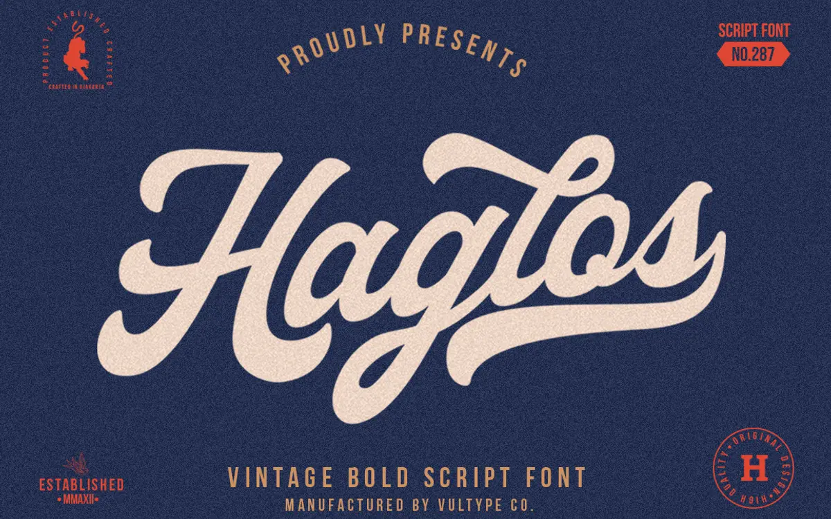
Is Haglos Bold Script free to download?
Haglos Bold Script is a commercial font sold on Creative Market, so the full version needs a paid license. Get it from the official listing: Haglos Bold Script font download.
Need something free? These script fonts from Google Fonts are free for personal and commercial use:
Design style
Haglos Bold Script sits in the thick-brush, American-vintage lane that’s been well worked over the last decade, but it leans harder into weight than most of its peers. The strokes are dense, the contrast is modest, and the letters feel inked with a worn brush rather than a fine pen. There’s a deliberate roughness to the joins — nothing jagged or distressed, just a slight irregularity that reads as handmade rather than vectorised. Ascenders and descenders swing out with confidence, and the overall rhythm is upright-leaning rather than a steep italic slant, which gives it a sturdier, more planted stance than a lot of wedding-style scripts.
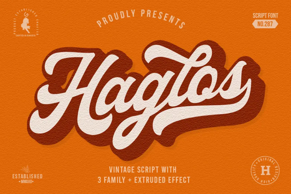
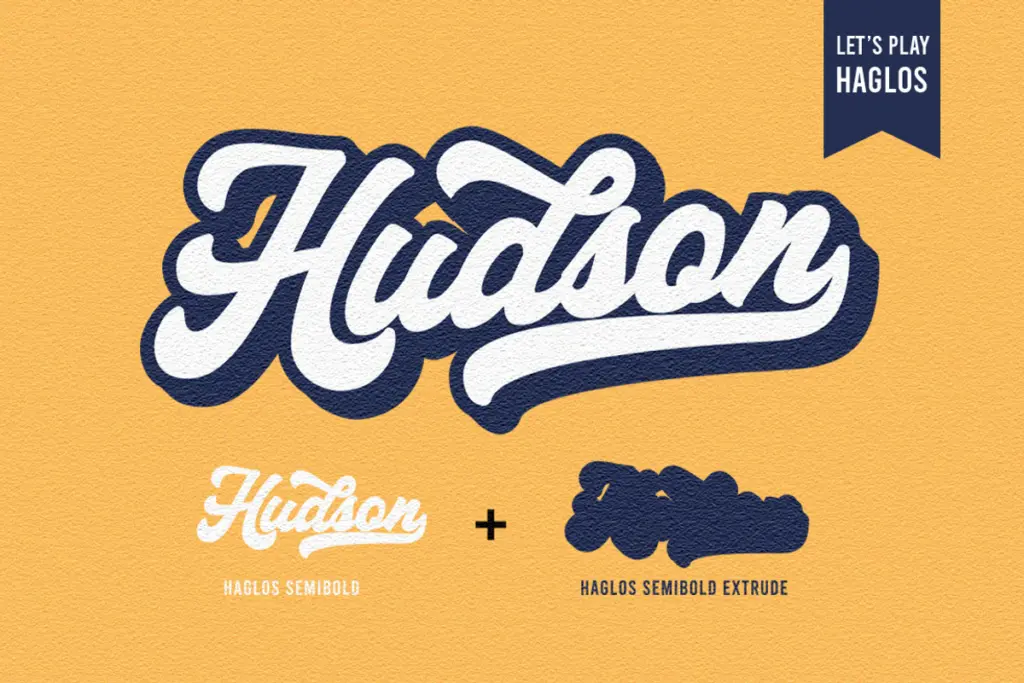
The bold weight is clearly the headline style here, and it shows: letterforms are built for presence, not for whispering. Where it gets interesting is the companion Regular and SemiBold weights and the Extrude versions bundled alongside — a layered, extruded treatment of each weight that adds a dimensional, screen-printed feel. That’s a genuine point of difference from the glut of single-weight vintage scripts on the market, and it gives buyers a reason to pick this one over something thinner.
Character set and features
The set covers upper and lowercase Latin, numerals, and basic symbols, with stylistic sets and ligatures layered on top via OpenType. The swash alternates are the real workhorse feature — they’re what let the face shift from a plain wordmark into something closer to hand lettering, with entry and exit strokes that connect or flourish depending on the context. Getting at them does require software with OpenType support (Illustrator, InDesign, CorelDraw) or a glyph browser, so this isn’t a drop-into-Word-and-go script if you want the full character.
PUA encoding is included, which at least means the swashes are reachable without OpenType feature support if you’re patient with a character map. Multilanguage support is mentioned without specifics, so treat that as a general nod to extended Latin coverage rather than a guarantee for any particular language. The ligature set helps smooth over awkward letter pairs, which matters more in a bold script than a light one, since thick strokes collide more easily at the x-height.
Use cases
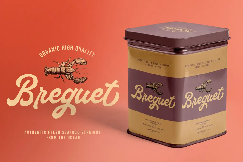
This is a logotype and badge font first. The weight and swash work make it suited to product labels, packaging, merchandise, and short headline treatments — anywhere a word or two needs to carry visual weight on its own. It’s less suited to long passages; at body-copy sizes the stroke contrast flattens and the swashes have nowhere to go, so reserve it for headers, short quotes, and display lines.
The Extrude variants add a layered dimensional option worth testing for posters, social graphics, or anything that wants a printed, screen-press feel rather than a flat vector look. Pair the bold weight with the lighter styles in the family for hierarchy — a bold wordmark with a semibold or regular tagline underneath — rather than leaning on Haglos alone for every element of a design.
What we liked, and what we didn’t
Strengths
- The extrude versions of each weight give a layered, screen-printed option not many script families bundle in
- Ligatures and swash alternates smooth over the awkward collisions that heavy-stroke scripts often hit
- Three weights (Regular, SemiBold, Bold) make internal hierarchy possible without reaching for a second typeface
Trade-offs
- Full swash access needs OpenType-aware software, so casual users may only see the base letterforms
- Stroke contrast flattens at small sizes, limiting it to headline and display use rather than body text
Haglos Bold Script is a confident, heavyweight vintage script that does its best work in short bursts — logos, labels, badge lettering. The swash set and the bonus extrude styles give it more range than a typical single-weight script, but it's not built for reading at length.

Tmfonts writes independent reviews of typefaces: what each font does well, where it falls short, what it suits, and where it is sold.