
The Minimalist Font Free Download
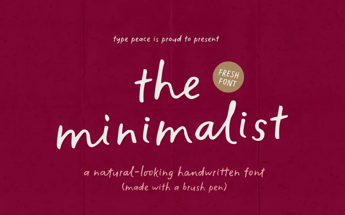
Is The Minimalist free to download?
The Minimalist is a commercial font sold on Creative Market, so the full version needs a paid license. Get it from the official listing: The Minimalist font download.
Need something free? These handwritten fonts from Google Fonts are free for personal and commercial use:
Design style
The Minimalist is a casual brush-pen script that leans into the texture of an actual tool rather than a smoothed-out digital approximation. Strokes thin and thicken unevenly, terminals sometimes catch and flare, and the baseline drifts a little from letter to letter. That drift is doing real work: it’s what keeps the word shapes from looking stamped out.
The name undersells the font a bit. This isn’t a minimal or restrained script — it’s loose, slightly rough, closer to a quick note scrawled with a dry brush than a calligraphic hand. The letterforms are narrow and upright rather than swash-heavy, which keeps the overall impression closer to handwriting than to formal lettering. It reads as unpretentious rather than decorative.
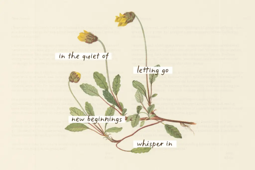
Character set and features
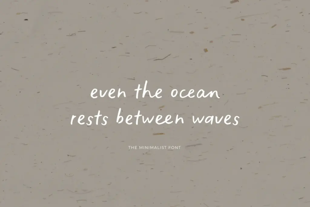
The practical core of this release is that every letter exists in two drawn versions, split across a Regular font and an Alt font (accessed via ss01), plus stylistic alternates and ligature sets layered on top. The stated purpose is to break up repetition — when two identical letters sit next to each other, the font can swap in an alternate automatically through Standard Ligatures, so a word like

Tmfonts writes independent reviews of typefaces: what each font does well, where it falls short, what it suits, and where it is sold.