
Royals Serif Essentials Pack Free Download
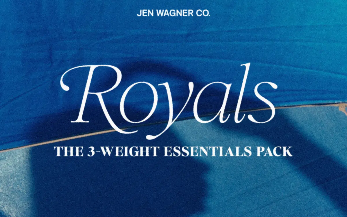
Is Royals Serif Essentials Pack free to download?
Royals Serif Essentials Pack is a commercial font sold on Creative Market, so the full version needs a paid license. Get it from the official listing: Royals Serif Essentials Pack download.
Need something free? These serif fonts from Google Fonts are free for personal and commercial use:
Design style
Royals Serif belongs to the current wave of boutique serifs built for branding kits rather than long-form reading. The Essentials pack gives you three weights — Thin, Regular, Bold — each with an italic, so six fonts total. The structure is restrained: rounded cap serifs, moderate contrast, and curves that favour an organic, hand-finished feel over geometric precision. Nothing about the skeleton is radical. It reads as a careful, market-aware interpretation of the transitional serif, trimmed down for header duty.
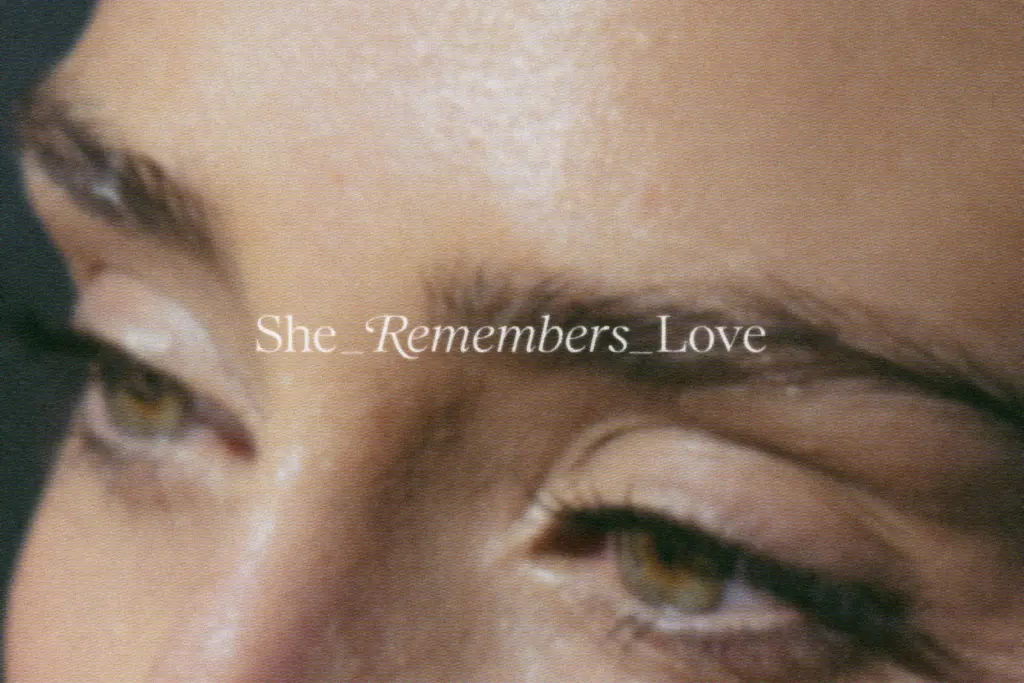
Where it picks up personality is in the capitals. The rounded serif terminals soften what could otherwise be a stiff, generic serif, and the swash alternates on B, D, E, F, K, P and R give it a bit of flourish without tipping into full calligraphic territory. The italics lean soft rather than sharp, which keeps the family coherent across weights — the Thin italic in particular has a quiet, editorial quality that reads well in pull quotes.
Character set and features
The set covers numbers, punctuation, and Latin language support, which is enough for most European-language branding work but not a reason to expect extended-language or non-Latin coverage. The swash alternates are limited to specific capitals rather than a full alternate set, so designers after an all-over decorative look will find the ornamentation more targeted than exhaustive — useful for a logotype’s initial, less so for a full display line of swashed text.
The inclusion of Canva-friendly kerning alternates is a practical touch worth noting: specific letter pairs like VA or Aw have been built as substitute glyphs to work around Canva’s lack of manual kerning. That’s a real accommodation for a huge segment of buyers who aren’t working in a proper type-setting environment, though it does mean the family’s best spacing behaviour is split between two different workflows — one for design software with OpenType support, one for copy-paste glyph swapping.
Because this is the Essentials pack rather than the full family, you’re working with three weights rather than a longer ramp. For most branding and header use this is plenty, but anyone hoping to build a layered editorial system with several intermediate weights will hit the ceiling fairly quickly.
Use cases
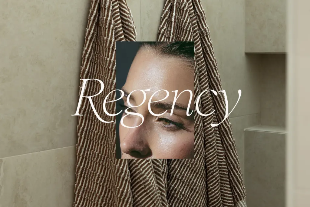
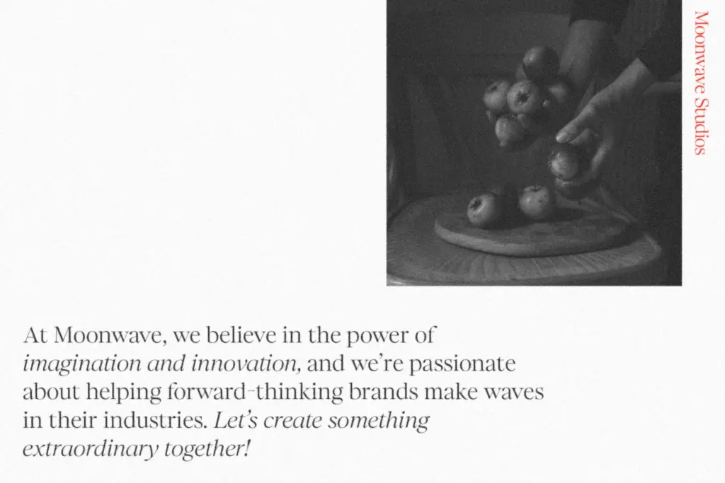
This is a headline and branding font first. Large-scale titles, logotypes, pull quotes, invitation headers, and packaging lockups are where the rounded serifs and swash caps earn their keep. The Bold weight holds up fine in short display lines; the Thin weight is decorative and wants generous size and spacing rather than small print or body copy. Pushed below headline sizes, the soft curves start to blur and the swash details lose their point.
It suits brands after a soft-luxe, slightly romantic register — beauty, lifestyle, boutique retail, wedding stationery — more than anything that needs to read as severe or corporate. Paired with a plain sans for body text, it does the job it was built for: a confident, legible header serif with just enough ornament to feel considered rather than templated.
What we liked, and what we didn’t
Strengths
- Rounded cap serifs and soft italics give it a distinct, gentle character at display sizes
- Targeted swash alternates on select capitals add flourish without overcomplicating the set
- Canva-friendly kerning alternates are a genuinely practical inclusion for non-professional users
Trade-offs
- Only three weights means limited range for building a full typographic hierarchy
- Thin weight loses definition below large sizes, so it's unsuited to body copy or small print
Royals Serif is a competent, soft-edged display serif that does exactly what branding projects ask of it: headlines, logotypes, and the occasional elegant quote. It's not groundbreaking, and the Essentials pack's three weights limit how far you can stretch it, but the swash details and Canva accommodations show real attention to how it will actually be used.

Tmfonts writes independent reviews of typefaces: what each font does well, where it falls short, what it suits, and where it is sold.