
Naterium Font Free Download
Is Naterium free to download?
Naterium is a commercial font sold on Creative Market, so the full version needs a paid license. Get it from the official listing: Naterium font download.
Need something free? These script fonts from Google Fonts are free for personal and commercial use:
Design style
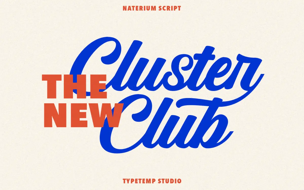
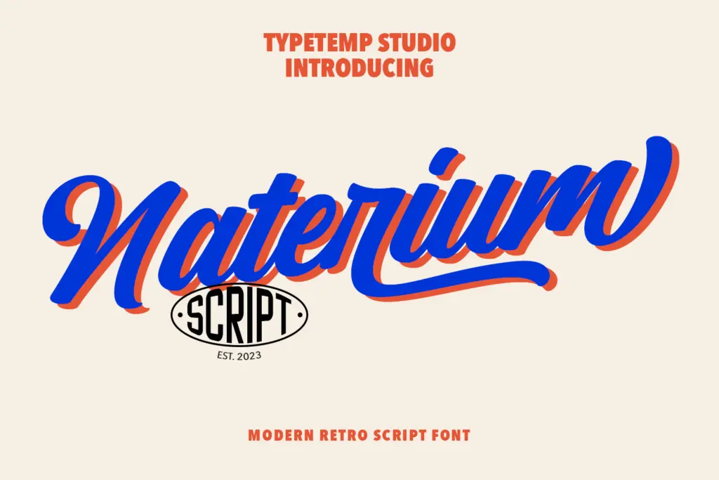
Naterium sits somewhere between a brush script and a monoline signature face, with just enough weight variation to read as lettering rather than handwriting. The strokes lean forward at a moderate angle and the joins are tight, which gives the font a compact, confident rhythm rather than a loose cursive flow. Calling it retro-modern is fair: the letter skeletons nod to mid-century signage scripts, but the spacing and the cleaned-up terminals feel contemporary rather than nostalgic.
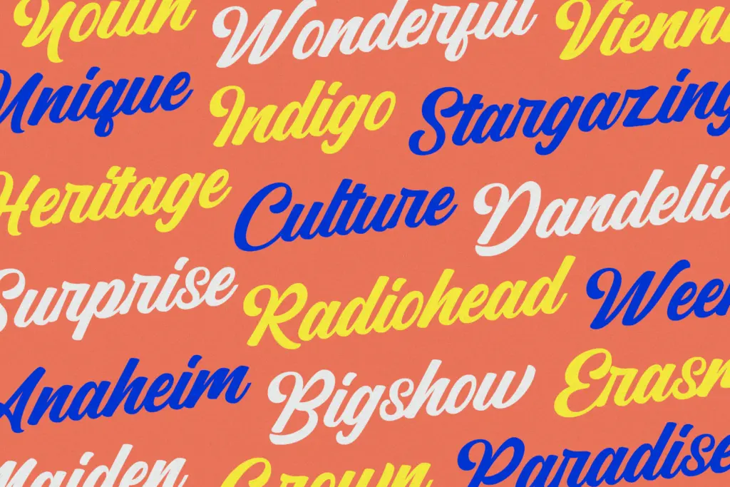
The drawing is consistent across the lowercase, which is where most of the character lives. Entry and exit strokes are kept short, so the font doesn’t sprawl the way some scripts do when you set more than a word or two. Capitals are more reserved, built for starting a word rather than carrying a whole line, and they pair sensibly with the lowercase without fighting for attention.
Character set and features
The font comes with alternate letterforms and ligatures, which is where a script like this earns its keep. Swapped alternates let you break up repeated letters in a word, and the ligatures smooth over awkward joins that would otherwise look mechanical. Used selectively, these features are what separate a script font from a script font that looks typed — Naterium gives you the tools to make that distinction, though it still takes a manual pass in your layout software to apply them well.
It ships in TTF, OTF and WOFF, so it covers desktop design work and basic web use without extra conversion. The seller notes it’s accessible in Illustrator, Photoshop and Word, which in practice just means it installs like any standard OpenType font and the alternates are reachable through the glyphs panel in apps that support OpenType features — Word users will only get the default glyphs unless they’re inserting characters manually.
Use cases
Naterium is built for short, declarative pieces of text: a logotype, a product name, a line on an invitation, a quote graphic. At that scale the joins and the alternates read clearly and the retro character comes through. It’s less suited to body copy or anything beyond a sentence — scripts with this much personality tend to fatigue the eye in long stretches, and Naterium is no exception.
It works well in branding contexts where a single word needs warmth without going fully handwritten — think packaging labels, wedding stationery, or a signature-style logo mark. For wedding invitations specifically, its restrained flourishes keep things legible rather than ornamental, which suits couples who want a vintage feel without illegible calligraphy. Pair it with a plain sans or slab for supporting text; Naterium should stay the loud voice in a layout, not share the stage.

What we liked, and what we didn’t
Strengths
- Alternates and ligatures let you break up repeated letters convincingly.
- Tight, compact joins keep short words legible rather than sprawling.
- Retro character comes through without tipping into illegible flourish.
Trade-offs
- Not suited to anything longer than a line or two of text.
- Full feature set requires an app with OpenType support, not just Word.
Naterium is a competent retro-modern script that does its best work in short bursts — logos, labels, a line on an invitation. The alternates and ligatures give it some flexibility, but it's not a font built for long-form setting, and the Word-friendly framing oversells how much of its feature set is actually reachable there.

Tmfonts writes independent reviews of typefaces: what each font does well, where it falls short, what it suits, and where it is sold.