
Dripdrop Liquid Font Set Free Download
Is Dripdrop Liquid Font Set free to download?
Dripdrop Liquid Font Set is a commercial font sold on Creative Market, so the full version needs a paid license. Get it from the official listing: Dripdrop Liquid Font Set download.
Need something free? These handwritten fonts from Google Fonts are free for personal and commercial use:
Design style
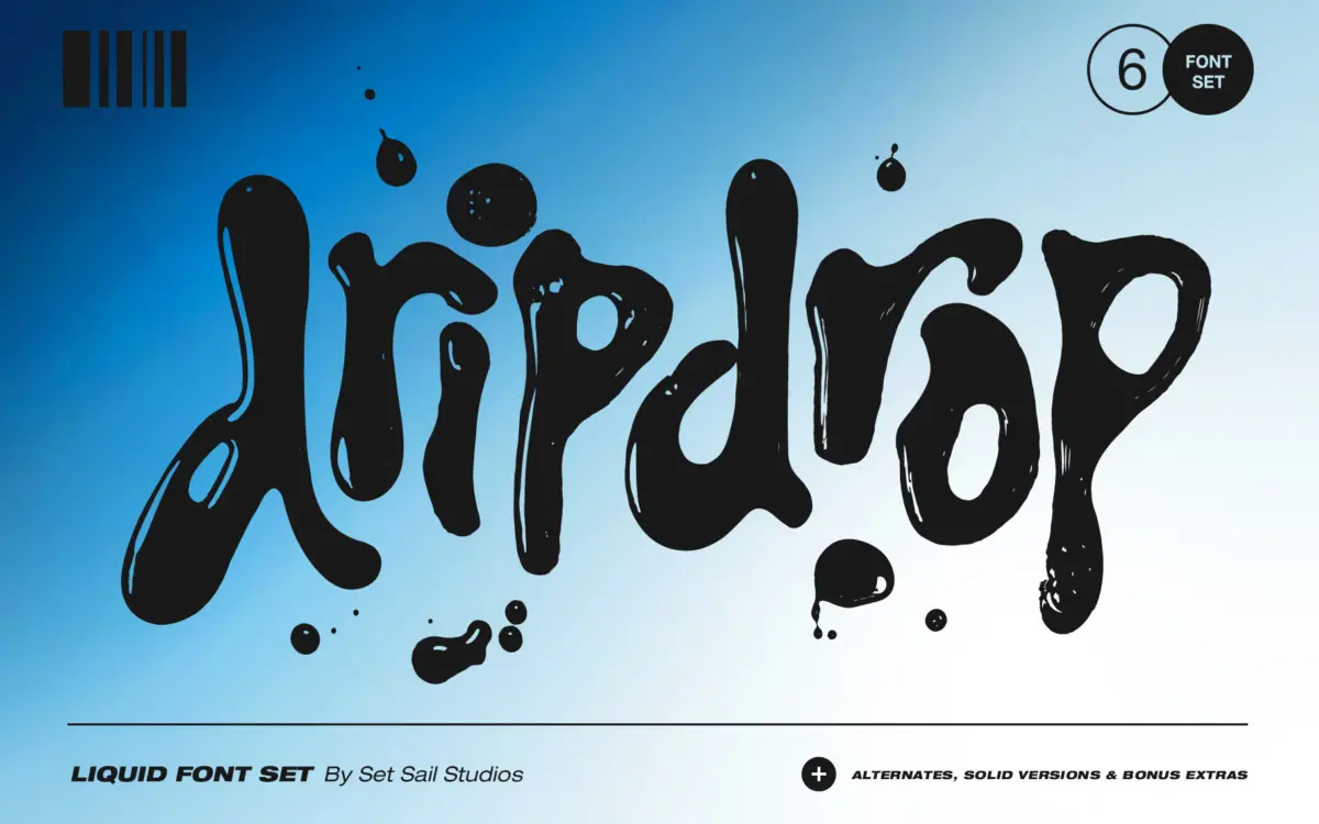
Dripdrop is built from actual squirted ink, scanned and turned into type, and it reads that way in the best sense. Letters bulge, pool and taper the way wet ink does on paper, with drips hanging off baselines and the occasional splat breaking the word shape. It sits in that Y2K-revival space of liquid metal logos and early internet graphics, but because the source material is physical ink rather than a 3D render, it has a rougher, more tactile feel than most “liquid” display fonts on the market.
The light-reflection version is the standout design decision here. Rather than flat gloss highlights dropped on afterward, the reflections follow the actual contours captured from the ink, so thick blobs catch light differently than thin connecting strokes. It’s a small detail but it’s the difference between a font that looks like liquid and one that looks like a filter applied to a font.
Character set and features
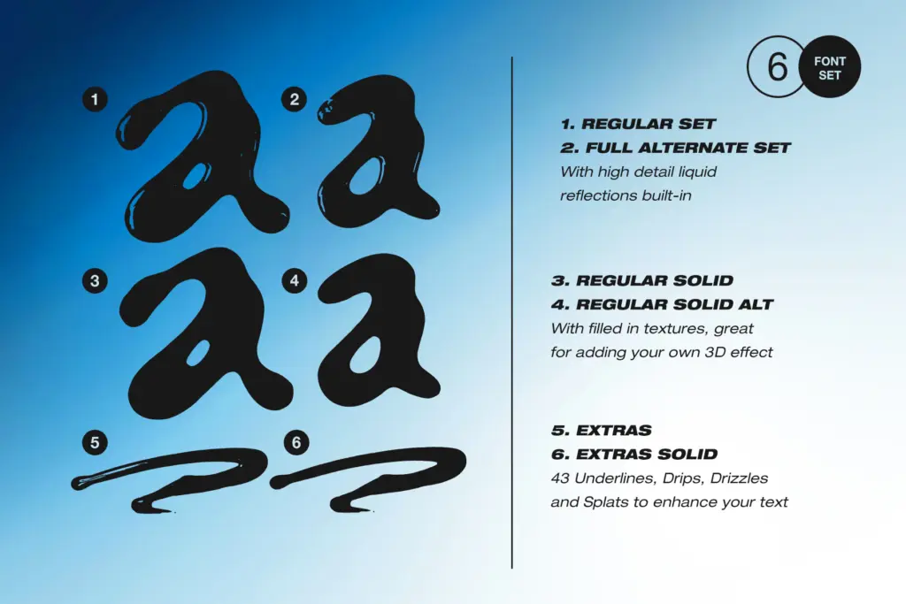
The set includes six separate font files rather than one font with alternates, which is worth understanding before you install anything. Dripdrop and Dripdrop Alt each give you a full uppercase, lowercase, numeral and punctuation set, but with different letterforms — so switching between the two mid-word is how you avoid the repeated-letter problem that plagues a lot of hand-lettered fonts, where every “e” or “s” looks identical and the illegibility of sameness creeps in.
Dripdrop Extras is a separate ornament font mapped to A–W and a–t, giving 43 drips, drizzles, underlines and splats you can drop in behind or around your main text. It’s a clever way to package decorative elements without cluttering the main glyph set, though it does mean a third font file to manage per project. Solid versions of all three strip out the reflections for situations where the gloss effect reads as noise rather than detail — flat colour print, small-scale use, or just a cleaner mood.
Because the whole set is drawn from ink rather than vector logic, don’t expect even rhythm or consistent x-height. That’s the point of the font, but it also means kerning will need manual attention on longer lines, and the reflections only really show up at a reasonable size.
Use cases
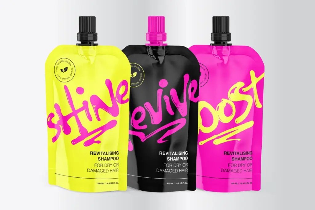
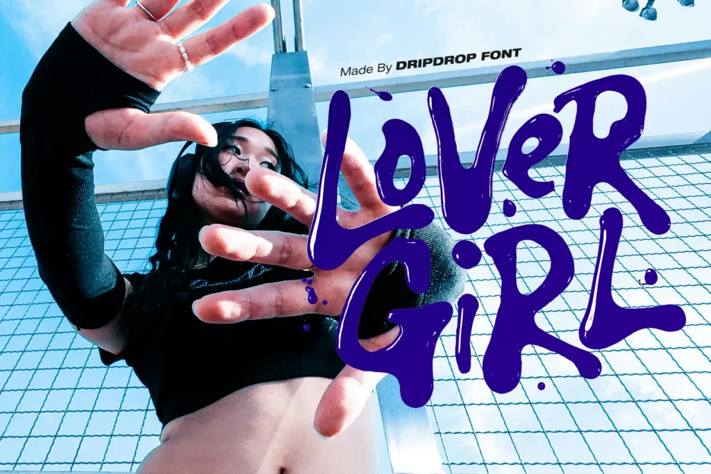
This is a font for headlines, logotypes and short bursts of text, not paragraphs. It belongs on band merch, streetwear graphics, skate and surf branding, packaging for anything that wants to feel unpolished on purpose, or social graphics chasing that early-2000s liquid-metal aesthetic. The alt version earns its keep on short wordmarks where repeated letters would otherwise give the trick away.
It’s less suited to anything requiring restraint — corporate collateral, body copy, or editorial work where a calm reading experience matters. The reflections are the font’s best feature and its main limitation: they need size and the right background to read as intentional rather than muddy.
What we liked, and what we didn’t
Strengths
- Reflections follow actual ink contours rather than a flat gloss overlay
- Alt letterforms and extras font solve the repeated-letter problem common to hand-lettered display fonts
- Solid versions give a flatter, more versatile option for small-scale or flat-colour use
Trade-offs
- Illegible at body-copy sizes and uneven rhythm demands manual kerning on longer lines
- Reflection detail can read as muddy at small sizes or against busy backgrounds
Dripdrop is a genuinely hand-made liquid font, and the reflection detail sets it apart from the glossier, more generic liquid-metal fonts out there. It's strictly a display tool for short, loud headlines, and needs size and a clean background to earn its keep.

Tmfonts writes independent reviews of typefaces: what each font does well, where it falls short, what it suits, and where it is sold.